As homeowners, we invest time, money, and effort into making our homes not just comfortable but also beautiful. However, picking the perfect trim and accent colors for your home can be a daunting task, especially when you consider the potential impact on the resale value of your property. The colors you choose can either attract potential buyers or turn them off completely. In this article, we’ll guide you through the process of choosing the right trim and accent colors to maximize your home’s resale value. We’ll also explore the various factors that affect the resale value of your home beyond its aesthetic appeal.
Factors that Affect Resale Value

When it comes to selling your home, there are a multitude of factors that can influence its resale value. Curb appeal, interior design, and market trends and demographics are just a few of the key elements that can make or break your home’s perceived value by potential buyers. It is important to ensure that your home appears attractive and up to date, both on the inside and outside. The right use of trim and accent colors can help bolster your home’s value and create an attractive appearance that appeals to a wide range of potential buyers.
Curb Appeal
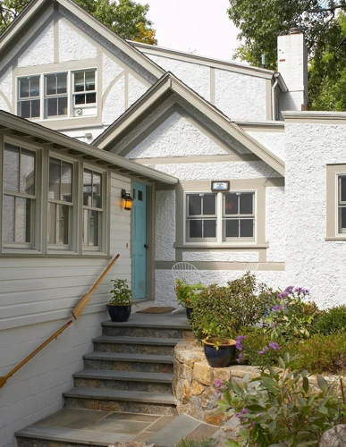
When it comes to selling your home, the first impression is essential, and it all starts with your home’s curb appeal. The right choice of trim and accent colors can significantly impact your home’s resale value, making it essential to choose wisely. Curb appeal refers to the exterior of your home, and it is the first thing potential buyers will see when they arrive at your home. Here are some factors to consider when choosing trim and accent colors for your home’s curb appeal.
- Complement your home’s body color: When choosing a trim color, you should ensure that it complements the body color of your home. For instance, if your home’s body color is a light shade of blue, you can choose white, beige, or a light shade of gray for your trim.
- Highlight your home’s architectural features: The trim color you choose should accentuate your home’s architectural features, such as window frames, shutters, and door frames. This can create a cohesive look for your home’s exterior.
- Use neutral colors: When selling a home, it’s advisable to appeal to the masses. Neutral colors like white, beige, and gray are classic choices for trim colors, and they can create a timeless look for your home’s exterior.
- Consider the psychology of colors: The colors you choose can influence people’s emotions and moods. Warm colors like red and orange can add energy and excitement, while cool colors like blue and green can create a relaxing and calming ambiance. Choose colors that complement the mood you want to create for your home’s exterior.
To learn more about curb appeal and how accent colors can make a difference, check out our article on “Home Curb Appeal with Accent Colors”.
Interior Design
When it comes to interior design, it’s important to keep in mind that the color of your trim and accent pieces can drastically impact the overall look and feel of your space. Here are some factors you should consider when choosing the right colors:
| Factor | Description |
|---|---|
| Room Size and Style | The size and style of your room can help you determine the best color choices for trim and accent pieces. For instance, if you have a small room, you may want to use lighter or neutral colors to open up the space, while a larger room may allow for more dramatic color choices. |
| Lighting | The amount and type of lighting in your space can also play a role in color selection. Rooms with lots of natural light may allow for bolder colors, while dimly lit areas may benefit from lighter, more reflective colors. |
| Existing Wall Color | The color of your walls can help guide your trim and accent color selections. For example, if you have a bold or dark wall color, you may want to use lighter or neutral trim and accent colors to create a cohesive look. |
| Personal Taste | At the end of the day, your personal taste and style preferences should also come into play when choosing trim and accent colors for your interior design. Don’t be afraid to experiment with bold or unique color choices if it aligns with your aesthetic. |
Remember, the cohesion of trim and accent colors with the rest of the interior design can have a significant impact on the resale value of your home. If you’re unsure about color choices or looking for inspiration, consider consulting with a professional interior designer or reviewing resources such as 10 Beautiful Trim Colors or The Psychology of Trim and Accent Colors. Additionally, pro tips such as DIY vs Pro Painting Trim and Accent and How to Achieve Contrast and Visual Interest with Trim and Accent Colors Painting can also help guide your decision-making process.
Market Trends and Demographics
One important factor that affects the resale value of your home is market trends and demographics. It’s crucial to keep in mind what potential buyers are looking for and what is currently popular in the local real estate market. This can help increase the appeal and overall value of your home.
To stay up-to-date with the latest market trends, research what is popular in your area. This may include certain colors or design styles that are in high demand. Demographics can also play a role in what buyers are looking for. For example, if your neighborhood is popular among families with children, creating a playful and colorful design may be more appealing.
To give an idea of popular trim and accent colors, we have created the following table based on current market trends:
| Trim Colors | Accents Colors |
|---|---|
| Soft Gray | Teal |
| Off White | Muted Yellow |
| Black | Bright Red |
| Crisp White | Deep Blue |
| Charcoal | Blush Pink |
| Dark Blue | Gold |
Remember, following market trends does not mean you have to sacrifice your personal style. It’s possible to incorporate popular colors and designs into your home while still maintaining your unique flair. If you’re unsure of where to begin or would like more guidance, consider hiring a professional painter. Check out our article on DIY vs. Pro Painting Trim and Accent to see which option is best for you. Additionally, take a look at our article on 10 Beautiful Trim Colors for more inspiration, or check out the best paints for exterior trim to ensure your colors stay looking fresh for years to come.
Choosing the Right Trim Colors
When it comes to boosting the resale value of your home, choosing the right trim colors can make a significant impact. The trim serves as a crucial accent to the primary body color and can make or break the overall look of your home. With so many options out there, it can be perplexing to know where to start. But fear not, we’ve put together a guide on the key factors to consider when selecting the perfect trim colors to enhance your home’s curb appeal and overall value. So, let’s dive in!
Consider Your Home’s Style
When it comes to choosing the right trim colors for your home, it’s important to consider the overall style of your home. Your home’s style should guide your color choices, as certain colors may complement some styles while clashing with others. Here is a breakdown of some popular home styles and the corresponding trim colors:
| Home Style | Trim Color Recommendation |
|---|---|
| Colonial | White, off-white, or cream to complement the classic, traditional style |
| Victorian | Deep or pastel shades of blue, green, or red to complement the ornate and colorful details of Victorian homes |
| Craftsman | Earthy tones like brown, beige, or forest green to complement the natural materials used in Craftsman homes |
| Modern | Black, white, or gray to complement the sleek lines and minimalist design of modern homes |
| Mediterranean | Warm, earthy tones like terracotta, ochre, or rust to complement the warm and inviting nature of Mediterranean homes |
Remember, the goal is to make sure that your trim color choice complements and enhances the style of your home, rather than detracting from it. By taking the time to consider your home’s style before selecting trim colors, you can ensure that your home has a cohesive and attractive look that will appeal to potential buyers.
Complement Your Home’s Body Color
A crucial aspect to consider while choosing the right trim color for your home is to complement your home’s body color. The trim color should enhance the body color, not clash with it.
- Analyze the Undertones: The body color of your home might have warm, cool, or neutral undertones. Choose a trim color that matches the undertones of your home’s body color.
- Match or Contrast: You can either use a trim color that matches the body color of your home for a cohesive look, or choose a contrasting color to make the trim stand out.
- Avoid Clashing Colors: Avoid using clashing colors for the trim that doesn’t complement the body color. For example, if your home has a beige body color, use warm earthy tones like brown or cream for the trim instead of bright hues such as pink or green.
By complementing the body color of your home, the trim color will not only enhance the visual appeal of your house, but it can also add value to your home. Remember, the trim and body color combination is a crucial factor when it comes to the resale value of your home.
Highlight Architectural Details
One effective way to choose trim colors is to highlight the architectural details of your home. This not only adds visual interest but can also increase the resale value of your property. Here are some tips for highlighting architectural details with trim colors:
| Tip 1: | Choose a trim color that contrasts with the body color of your home. This will draw attention to details like windows, doors, and molding. |
| Tip 2: | Consider using a different trim color for each architectural feature, such as a lighter shade for window frames and a darker shade for door frames. |
| Tip 3: | If your home has intricate details or unique architectural features, choose a trim color that contrasts strongly with the body color to make them stand out. |
| Tip 4: | For homes with simple architectural features, consider using a bold trim color to add interest and make the home stand out in the neighborhood. |
By highlighting the architectural details of your home with trim colors, you can create a unique and visually appealing look that can increase the resale value of your property.
Appeal to the Masses
When choosing trim colors for your home, it’s important to consider what will appeal to the masses. This means choosing colors that are widely accepted and not too bold or unique. Neutral colors, such as white, beige, or gray, are generally safe choices that have broad appeal. However, you can add a touch of interest by choosing a slightly warmer or cooler shade to complement your home’s body color.
Another option is to select a color that is a few shades darker or lighter than your home’s body or main color. This creates a subtle contrast that can add depth and interest without being too overwhelming. Just be sure to choose a shade that complements, rather than clashes with, your home’s main color.
When it comes to trim color, less is typically more. Avoid using too many different colors or shades, as this can make your home look chaotic and uncoordinated. Stick with one or two trim colors for a cohesive and polished look.
Keep in mind that classic, timeless colors are often the most appealing to the masses. Trendy or unique colors may be loved by some but may turn off others. Think about the long-term resale value of your home when making color choices.
Consider the architecture of your home as well. Traditional homes typically look best with classic, understated colors such as white or cream. Modern homes may be able to pull off bolder or more unique colors, but still, be careful not to go too overboard.
Appeal to the masses when selecting your trim color to ensure the widest possible appeal and the greatest potential for resale value.
| Considerations for Appealing to the Masses |
|---|
| Neutral colors have broad appeal and are generally a safe choice |
| Avoid using too many different colors or shades, stick with one or two for a cohesive look |
| Classic, timeless colors are often the most appealing to the masses |
| Consider your home’s architecture when selecting trim colors |
Coordinate with Accent Colors
When choosing trim colors, it’s important to consider how they will coordinate with the accent colors used throughout your home. Here are some tips for coordinating your trim and accent colors:
1. Use a color wheel: One easy way to coordinate colors is by using a color wheel. This tool can help you choose colors that are complementary or analogous to each other.
2. Keep it simple: It’s best to choose just a few accent colors and stick with them throughout your home. This will create a cohesive look and make your home feel more pulled together.
3. Match undertones: When choosing accent colors, make sure they have similar undertones to your trim color. For example, if you have a warm beige trim, consider using warm green or gold accents.
4. Contrast carefully: While contrast can be striking, be careful not to go overboard. If your trim color is already bold, consider using more subtle accent colors.
5. Use patterns: If you’re struggling to choose accent colors, look to patterns. A patterned pillow or rug can provide inspiration for coordinating colors.
Coordinating trim and accent colors can elevate the look of your home and increase resale value. By following these tips, you can create a cohesive color scheme that will leave a lasting impression.
Use Neutral Colors for a Classic Look
Using neutral colors for your trim and accents can give your home a timeless, classic look. Neutral colors are subtle and versatile, providing a sophisticated and calming effect to your overall design. Here are some tips to help you choose the right neutral colors for your home:
- Consider the undertones: Even neutral colors have undertones that can either add warmth or coolness to a room. Be sure to choose undertones that complement the other colors in your home.
- Choose shades carefully: Neutral colors can range from beige to gray and even pastels. Select a shade that will work well with your home’s decor while still being light enough to create a classic atmosphere.
- Use texture: Adding texture to a neutral color scheme can create visual interest and depth that brings new life to your home’s design. Consider using textured fabrics, like linen or woven cotton, and natural materials, such as stone or wood.
- Mix and match: Don’t be afraid to pair different neutral shades together for a layered effect. This can add dimension to your design and make your home feel cozy and inviting.
- Create contrast: Use neutral colors to create a contrast against bolder accent colors. This approach can make both types of colors stand out and provide balance to the overall design.
By choosing a neutral color palette, you can create a classic and timeless look that will appeal to a wide variety of potential buyers. Remember to consider the undertones and shades carefully, use texture, mix and match, and create contrast. By applying these tips, your home will have a sophisticated and classic look that is sure to increase its resale value.
Using Accent Colors for Maximum Impact
When it comes to designing the interiors of your home, choosing the right accent colors can take your decor from bland to beautiful. Accent colors are what give your space personality and make it stand out from the rest. They can also have a significant impact on the resale value of your home. By strategically incorporating accent colors, you can attract potential buyers and maximize the value of your property. In this section, we’ll explore how to use accent colors to make your home look its best.
Create a Focal Point
When it comes to using accent colors in your home to increase resale value, creating a focal point is a great strategy. By drawing attention to a specific area or feature of the home, you can attract potential buyers and showcase the unique aspects of your property. Here are a few tips for creating a focal point with accent colors:
- Choose a high-traffic area: A focal point should be somewhere that people will naturally look or spend time. Consider a wall in the living room or a piece of furniture in the entryway.
- Select a bold hue: To create contrast and draw the eye, choose an accent color that stands out from the surrounding colors. For example, a bright red accent wall in a white room can instantly become a focal point.
- Use texture to enhance: Adding texture to the focal point can make it even more eye-catching. Consider incorporating a patterned rug or textured wallpaper in your accent color.
- Highlight architectural features: If your home has unique architectural features, such as an ornate fireplace or a beautiful staircase, using an accent color to highlight these details can create a stunning focal point.
- Accessorize with complementary colors: Pairing the accent color with complementary colors in decor and accessories can help tie the focal point together and create a cohesive look throughout the room.
By using accent colors to create a focal point, you can add visual interest and personality to your home, while also increasing its resale value. Remember to choose a strategic location, select a bold hue, and use texture and accessories to enhance the overall effect.
Highlight Architectural Features
When it comes to using accent colors in your home, it’s important to consider highlighting the architectural features of your house. This can be achieved through careful color selection and placement. By using accent colors, you can draw attention to the unique aspects of your home’s design, making it stand out to potential buyers.
There are a few key architectural features that you may want to consider highlighting through the use of accent colors:
| Feature | Accent Color Ideas |
| Trim or molding | a contrasting color to make it pop, or a shade that complements the body color |
| Doors and windows | a bold color or a shade that matches the trim or body color |
| Staircases or banisters | a color that contrasts with the wall paint, or a subtle complementary shade |
| Fireplace mantels or built-ins | a color that matches the wall paint for a cohesive look, or a contrasting hue for added visual interest |
When selecting accent colors for these features, it’s important to consider the overall color scheme of your home. You want to ensure that the accents complement the main body color, rather than clash with it. For example, if your home’s body color is a warm beige, you may want to consider using cooler blues or greens as accents to create a harmonious, balanced look.
Using accent colors to highlight architectural features can also help to create a sense of flow and continuity throughout your home. By using the same accent color in multiple rooms or on different features, you can tie the design together and create a cohesive look that will appeal to potential buyers.
Highlighting your home’s architectural features through the use of accent colors is a smart way to increase its resale value. By drawing attention to the unique design elements that make your home special, you can make it stand out in a crowded market and attract potential buyers who are looking for something special.
Use Color Psychology
Color psychology is the study of how different colors can affect our emotions, behaviors, and moods. When it comes to home design, understanding color psychology can help you choose the right colors for your accents and trim to create a certain atmosphere or evoke specific feelings.
Color | Psychological Effect
Red | Can stimulate energy, passion, and excitement. It can also increase appetite, making it a popular choice for dining rooms and kitchens. However, it can also be perceived as aggressive or overwhelming in large doses.
Orange | Can promote warmth, friendliness, and enthusiasm. It’s a popular accent color for living rooms and family rooms. However, like red, it can be overpowering in large doses.
Yellow | Can evoke feelings of happiness, optimism, and creativity. It’s a great accent color for kitchens, bathrooms, and other areas where natural light is limited. However, it can also create feelings of anxiety or frustration if used excessively.
Green | Can promote a sense of calm, balance, and harmony. It’s a popular color for bedrooms, bathrooms, and other areas where relaxation is a priority. However, different shades of green can have different effects – for example, lime green can be energizing while forest green can be calming.
Blue | Can create a sense of serenity, trust, and security. It’s a popular color for bedrooms, bathrooms, and other calming spaces. However, too much blue can create feelings of sadness or coldness.
Purple | Can evoke feelings of luxury, creativity, and spirituality. It’s a popular accent color for bedrooms and living rooms, but can also be used in small doses throughout the home.
Pink | Can promote feelings of love, nurturing, and warmth. It’s a popular accent color for bedrooms, nurseries, and other feminine spaces.
Black | Can create a sense of sophistication, elegance, and drama. It can also create feelings of heaviness or depression in large doses, so it’s important to use it sparingly.
White | Can create a sense of lightness, purity, and simplicity. It’s a popular color for kitchens, bathrooms, and other areas where cleanliness and hygiene are important. However, too much white can create feelings of sterility or emptiness.
By understanding the psychological effects of colors, you can choose the right trim and accent colors to create the atmosphere you want in your home. Whether you want a cozy and intimate space or a bright and energetic one, the right colors can make all the difference.
Bold vs. Subtle Choices
When it comes to using accent colors, you have the option to choose between bold and subtle choices. Both of these have their advantages and disadvantages, and deciding which one to use ultimately depends on your personal preference and the style of your home.
Bold Colors can make a statement and create a sense of drama. They can be attention-grabbing and add visual interest to a space. However, bold colors can also be overwhelming if used in excess or if they clash with other colors in the room. In terms of resale value, bold colors can be polarizing and may not appeal to everyone’s taste.
Subtle Colors, on the other hand, can create a sense of calmness and balance in a room. They can also make a space feel larger and more open. Subtle colors are less likely to clash with other colors in a room and are generally seen as more timeless and classic. However, too many subtle colors can create a bland or boring space, and they may not have the same visual impact as bold colors.
To help decide which approach is best for you, consider the following factors:
| Factors | Bold Colors | Subtle Colors |
|---|---|---|
| Home Style | A contemporary or modern home may be better suited for bold colors, while a traditional or classic home may be better suited for subtle colors. | A wide range of home styles can benefit from subtle colors, but they are particularly well-suited for traditional or classic homes. |
| Room Size | Bold colors can work well in larger rooms, but they may overwhelm smaller rooms. | Subtle colors work well in both large and small rooms, and can make a room feel more spacious. |
| Personal Preference | If you love the look of bold colors and want to make a statement with your home design, then go for it! Just make sure to use them in moderation and balance them with other, more neutral colors. | If you prefer a more understated look or want to create a space that feels calm and relaxing, then subtle colors may be the way to go. |
| Resale Value | Bold colors may not be as universally appealing as subtle colors, so they may not be the best choice if you’re planning to sell your home in the near future. However, if you plan to stay in your home for a long time, then choosing bold colors that you love can help make your home feel personalized and unique. | Subtle colors tend to have more universal appeal, so they may be a safer choice if you’re planning to sell your home in the near future. They are timeless and classic, which means they won’t go out of style quickly. |
Ultimately, the choice of using bold or subtle colors is up to you. Just make sure to consider the style of your home, the size of the room, your personal preferences, and the potential resale value when making your decision.
Consider Your Home’s Surroundings
When using accent colors to maximize the resale value of your home, it’s important to carefully ‘Consider Your Home’s Surroundings’. This means taking into account the natural and built environment in which your home is located.
Location: The location of your home is a key consideration when choosing accent colors. If your home is located in a natural setting, consider using earthy tones and muted colors that blend in with the surrounding environment. On the other hand, if your home is located in an urban or suburban setting, brighter, bolder colors may be more appropriate to make your home stand out.
Climate: The climate of your area should also be taken into account. If you live in a warm and sunny climate, cool colors such as blues and greens can help create a sense of coolness and calm. Conversely, if you live in a cooler climate, warmer colors such as yellows and oranges can create a feeling of warmth and coziness.
Architecture: The architecture of your home is another important factor to consider when choosing accent colors. If your home has strong architectural details, consider choosing accent colors that highlight and draw attention to those features. For example, if you have a beautiful front door, consider using a bold color to make it stand out.
Neighborhood: Your neighborhood can also influence your choice of accent colors. Take a look around and see what colors are used on neighboring homes. Choose colors that complement and coordinate with the surrounding colors to create a cohesive and appealing look.
Table
| Factors to Consider | Examples |
|---|---|
| Location | Earthy tones for natural settings, bolder colors for urban/suburban settings |
| Climate | Cool colors for warm climates, warm colors for cool climates |
| Architecture | Accent colors that highlight architectural details |
| Neighborhood | Colors that complement and coordinate with neighboring homes |
When choosing accent colors for your home, it’s important to keep your surroundings in mind to create a cohesive and attractive look that will appeal to potential buyers. By considering location, climate, architecture, and neighborhood, you can choose accent colors that make your home stand out in a positive way.
Conclusion
In conclusion, the impact of trim and accent colors on the resale value of a home cannot be underestimated. The right color choices can make a significant difference in attracting potential buyers and increasing the value of the property. When choosing trim colors, it is important to consider the style of the home, complement the body color, highlight architectural details, and appeal to a broad audience. Neutral colors can also provide a classic look that never goes out of style.
Similarly, using accent colors strategically can create a focal point, highlight architectural features, and tap into color psychology to evoke emotions and create a certain atmosphere. It is essential to strike a balance between bold and subtle choices, and consider the surroundings of the home to ensure cohesive color choices.
Overall, the resale value of a home is influenced by many factors, and trim and accent colors are certainly among them. By carefully selecting colors that enhance the home’s style and appeal to potential buyers, homeowners can achieve maximum impact and ultimately increase the value of their property.
Frequently Asked Questions
How much of an impact do trim and accent colors have on home resale value?
The impact of trim and accent colors on home resale value can vary, but it is generally considered to be a significant factor that can influence potential buyers.
What are some factors that affect home resale value?
Factors that affect home resale value can include location, condition, size, design, features, and amenities, among others.
What is curb appeal and why is it important?
Curb appeal is the attractiveness of a home from the street, and it is important because it can make a strong first impression and increase the likelihood of potential buyers taking an interest in the property.
How can I choose the right trim colors for my home?
You can choose the right trim colors for your home by considering its style, complementing its body color, highlighting architectural details, appealing to the masses, coordinating with accent colors, and using neutral colors for a classic look.
How can I use accent colors for maximum impact?
You can use accent colors for maximum impact by creating a focal point, highlighting architectural features, using color psychology, making bold vs. subtle choices, and considering your home’s surroundings.
What are some popular trim color choices?
Some popular trim color choices include white, cream, gray, black, and beige, among others.
What are some popular accent color choices?
Some popular accent color choices include blue, green, red, yellow, and orange, among others.
Can using bold accent colors negatively impact home resale value?
Using bold accent colors can be risky, as they may not appeal to all potential buyers and could potentially distract from a home’s more valuable features. It is generally recommended to use them sparingly or in small doses.
Are neutral colors a safe choice for trim and accent colors?
Neutral colors can be a safe and classic choice for trim and accent colors, as they have broad appeal and can complement a variety of home styles and body colors.
How can I find the right balance between trim and accent colors?
You can find the right balance between trim and accent colors by considering the overall color scheme of your home, using the 60-30-10 rule (60% of a dominant color, 30% of a secondary color, and 10% of an accent color), and consulting a professional if needed.