Introduction
Choosing the right colors for your home’s exterior can be a daunting task. With so many options available, it can be overwhelming to decide which colors will best suit the style of your home and your own personal tastes. However, understanding the psychology behind colors can make the process much easier. By exploring the meanings and emotions associated with different hues, you can confidently choose trim and accent colors that will enhance the overall look and feel of your home. Read on to learn more about the psychology of colors and how to choose the right trim and accent colors for your home’s exterior.
The Basics of Using Colors for Home Exteriors
Using colors for home exteriors is a crucial task, whether you’re painting a new home or refreshing an existing one. Color can make your home stand out and look visually appealing. Here are some important basics that you should know when choosing colors for your home exterior:
- Consider your home’s architecture and style: The color you choose should complement the style of your home, rather than contradicting it. For example, a Victorian-style home would look best with a more traditional color scheme, while a contemporary home would benefit from a more modern color palette.
- Think about the surrounding environment: Take inspiration from the natural surroundings of your home. If you live in a forested area, consider green or earthy tones. Or if you want your home to stand out in a more urban environment, brighter colors may be appropriate.
- Pay attention to your roof: Remember that your roof color is a significant part of the color palette for your home. Be sure that the color you choose for your exterior walls complements the color of your roof.
- Take into account the size of the house: Lighter colors can make a small house appear larger. Meanwhile, bold colors can emphasize the size of a larger home.
- Consider the neighborhood: You don’t want your home to clash with your neighbors’ houses. Take cues from the surrounding homes and choose colors that work well with them.
Remember that the exterior trim and accent colors are just as important as the primary color of your home’s siding. Trim and accent colors can help to highlight important architectural features and add depth and dimension to your home’s exterior. So, once you’ve chosen the perfect main color for your home, pay attention to selecting the right trim and accent colors. To help you do this, read on to learn more about the psychology of colors and how to choose the right trim and accent colors for your home exterior. For more tips on choosing the perfect trim colors for your home, take a look at this article.
Understanding the Emotions and Meanings behind Colors
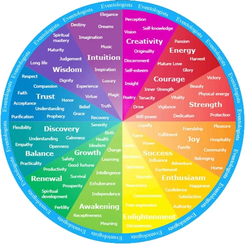
When it comes to choosing the right colors for your home’s exterior, it’s important to understand the emotions and meanings that different colors can evoke. Colors have the power to influence our moods and emotions, so it’s essential to choose colors that accurately reflect the desired vibe of your home. Warm colors, cool colors, and neutral colors all convey specific emotions and can be used to convey different messages to your home’s visitors. Understanding the psychology of color can help you choose the right trim and accent colors for your home, creating a cohesive and inviting look.
Warm Colors
Warm colors are often associated with energy, passion, and warmth. These colors tend to be in the red, orange, and yellow families. These colors are great for adding a bit of personality and vibrancy to your home’s exterior. Red, for example, is a color that represents passion, strength, and courage. It is a great color for adding a bold statement to your home’s exterior, but it is important to be cautious as too much red can be overwhelming. Similarly, orange represents enthusiasm and warmth, and can be used to create excitement and energy in your home’s exterior. Yellow, on the other hand, represents happiness, cheerfulness, and friendliness. It can be used to create a warm and welcoming environment.
When using warm colors for your home exterior, it’s important to find the right balance. You don’t want to overwhelm your visitors with too much boldness, but you also don’t want your house to look boring. Finding the right warm color in combination with the right accent and trim colors can make all the difference. For inspiration on how to use warm colors effectively, you can check out some beautiful trim colors that complement warm colors.
Adding warm colors to your home’s exterior can also increase its resale value. According to a report by Zillow, homes with front doors painted in shades of black, charcoal, or navy blue can sell for $6,271 more than expected. Other warm colors, such as yellows and reds, can also increase a home’s resale value if used in the right way. However, it’s important to keep in mind that resale value might not be the only factor to consider when choosing colors for your home’s exterior.
Knowing the meaning and emotions behind each warm color can be extremely helpful when choosing colors for your home’s exterior. Whether you want to create a bold statement or simply add a touch of friendliness, warm colors can help you achieve your goals. It’s important to remember that warm colors can make your home look visually smaller, so always take the size of your home into account when choosing your colors. To learn more about how to achieve cohesion with your trim and accent colors, check out our article on trim and accent color selection.
Cool Colors
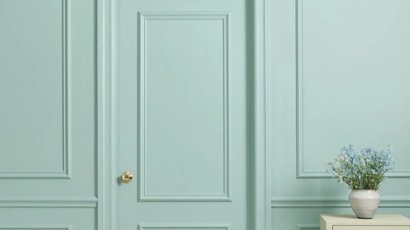
Cool colors are calming, soothing, and relaxing hues that are often associated with the sky, water, and nature. They are perfect for creating a tranquil atmosphere and are commonly used in bedrooms, bathrooms, and other areas of the home where peacefulness is desired.
Here are some of the most common cool colors and their associated meanings:
| Cool Colors | Meanings |
|---|---|
| Blue | calmness, serenity, trust, intellect |
| Green | balance, harmony, growth, freshness |
| Purple | creativity, luxury, mystery, spirituality |
| Gray | sophistication, neutrality, balance, unity |
| Teal | renewal, calmness, stability, sophistication |
When choosing cool colors for exterior trim and accent colors, consider the overall mood you want to create. If you want to achieve a calm and relaxing atmosphere, use cooler colors such as blues, greens, and grays.
However, it’s important to remember that cool colors can also be perceived as unwelcoming or uninviting in some situations. If you want to add some warmth and friendliness to your home’s exterior, you may want to consider incorporating some warmer colors as well.
For more information on choosing the right exterior trim and accent colors, check out our article on Home Curb Appeal Accent Colors. Additionally, if you’re planning on painting your home’s trim and accents yourself, be sure to read our article on DIY vs Pro Painting Trim and Accent for some helpful tips.
Neutral Colors
Neutral colors are often the foundation of any exterior design because they can provide a calming and balanced effect. These colors are versatile and can be paired with almost any other color. The most popular neutral colors are white, black, gray, beige, and brown.
White is a classic and timeless color that conveys purity and cleanliness. It looks great on its own or paired with any other color. Black, conversely, is a dramatic color that evokes power, sophistication, and elegance. It is often used for accents or to create contrast with lighter colors.
Gray is a popular neutral color because of its versatility. The light and muted shades can provide an airy and modern look. On the other hand, darker shades can make a home look bold and striking. Beige is another popular neutral color that can create warmth and comfort. Its versatility and ability to complement a variety of colors make it a favorite among homeowners.
Brown, meanwhile, is a natural color that can create a warm and welcoming feel. It can be used as a primary color or paired with lighter or darker neutrals for contrast.
When choosing a neutral color for your trim and accent, it is important to take into consideration your home’s architectural style, surroundings, and personal preferences. It is also important to remember that neutral colors can have different undertones. For example, gray can have blue, green, or warm brown undertones, and beige can have pink or yellow undertones.
To ensure that you choose the perfect neutral color, consider testing the paint on a small section of your house or observing the color in different lighting conditions before committing to a color.
Neutral colors can provide a soothing and calming effect to your home’s exterior. They are versatile and can be paired with other colors to create contrast and visual interest. To learn more about pairing trim and accent colors, check out our article on painting trim and accent tips. Additionally, the right color choices for your trim and accent can increase your home’s resale value. Learn more about this topic in our article on resale value and trim accent colors.
Choosing the Right Trim Colors
When it comes to choosing the right colors for your home’s exterior, the trim color is just as important as the siding color. The trim adds definition and detail to the overall look of your home, but choosing the perfect color can be a perplexing task. Should you match the trim color with the siding or does contrast create visual interest? How can you accentuate certain features of your home’s exterior with trim colors? In this section, we’ll explore the art of choosing the right trim colors and provide tips for achieving a cohesive and visually appealing exterior. For advice on the best exterior paints for trim, visit this resource. If you’re interested in achieving contrast and visual interest with trim and accent colors, take a look at this guide.
Matching Trim and Siding
When it comes to choosing the right trim colors for your home exterior, a key consideration is how to match the trim with the siding. This is especially important if you want to achieve a cohesive and harmonious look.
Matching trim and siding involves selecting a trim color that is similar or identical to the color of your siding. This creates a subtle and understated effect, as the trim blends in seamlessly with the main color.
To do this effectively, it is important to consider the undertones of your siding color. For example, if your siding is a warm beige with yellow undertones, you may want to select a trim color with warm undertones, such as a creamy white or a light tan.
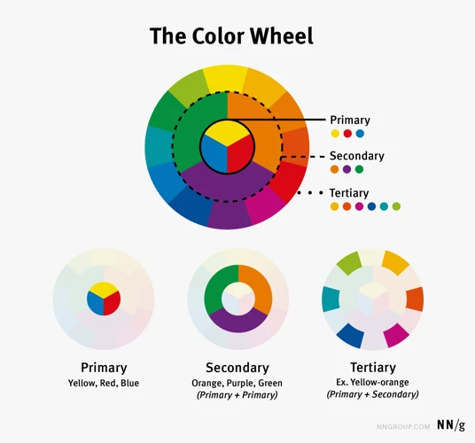
To help you choose the right color combinations, you may find it helpful to use a color wheel. This visual tool shows how different colors relate to each other, and can help you identify complementary or analogous colors.
Here is a simple color matching table that can help you choose the right trim color based on your siding color:
| Siding Color | Trim Color Options |
|---|---|
| Warm beige | Creamy white, light tan |
| Cool gray | White, light gray |
| Earthy brown | Deep espresso, medium tan |
| Blue-green | Ivory, soft beige |
Remember, matching trim and siding doesn’t necessarily mean using the exact same color for both. Rather, it is about choosing a trim color that complements and enhances the overall look of your home exterior. By using these tips and tools, you can select the perfect trim color to achieve a cohesive and aesthetically pleasing result.
Creating Contrast with Trim and Siding
When it comes to choosing the right colors for your home’s exterior, creating contrast between the trim and siding can add depth and visual interest. Contrast can be achieved through differences in hue, value, or saturation. Here are some tips for creating contrast with trim and siding:
- Light/Dark Contrast: Choosing a light color for the siding and a dark color for the trim can create a classic, high-contrast look. On the other hand, using a dark color for the siding and a lighter color for the trim can create a more contemporary and subdued feel.
- Contrasting Hues: Combining complementary colors, such as blue and orange or green and red, can create a bold, eye-catching contrast. For a more subtle contrast, consider using analogous colors, which are next to each other on the color wheel, like yellow and green or blue and purple.
- Contrasting Saturation: High-saturation colors, or colors that are very intense, can create a striking, high-contrast look when paired with lower-saturation colors. For example, a bright red door paired with muted gray siding and trim can draw attention to the entrance of the home.
Remember, it’s important to strike a balance between contrast and cohesion in your color choices. While creating contrast can add visual interest, using too many contrasting colors can make the exterior of the home appear disjointed and chaotic. It’s important to consider the overall style and architecture of your home when choosing colors for the trim and siding.
Accentuating Home Features with Trim Colors
When it comes to accentuating home features with trim colors, there are a few key things to keep in mind. Here are some considerations to make when selecting colors to enhance your home’s features:
- Highlighting – Selecting a trim color that is lighter or darker than the siding color can create a contrast that draws attention to specific areas of the home, such as windows or doors. For example, if you have a light-colored siding, a darker trim color can create contrast and draw attention to the windows and doors.
- Complementing – If you have certain features on your home that you want to highlight, such as unique architectural details or a specific color in your landscaping, choose a trim color that complements these elements. For example, if you have red flowers in your landscaping, consider a trim color with red undertones to tie the whole look together.
- Emphasizing – If you have a standout feature on your home that you want to emphasize, such as a unique door or shutters, consider using a bold accent color for the trim. This will draw the eye to the area and make the feature pop.
- Matching – If you have a more subtle feature that you want to blend in with the rest of the home’s design, choose a trim color that matches the color of the feature. For example, if you have a small side entrance that you want to blend in with the siding, choose a trim color that matches the siding color to create a cohesive look.
By utilizing these techniques and selecting the right trim colors, you can accentuate your home’s features and create a look that is both visually appealing and cohesive. Remember to consider the emotions and meanings behind colors when making your selections to ensure that the final result reflects your personal style and the desired mood of your home.
Choosing the Right Accent Colors
When it comes to adding personality and style to your home exterior, choosing the right accent colors can make a huge impact. Whether you’re aiming for a bold and vibrant look or a more muted and subtle design, accent colors can help you achieve your desired aesthetic. However, with so many colors to choose from, it can be overwhelming to decide which ones will work best for your home. Fear not! In this section, we’ll explore the ins and outs of choosing the perfect accent colors for your home.
Effectively Using Accent Colors
A key aspect of the psychology of colors is the effective use of accent colors. Accent colors can draw attention to specific areas of your home’s exterior and create a cohesive look for the overall design. When choosing accent colors, it’s important to consider the emotions and meanings associated with different hues, as well as how they fit with your home’s style.
One effective way to use accent colors is to use complementary colors. This means selecting colors that are opposite each other on the color wheel. For example, if your home’s siding is a cool blue, a warm yellow accent color can create a striking contrast. This technique can be particularly effective for window shutters and doors.
Another way to use accent colors is to select shades that match the dominant color of your home’s exterior. This creates a cohesive look that ties all elements together. For example, if your home is primarily painted in a warm beige tone, choosing a darker shade of beige for the front door can add depth and cohesion to the overall design.
Monochromatic accent colors can also be effective. This approach involves choosing accent colors that are variations of the dominant color on your home’s exterior. For example, if your home is painted in a pale green tone, a darker shade of green can be used as an accent color for trim or shutters. This creates a subtle and unified look.
It’s important to remember that color is a powerful tool, and the wrong selection can have a negative impact on your home’s exterior design. However, with a basic understanding of color psychology and some careful consideration, you can use accent colors to create a beautiful and cohesive look for your home.
| Effective Techniques for Accent Colors | Examples |
|---|---|
| Complementary colors | Using warm yellow accents with cool blue siding |
| Matching dominant color | Choosing a darker shade of beige for the front door on a warm beige-painted home |
| Monochromatic colors | Using a darker shade of green for trim on a pale green-painted home |
Choosing Accent Colors that Complement Your Home Style
When choosing accent colors for your home exterior, it’s important to consider the overall style of your home. You want to select colors that complement rather than clash with the existing color palette and architectural features. Here’s a breakdown of some popular home styles and the accent colors that work well with them:
| Home Style | Accent Colors |
|---|---|
| Traditional | Classic combinations like black and white, beige and gold, or navy and white work well for traditional homes. Burgundy and forest green also make good accent colors. |
| Modern | For a modern home, consider bold accent colors like bright red, royal blue, or lime green. You can also use neutral colors like gray or black to create a sleek and sophisticated look. |
| Craftsman | Earthy tones like olive green, rust, and mustard yellow complement the warm wood features often found on Craftsman-style homes. You can also add pops of brighter colors like turquoise or deep blue for contrast. |
| Colonial | Deep shades of blue, green, or red are popular choices for Colonial homes. You can also opt for more neutral accent colors like beige or creamy white to highlight the home’s stately appearance. |
| Cottage | Soft pastel colors like baby blue, blush pink, or light yellow complement the quaint and cozy look of a cottage-style home. You can also add darker accent colors like navy or olive green for a bit of contrast. |
Remember to consider the existing colors on your home’s exterior when choosing accent colors. You can also look to your surrounding environment or decorative elements like shutters or doors for inspiration. With a little planning and attention to detail, you can choose the perfect accent colors to bring out the best in your home’s style.
Final Thoughts
After learning about the psychology behind colors and how they can affect our mood and emotions, it’s time to make informed decisions when choosing the right trim and accent colors for your home exterior. Keep in mind that the color scheme you choose can make a significant impact on the overall appearance and feel of your home, so it’s essential to take your time and carefully consider your options.
Take Inspiration from Other Houses: It’s always a great idea to take inspiration from other houses in your neighborhood or online to see what color schemes are popular and what works well. You can also drive around your area to see which colors and combinations catch your eye.
Consider Your Home’s Architecture: While certain color schemes may be trendy or fashionable, it’s essential to choose a color scheme that complements your home’s style and architecture. For example, a traditional style home may look better with warm, neutral colors, while a contemporary home may look better with cool, bold colors.
Think about Curb Appeal: Your home’s curb appeal is essential, especially if you plan to sell your home in the future. The right color scheme can increase your home’s value and make it stand out in a positive way.
Don’t Be Afraid to Mix and Match: If you’re feeling adventurous and want to try out a unique color scheme, don’t be afraid to mix and match different colors and shades. Just make sure they work well together and make sense with the overall style of your home.
Get the Opinions of Others: If you’re having a hard time choosing the right trim and accent colors, consider getting the opinions of your family, friends, or a professional home decorator. They can offer you valuable insights and help you make the right decision.
Choosing the right trim and accent colors for your home’s exterior can seem overwhelming, but by taking your time, considering your home’s architecture, and getting inspiration from other houses, you can make the right decision that enhances your home’s curb appeal and makes it stand out in a positive way.
Frequently Asked Questions
What are the most popular trim colors for home exteriors?
The most popular trim colors are white, cream, and black.
Can I use more than one trim color on my home?
Yes, you can use multiple trim colors, but it’s important to make sure they complement each other and the overall look of your home.
How can I use color to make my home look bigger?
Using light colors on the trim and siding can make your home look bigger and brighter. Avoid using dark colors, which can have a shrinking effect.
Can the color of my home’s trim affect its resale value?
Yes, the right choice of trim color can increase your home’s curb appeal and resale value. Stick to classic colors that will appeal to a wide range of buyers.
What’s the best way to choose an accent color?
Look at the color wheel and choose a color that’s opposite the dominant color of your home’s exterior. This will create a complementary color scheme that stands out.
How can I ensure that my accent color doesn’t clash with the rest of my home?
Use an online color visualizer tool to try out different color combinations before committing to one. You can also consult with a professional designer for expert advice.
What’s the psychology behind warm colors?
Warm colors like red, yellow, and orange evoke feelings of energy, happiness, and excitement. They can be stimulating and attention-grabbing, making them a good choice for accent colors.
What’s the difference between a monochromatic and a complementary color scheme?
A monochromatic color scheme uses different shades of the same color, while a complementary color scheme uses opposite hues on the color wheel. Complementary schemes tend to be bolder and more striking.
Can I use different trim colors on different parts of my home?
Yes, but it’s important to consider how these colors will interact and whether they will create a cohesive overall look. Using too many different colors can make your home look busy and cluttered.
What’s the best way to choose a color palette for a historic home?
Consult with a professional designer or historic preservation expert to ensure that your color choices are in line with the period and style of your home. Stick to classic and traditional colors to maintain its authenticity.