Introduction
Color is an integral part of human experience, impacting our emotions, perceptions, and even our physiology. Warm and cool colors, in particular, have a significant influence on our temperature perception, making us feel either warmer or cooler. Understanding how these colors operate on a physical and psychological level can help us better harness their power when it comes to art, design, and even mood regulation. In this article, we will dive into the science behind warm and cool colors and explore the ways in which they impact our temperature perception and emotions.
Defining Warm and Cool Colors
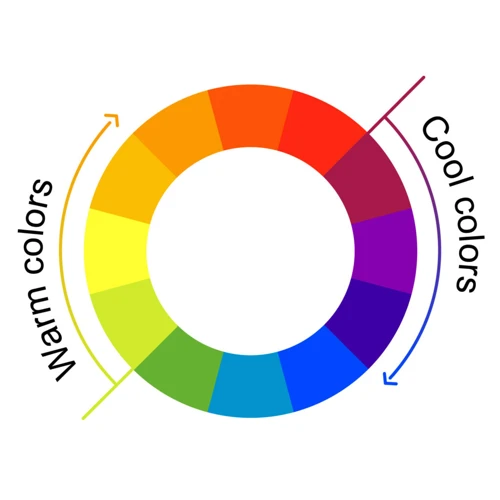
The concept of warm and cool colors is an essential aspect of color theory. Every color can be classified as either warm or cool depending on its underlying hues. Warm colors are hues that evoke feelings of warmth, energy, and vibrancy, while cool colors tend to have calming and soothing effects, creating a sense of relaxation and tranquility. The following table provides some examples of warm and cool colors:
| Warm Colors | Cool Colors |
|---|---|
| Red | Blue |
| Orange | Green |
| Yellow | Purple |
Warm colors tend to be associated with heat, warmth, and passion, whereas cool colors create a sense of calm, relaxation, and tranquility. It’s essential to understand the differences between warm and cool colors, as using them together or separately can dramatically impact the mood and ambiance of a room or a piece of art. Incorporating both warm and cool colors is a great way to create a visually cohesive color palette that can help establish the desired ambiance in a space.
The Physical Impact of Warm and Cool Colors
As we explore the impact of colors on temperature perception, it’s important to understand the physical implications of warm and cool colors. By analyzing the wavelengths of different colors and how they interact with light, we can uncover how warm and cool colors alter our perception of temperature. This understanding sets the foundation for examining the psychological effects of color, which we’ll explore next. If you want to learn more about the psychology of warm colors, check out our article on Psychology of Warm Colors. Additionally, for tips on incorporating cool colors into your home ambiance, take a look at our article on Cool Colors for Home Ambiance.
How Warm Colors Affect Temperature Perception
When it comes to temperature perception, warm colors such as red, yellow and orange create a feeling of coziness and warmth. This is because they are reminiscent of things such as sunshine, fire and warmth. Warm colors also have the ability to stimulate the body and mind, making them perfect for rooms where people want to feel energized and lively. An interesting fact about warm colors is that they can actually make people feel physically warmer, even if the temperature in the room remains the same. In contrast, cool colors like blue, green and purple tend to have a cooling effect on the body and can help to create a sense of relaxation and calmness. They are often associated with things such as water, sky and nature.
To better understand how colors affect our perception of temperature, we can look at the science behind it. According to color theory, bright colors tend to advance towards the viewer, while dull colors recede. This means that warm colors make a space feel smaller and more intimate, while cool colors make it feel larger and more spacious. For example, if you have a small bedroom, painting the walls a warm color like red or orange can create a cozy and intimate feeling, while painting them a cool color like blue can make the room feel more open and airy.
The use of warm and cool colors can also affect the perception of temperature in a room. One common misconception is that warm colors are always best for creating a warm atmosphere, but this is not necessarily true. In fact, incorporating cool colors into a warm room can help to balance the temperature perception and create a more comfortable and visually appealing space. For example, if you have a warm living room with orange walls, adding cool accents like a blue throw pillow or green plant can help to create a more balanced and cohesive look.
The use of warm and cool colors has a significant impact on temperature perception in a space. Warm colors create a feeling of coziness and warmth, while cool colors have a cooling effect and can create a sense of relaxation. It’s important to consider the science behind color theory when choosing colors for a room and to experiment with different color palettes to find the perfect balance. Whether you incorporate warm and cool colors in the same space or use them to create distinct areas, the possibilities are endless.
How Cool Colors Affect Temperature Perception
Cool colors are known to have a calming effect on people, which is why they are often used in spaces designed for relaxation, such as bedrooms. Blue, green, and purple are the most commonly used cool colors. According to color psychology, blue is associated with feelings of calmness and serenity, while green is associated with nature and tranquility. Purple, on the other hand, is associated with creativity and luxury.
Blue, one of the most popular cool colors, is often used in interiors to give a feeling of a cool breeze. This calming color is known to lower blood pressure and slow respiration and heart rate. The psychological effects of blue include feelings of calmness, relaxation, and serenity. Blue is an excellent choice for a bedroom as it provides a soothing effect and helps people to fall asleep faster.
Green is another popular cool color that can help create a relaxing atmosphere in a room. It is associated with nature and is often used in interiors to bring the outdoors in. Green has calming effects, reduces eye strain, and is restful to the eye. It also promotes a sense of safety and tranquility, making it an excellent choice for a bedroom.
Purple is a cool color that is often associated with luxury and creativity. This color combines the calming effects of blue and the soothing effects of red. It is an excellent choice for a bedroom or a creative workspace as it promotes a sense of calmness while stimulating creativity.
It’s important to note that while cool colors tend to have a calming effect, they can also create a feeling of detachment and even sadness. It’s essential to incorporate warm colors or neutral accents to create a visually cohesive space. Neutral wall accents or warm living room colors are great ways to use cool colors without creating a depressing atmosphere. A visually cohesive color palette that incorporates warm and cool colors brings a balance and harmony into a space. For instance, when choosing paint colors, it may be useful to consider warm versus cool exterior paint colors, and making your decision based on the specific emotional tone that you’d like to evoke in your home.
The Emotional Impact of Warm and Cool Colors
When it comes to colors, they not only have a physical impact on our temperature perception but also an emotional impact. Understanding the emotional impact of colors is essential in choosing the right colors, creating a mood for a room, or even planning a whole house color scheme. The psychology of warm and cool colors can help in making informed color choices that evoke the desired emotions in a space. Whether it’s incorporating warm and cool colors into a room, deciding between warm and cool exterior paint, or creating a visually cohesive home color palette, the emotional impact of colors is a crucial factor to consider.
The Psychology of Warm Colors
Warm colors are often associated with comfort, energy, and excitement. Understanding the psychology of warm colors can be beneficial when creating artwork or designing a living space. Here are some key points to consider:
1. Warm colors can increase energy levels: Warm color shades like red, orange, and yellow can stimulate the brain, increase heart rate, and even boost blood pressure. That’s why these colors are often used in spaces where high energy is desired, such as gyms, dance studios, or other activity areas.
2. Warm colors promote comfort and coziness: Warm colors can create a sense of comfort and ease in a space. When used in areas like living rooms or bedrooms, these colors can create a cozy atmosphere that invites relaxation and calmness.
3. Warm colors can evoke strong emotions: Warm colors have been known to evoke strong emotions like passion, joy, and even anger. This is why they are often used in advertising to grab the viewer’s attention and create an emotional response.
4. Warm colors can increase appetite: It is believed that warm colors can stimulate the appetite, which is why they are often used in restaurants or kitchens. Colors like red and orange can make you feel hungry and increase your desire to eat.
5. Warm colors can create a sense of intimacy: Warm colors can create a sense of intimacy and closeness, making them a great choice for bedroom spaces. Soft shades of orange or peach can create a romantic atmosphere, while deeper shades of red or burgundy can add a sense of sensuality and passion to the space.
Understanding the psychology of warm colors can help you choose the right colors for your living space or artwork. If you want to incorporate warm and cool colors in a room, you can check out tips on how to create a visually cohesive color palette. For warm living room color ideas, you can take a look at this article. If you want to explore cool color schemes for a bedroom, check out this article. And if you’re interested in learning more about warm versus cool exterior paint, you can read this article.
The Psychology of Cool Colors
Cool colors like blue, green, and purple are often associated with calmness, serenity, and relaxation. These colors have the ability to slow down the body’s metabolism and heart rate, creating a sense of tranquility and peacefulness. They can also have a cooling effect on the body, which is why they are often used to decorate rooms in hotter climates.
Studies have also shown that cool colors can enhance concentration and productivity. They can create a feeling of order and stability, which can be helpful in work environments or other areas where clarity of thought is important.
In terms of emotions, cool colors are often associated with sadness or melancholy. This is because they can give a feeling of distance or detachment. However, when used in the right way, cool colors can also create a sense of sophistication and elegance.
When it comes to interior design, cool colors can be used to create a relaxing and soothing atmosphere. They can be paired with complementary colors such as grey or white to enhance their calming effect. Neutral wall accents can also be used to create a visually cohesive look.
Cool colors have a distinctly different emotional and physical impact compared to warm colors. While they may not be as stimulating or energizing, they have a unique ability to calm and soothe both body and mind. When used in the right way, they can create a sense of order and tranquility in any space.
Connecting Color and Temperature Perception in Painting
As we discovered earlier, warm and cool colors can have a significant impact on our physical and emotional responses. But did you know that understanding these color groups could help you create a more visually compelling painting? By connecting color and temperature perception in painting, you can craft a piece that evokes a specific mood or atmosphere. In this section of the article, we will explore the ways in which warm and cool colors can influence a painting’s overall composition and offer tips on using warm and cool color palettes to create a visually cohesive piece. So, let’s dive in and explore the art of color theory!
Using Warm and Cool Color Palettes
Using Warm and Cool Color Palettes
An artist’s color palette can have a significant impact on the temperature perception of their artwork. By using either warm or cool colors, they can create a psychological and physical response from their audience. Choosing the right palette can enhance the emotional impact of the artwork.
A warm color palette is ideal for conveying a sense of warmth and energy, as well as creating drama and intensity. Warm colors such as red, orange, and yellow are great for depicting heat, fire, and the sun. For example, an artist may use a warm color palette to depict a sunset, using orange and yellow tones to create the image of a blazing sun sinking into the horizon. Another example of a warm color palette being used would be to depict a roaring fire or warm candlelight.
On the other hand, a cool color palette can create a calm, soothing effect on the viewer. Cool colors such as green, blue, and purple are often used to depict water, sky, and nature. For example, an artist may use a cool color palette to depict a wintery landscape, using cool blues to create the scene of a cold, snowy day.
It is important to use both warm and cool colors appropriately, as each brings its unique effect to the composition. An artist can use warm colors to draw attention to specific areas of their canvas, using them as accent colors. Cool colors, on the other hand, can help to create a visually calming effect and can be used to depict background elements or create a sense of depth.
To create a visually cohesive artwork, an artist should choose their color palette carefully. It is important to consider the relationship between colors and the feeling or emotion they evoke. An artist’s color palette should complement the message they are trying to convey through their artwork. By choosing the right color palette, an artist can enhance the emotional impact of their art.
The use of warm and cool color palettes is essential for creating impactful artwork that conveys different emotions and effects. The right color palette can create a sense of warmth or calmness and allow artists to express their vision effectively. By considering the impact of both warm and cool colors, artists can create visually cohesive and powerful art.
Choosing Colors for Different Seasons
Seasons play a crucial role not only in our daily life but also in the world of painting. Using different colors for different seasons is a great way to set the mood and add depth to your artwork. Every season has its unique characteristics that can be reflected using the appropriate colors.
Spring: Spring is a season known for its rebirth and rejuvenation. The ideal colors for this season are light and pastel shades, such as baby pink, soft green, pale yellow, and sky blue. These colors evoke a sense of freshness, lightness, and youth. Spring colors also symbolize growth and new beginnings. Hence, using warm and cool colors in balance can make your artwork stand out.
Summer: Summer is a season of heat and warmth, so it is best to use cool colors that create a feeling of relaxation and calmness. Blues and greens are the ideal colors for this season, as they represent the ocean, sky, and forests. You can also use warm colors such as yellow, orange, and red to add a touch of brightness and energy. These colors can evoke feelings of happiness, excitement, and vibrancy.
Fall: Fall is a season of change and transformation. The colors that are typically associated with this season are warm and earthy tones, such as rust orange, maroon, deep red, olive green, and mustard yellow. These colors evoke a sense of coziness and comfort, as well as a feeling of maturity and wisdom. Using these colors in your artwork can create a sense of depth and richness that is perfect for fall.
Winter: Winter is a season of coldness, snow, and darkness. The ideal colors for this season are shades of blue and purple, which represent frost and ice. You can also use white, gray, and black to create a sense of stillness and quietness. You can add a touch of warmth to your artwork by using warm colors such as red and orange in small amounts. These colors can evoke a sense of passion and energy that contrasts with the coldness of the winter season.
Choosing the right color palette for your artwork can be challenging. However, by understanding the impact of different colors on our psyche and temperature perception, you can make informed decisions on which colors to use in your artwork. For more information on how to create visually cohesive color palettes for your home or artwork, you can check out our guide on Visually Cohesive Home Color Palettes.
Conclusion
In conclusion, the science behind warm and cool colors and their impact on temperature perception is fascinating. The physical impact of warm and cool colors on temperature perception is rooted in our biology and the way our brains perceive colors. Warm colors stimulate our bodies and make us feel warmer, while cool colors have the opposite effect.
Furthermore, the emotional impact of warm and cool colors is also significant. Warm colors tend to evoke feelings of energy, excitement, and passion, while cool colors are often associated with calmness, relaxation, and tranquility. Understanding the psychology behind these colors can help us create different moods and emotions in our surroundings.
In painting, the connection between color and temperature perception is especially important. By using warm or cool color palettes, artists can convey a sense of warmth or coolness in their paintings. Additionally, choosing colors that are appropriate for different seasons can help enhance the mood and atmosphere of their work.
Overall, the science behind our perception of warm and cool colors is a complex topic that impacts our lives in many ways. By understanding this science, we can become more aware of how colors influence our perception of temperature and emotions. This knowledge can be used to create powerful and effective designs, whether in art, advertising, or everyday life.
Frequently Asked Questions
What are some examples of warm colors?
Some common warm colors are red, orange, and yellow.
What are some examples of cool colors?
Some common cool colors are blue, green, and purple.
How do warm colors impact our perception of temperature?
Warm colors can make us feel warmer and cause us to perceive higher temperatures.
How do cool colors impact our perception of temperature?
Cool colors can make us feel cooler and cause us to perceive lower temperatures.
What emotions are commonly associated with warm colors?
Warm colors are often associated with emotions like passion, energy, and excitement.
What emotions are commonly associated with cool colors?
Cool colors are often associated with emotions like calmness, tranquility, and stability.
How can warm and cool colors be used together in artwork?
Warm and cool colors can be balanced to create contrast and depth in artwork, while also evoking different emotional responses.
What are some examples of warm and cool color palettes?
An example of a warm color palette might include red, orange, and yellow, while a cool color palette might include blue, purple, and green.
How can color choice be used to represent different seasons?
Colors like warm oranges and yellows might be used to represent the warmth of summer, while cool blues and greens might be used to represent the chill of winter.
What is the significance of color in branding and advertising?
Color can be used strategically in branding and advertising to evoke certain emotions and perceptions in consumers, ultimately influencing their purchasing decisions.