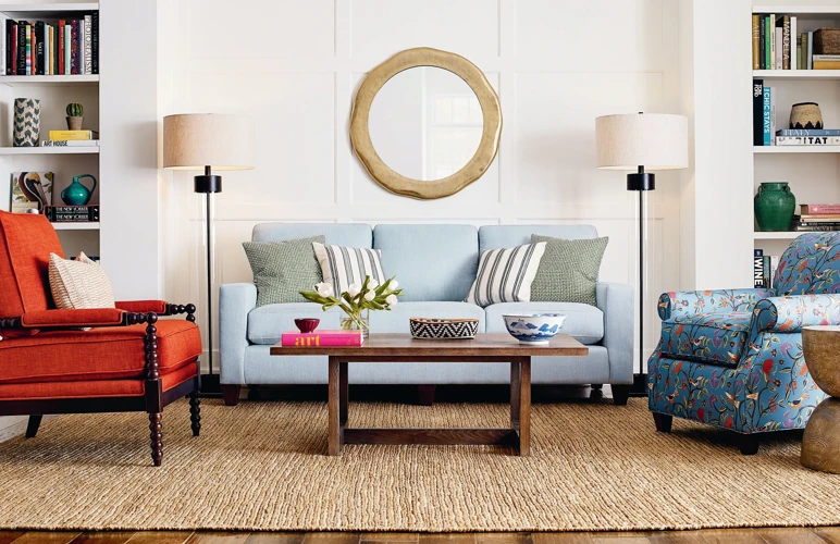
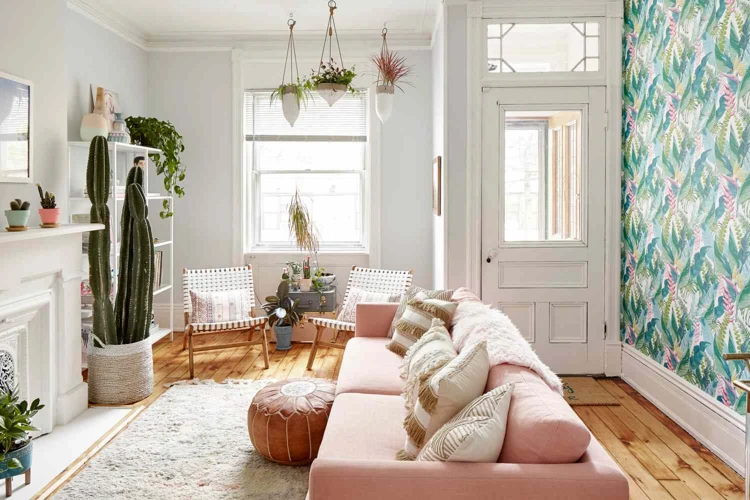
When it comes to transforming your living space, the power of a cohesive color palette cannot be overstated. The principles of color theory in home decor offer a strategic approach to selecting shades that enhance the mood and aesthetics of your home. By digging into the basics of color harmony, you can craft a visually appealing environment that reflects your personal style.
Color Wheel Fundamentals
The color wheel is a vital tool in developing a balanced home color palette. It visually represents the relationship between colors and serves as a guide for creating combinations that are pleasing to the eye. To use the color wheel effectively in choosing home colors, consider complementary (opposite on the wheel), analogous (next to each other), and triadic (evenly spaced) color schemes for dynamic interior color coordination.
The Role of Color Temperature in Your Home
Color temperature significantly impacts the atmosphere of a room. Warm colors, such as reds, oranges, and yellows, evoke a sense of coziness and energy, while cool colors like blues, greens, and purples suggest calmness and serenity. Striking the right balance between warm and cool shades is a cornerstone of harmonious home colors, establishing a desired emotional response from each space.
Color Intensity and Mood
Intensity, or the brightness of a color, also affects the mood of a room. Bold, saturated colors can invigorate a space, whereas muted tones promote relaxation. Understanding this aspect of color theory in home decor is crucial for setting the right tone in your living environment.
Designing Your Cohesive Color Palette
Creating an interior design color palette that resonates with your home’s character requires careful consideration and planning. A well-designed palette not only adds visual interest but also creates a sense of unity throughout your space.
Choosing Home Colors: Where to Begin
- Consider the function and mood of each room
- Take inventory of your existing furniture and decor
- Draw inspiration from artwork, textiles, or nature
Color Palette Design: Establishing a Harmonious Foundation
Begin with a neutral base for flexibility and layer in color to add depth and personality. This approach to color palette design ensures that your foundation is versatile, allowing for easy updates or changes in the future.
Interior Color Coordination: Balancing Warm and Cool Tones
Maintaining a visual balance in your home means mixing warm and cool tones effectively. Interior color coordination often involves offsetting a predominantly warm palette with a few cool accents or vice versa, achieving a look that is both inviting and refreshing.
Applying Home Color Schemes Throughout Your Space
Once you have selected your home color schemes, the next step is to apply them thoughtfully throughout your living space. Consistency in color application is key to achieving a cohesive look that flows naturally from room to room.
Creating Flow with Home Color Schemes
Achieving a seamless transition throughout your home can be accomplished by repeating key colors in different ways. For instance, the main hue from your living room can serve as an accent in the dining room, weaving a continuous thread that ties the spaces together.
Matching Colors for Home: Transitioning Between Spaces
Matching colors for home doesn’t mean every room should look the same. Instead, it’s about creating a sense of harmony. Use variations in shade and tint to differentiate spaces while maintaining a connection between them.
Interior Design Color Palette for Shared and Private Areas
In shared areas, opt for colors that foster a welcoming atmosphere. For private spaces like bedrooms, consider personal preference and the desired mood when selecting your interior design color palette.
Achieving a Balanced Home Color Palette
A balanced home color palette is soothing to the eye and easy to live with. It’s about finding the right mix of colors that complements the overall design of your home while also reflecting your unique style.
The 60-30-10 Rule in Color Palette Creation
This classic decorating principle suggests using 60% of a dominant color, 30% secondary color, and 10% accent color to balance the visual weight in each room. This rule simplifies the process of creating a cohesive color palette and can be applied to walls, furniture, and accessories.
Harmonious Home Colors: Utilizing Textiles and Accessories
Textiles and accessories are your allies in reinforcing harmonious home colors. Curtains, rugs, cushions, and art pieces can all introduce color and pattern to a room without overwhelming the senses.
Maintaining Cohesion with Neutral Bases and Accent Hues
Starting with a neutral base allows for versatility, while accent hues bring life and personality to your decor. This strategy is key in maintaining cohesion and ensuring your home feels balanced and harmonious.
Advanced Techniques for a Cohesive Home Environment
For those looking to elevate their home decor, advanced techniques in color application can add sophistication and depth to your living space.
Contrasting and Complementary Colors for Dimension
Introducing contrasting or complementary colors can create visual interest and dimension within a room. Pairing colors with opposite characteristics can highlight architectural features or draw attention to focal points.
Using Patterns and Textures to Enhance Your Color Scheme
Patterns and textures are excellent ways to enrich your color scheme. They add complexity and tactile elements that can enhance the overall sensory experience of a room.
Strategic Use of Greenery and Natural Elements
Incorporating greenery and natural elements can bring an organic touch to your decor. Plants and natural materials often introduce subtle color variations that can complement and soften your chosen palette.
Tips for Choosing and Implementing Your Home Color Palette
Selecting and implementing your home color palette is a creative and personal process. These tips can guide you toward achieving a look that is both timeless and tailored to your preferences.
Consider Your Home’s Architecture and Natural Light
The architecture of your home and the natural light it receives should influence your color choices. Light can dramatically alter how a color appears, so it’s important to consider the direction of windows and the quality of light when choosing home colors.
Choosing Colors with Timeless Appeal
Selecting colors that have a timeless quality ensures your decor remains stylish and adaptable over the years. Neutrals and muted tones often have this enduring appeal, serving as a reliable base for your color palette design.
Testing Your Palette: Samples and Swatches
Before fully committing to your chosen palette, test it with samples and swatches in various lights and settings. This will give you a realistic preview of how the colors will interact with each other and with the space itself.
Final Touches: Refining Your Home’s Color Story
The final touches to your home’s color story are what truly personalize the space. These finishing details can make a significant impact on the overall look and feel of your home.
Detail-Oriented Decorating: Small Changes, Big Impact
Attention to detail in decorating can transform a nice space into an extraordinary one. Small elements like trim, hardware, and fixtures in accent colors contribute to a more polished and cohesive look.
Bold Statements: When to Commit to Intense Colors
While neutrals and muted tones play it safe, sometimes a room calls for a bold statement. Intense colors can be used effectively to create a dramatic impact, especially when they are part of a well-thought-out cohesive color palette.
Creating a visually cohesive color palette for your home can be both exciting and daunting. Whether you’re looking for the perfect color scheme for your home’s exterior or trying to create harmony within your interior spaces, understanding color theory and practical painting tips is key. For a comprehensive guide on achieving a cohesive color scheme for your home’s exterior, check out our article on achieving a cohesive color scheme for your home exterior. To delve deeper into creating a harmonious color palette, especially using analogous color combinations, read our insights in the article about harmonious color palettes with analogous combinations. And for those of you ready to pick up the brush, don’t miss our expert quality interior painting tips to ensure a flawless finish. Discover how to make your home a reflection of your personal style with colors that flow beautifully from room to room.
Monochromatic Schemes: A Study in Single-Hue Sophistication
A monochromatic scheme, built around variations of a single hue, can be incredibly sophisticated. By adjusting saturation and brightness, you can add depth and interest within a unified color family, culminating in a refined and elegant aesthetic.
A well-executed home color scheme is a testament to the power of color theory in home decor. With these insights and tips, you’re well on your way to creating a visually cohesive and harmonious environment that you’ll love for years to come.


