When it comes to designing the interior of your home, color is a crucial element that can make or break the overall look and feel of the space. But with so many colors to choose from, it can be overwhelming to narrow down your options. One color palette that has gained popularity in recent years is neutral colors. These colors are often associated with simplicity and a sense of calm, but what is it about neutral colors that make them so appealing in interior design? In this article, we’ll delve into the psychology behind neutral colors and explore how they can impact the mood of your home. We’ll also discuss the benefits and downsides of using neutral colors in interior design, share some tips on how to incorporate these colors into your home decor, and showcase some examples of neutral color home decor to inspire you.
The Basics of Neutral Colors
When it comes to designing the interior of your home, one of the most important factors to consider is color. Color has a huge impact on the overall mood and aesthetic of your space, and it’s important to choose the right colors to achieve the desired effect. One category of colors that is popular in interior design is neutral colors. Neutral colors can create a sense of balance and tranquility in a space, but they can also be tricky to work with. In this section, we’ll delve into the basics of neutral colors so you can understand how to incorporate them into your home design. For more insight into the psychology of color in interior design, be sure to check out our other articles, such as “Calming, Cool Colors in Interior Design” or “Using Bold Colors in Small Spaces.”
What Are Neutral Colors?
Neutral colors are hues without any strong chromaticity, such as blacks, whites, grays, and browns. Neutral colors do not belong to any particular color family, and they are often used as an unobtrusive background for other, more visually striking colors. Black and white are arguably the most common neutral colors, as they are often used in combination with bright colors to create a high-contrast look. Unlike warm colors, such as red, orange, and yellow, which are often viewed as vibrant and energetic, neutrals can create a calming, soothing effect on the viewer. Unlike cool colors, such as blue, green, and purple, which can often have a sedative effect, neutrals feel more balanced and stable to most viewers.
There are many practical reasons why interior designers and homeowners alike often turn to neutral colors in their décor. Neutrals are versatile and easy to incorporate into existing schemes, and they can help to create a cohesive look throughout a space. One key advantage neutral colors have is their ability to serve as a backdrop for other color accents, such as painted accent walls or colorful furniture. Neutral colors also tend to be low-maintenance and easy to clean, which is important for many busy households. For these reasons and more, neutrals have become an essential component of modern interior design.
If you want to learn more about the impact of colors on mood and interior design, there are many helpful articles available online. For example, you can read about how warm colors can impact mood in a room or how to choose the right paint color for a home office. There are also articles that cover topics like the psychology of relaxing bedroom colors or how color can influence appetite in the kitchen and dining room. Additionally, if you’re curious about how to achieve a cohesive color scheme for your home’s exterior or how to use color to highlight specific architectural features, there are plenty of resources that can help.
Examples of Popular Neutral Colors
Neutral colors are an excellent base for any interior design project. They can make a space feel calm, sophisticated, and timeless. Some popular neutral colors include:
- Beige: This warm neutral color creates a cozy and inviting feeling in a room. Beige pairs well with other warm tones, like yellow and orange, and can also be used as a backdrop for brighter accent colors.
- Gray: A neutral color that has gained popularity in recent years is gray. It can create a cool and calming effect in a room, and pairs well with other cool tones like blue and green. Gray can also act as a backdrop for bolder accent colors.
- White: A classic neutral color, white can create a bright and airy feeling in a room. It pairs well with any color, making it a versatile choice for any design style. White can also help small rooms feel larger and more open.
- Black: Although not typically thought of as a neutral color, black can create a dramatic and sophisticated effect in a space. It pairs well with almost any color, making it a great accent color. However, too much black can make a room feel dark and small, so it may be best to use it sparingly.
Each of these neutral colors has its own unique qualities and can create a specific mood in a room. It’s essential to choose the right neutral color for your space based on your design goals and the mood you want to create. For more information on color psychology and its impacts on mood, check out our article on warm colors and their mood impact. If you’re struggling to choose a paint color for your home office, our article on choosing paint colors for your home office may provide some helpful tips. For tips on creating a relaxing bedroom, check out our article on bedroom color psychology. And if you’re curious about how color can influence appetite in the kitchen and dining room, our article on the influence of color on appetite in the kitchen and dining room may be of interest. Once you’ve chosen your neutral color, consider our article on achieving a cohesive color scheme for your home exterior to tie your design together. And if you’re looking for ways to add color to your space without overwhelming it, consider our article on the power of accent walls in interior design.
The Psychology of Neutral Colors
Neutral colors are often seen as an easy choice for interior design, but they can have a much greater impact on a room than one might expect. Understanding the psychology of neutral colors can help you make informed decisions about the atmosphere you want to create in your home. From affecting our moods to influencing our perceptions of space, the power of neutral colors is not to be underestimated. So if you’re curious about the impact of these subtle shades, read on to discover their hidden potential. And if you’re interested in adding a pop of color to your neutral space, consider the power of accent walls in interior design.
How Neutral Colors Affect Mood
One of the most interesting aspects of using neutral colors in interior design is the way they can affect mood. Although often considered “bland” or “boring,” neutral colors can actually have a profound effect on emotions and contribute to an overall sense of well-being in a space.
Neutral colors can be calming: One of the primary ways neutral colors affect mood is by creating a sense of calmness or relaxation. This is particularly true of shades such as beige, taupe, and light gray, which have a soothing, spa-like effect.
Neutral colors can make a space feel larger: Because neutral colors reflect more light than darker shades, they can help a room feel more spacious and open. When combined with natural light and minimalist design, neutral colors can give the impression of a much larger space.
Neutral colors can provide a sense of balance: Neutral colors work well in interior design because they can provide a sense of balance and harmony to a room. By choosing a neutral color palette, you can create a cohesive and unified look that is more visually pleasing.
Neutral colors can be versatile: Neutral colors are extremely versatile and can be used in a wide variety of design styles, from traditional to contemporary. They are also easy to pair with other colors or patterns, making them a great choice for anyone who likes to switch up décor frequently.
However, it’s important to note that using neutral colors exclusively can have downsides as well. Such as, a room may feel too sterile or lacking in personality. It is important to balance neutral colors with other design elements to create an inviting and comfortable space.
The psychological effects of neutral colors in interior design are numerous and unique to each space. It’s up to the individual to determine what works best for their personal style and preferences. If you are interested in learning more about interior design techniques, check out our article on the /power-of-accent-walls-in-interior-design/.
Benefits of Neutral Colors in Interior Design
Neutral colors are a popular choice in interior design due to their various benefits. Let’s take a look at some of the most significant benefits of incorporating neutral colors into your home decor:
| Benefits of Neutral Colors in Interior Design |
|---|
| Flexibility: One of the major benefits of neutral colors is their versatility. Neutral colors are simple, understated, and go with everything. They can be used as the main color scheme of a room or as a complementary color to bolder hues. Neutral colors can also be used to create a backdrop for art, furniture, and decor. |
| Timelessness: Neutral colors are a classic choice for interior design. They are not trendy or faddish and can withstand the test of time. Neutral colors are elegant, understated, and never go out of style. They are a perfect choice for those who want a timeless, sophisticated look in their homes. |
| Calmness: Another major benefit of neutral colors is their ability to create a sense of calm and tranquility in a space. Neutral colors such as beige, gray, and taupe can help to create a relaxing environment that is perfect for unwinding after a long day. |
| Enhancement: Neutral colors can also enhance the look of other colors in a room. For example, if you have a colorful piece of furniture or decor item that you want to stand out, using a neutral color on the walls can help to enhance its appearance. |
| Accessibility: Neutral colors are a safe and accessible choice for interior design. They are non-threatening and non-distracting, making them a good option for those with sensory issues or those who are sensitive to loud or bright colors. |
Incorporating neutral colors into your home decor can provide a sense of flexibility, timelessness, calmness, enhancement, and accessibility. Additionally, neutral colors provide the opportunity to create a cohesive and sophisticated look in your home that can withstand the test of time.
Downsides of Neutral Colors in Interior Design
While there are several benefits to using neutral colors in interior design, there are also some downsides to consider. Here are some points to keep in mind:
- Can be boring: Neutral colors can sometimes lack the excitement and visual interest that come with more vibrant hues. This can make a space feel dull or uninspired, particularly if they rely solely on neutral shades.
- May feel impersonal: Because they lack a strong emotional impact, neutral colors may sometimes feel impersonal or cold. This can be particularly true in spaces that are meant to be welcoming or cozy, like living rooms or bedrooms.
- Lack of contrast: Because many neutral colors have similar tones and shades, it can be difficult to create contrast and depth in a space that relies heavily on them. This may result in a lack of visual interest or definition, particularly if the space is large or open.
- May not suit your personal tastes: While neutral colors are generally considered versatile and easy to work with, they may not be everyone’s cup of tea. Some people may prefer brighter or bolder colors, or may find neutral shades to be too plain or understated.
None of these downsides are necessarily dealbreakers, but they’re important to keep in mind when considering using neutral colors in your home decor. By being thoughtful about how and where you use them, however, you can create a space that feels cohesive, stylish, and welcoming – even if you’re working with a pared-down palette.
Using Neutral Colors in Home Decor
Choosing the right colors for your home decor can be a perplexing task. While bold and bright colors might seem like an exciting choice, they can quickly become overwhelming. Neutral colors, on the other hand, offer a sense of calm and balance to a room. But how do you incorporate these colors effectively? In this section, we will explore how to choose the right neutral color for your home and best practices for incorporating them into your decor.
How to Choose the Right Neutral Color for Your Home
Choosing the right neutral color for your home can be a daunting task, especially with the numerous options available. Here are some steps to guide you in the process:
- Consider the mood you want to create: Neutral colors have different effects on mood. If you want a calming and relaxing effect, choose a neutral color like beige or ivory. But, if you want a warmer and cozier look, choose a neutral color like taupe or grey.
- Think about the amount of natural light in the room: The amount of natural light in a room can affect how a neutral color appears. For example, a warm toned neutral like beige may appear brighter and more yellow in a room that gets a lot of natural light. While, in a room with less natural light, it may look more muted and cooler.
- Consider the existing decor: You want to choose a neutral color that complements the existing decor in the room. Look for colors that work well with the existing furniture, flooring, and accessories.
- Sample the color: Once you have narrowed down your options, it is important to take samples of the neutral colors you are considering. Test the colors in different parts of the room and at different times of the day to see how the color looks under different lighting conditions.
- Consider the undertones: Neutral colors can have undertones that can affect how they look in a room. Undertones are the subtle hints of color that can be found in a neutral color. For example, beige may have undertones of yellow, pink or green. It is important to consider these undertones when selecting a neutral color to ensure it complements the existing decor in the room.
By considering these factors in your decision-making process, you can choose the right neutral color that creates the mood you want and complements your existing decor to create a cohesive design.
Best Practices for Incorporating Neutral Colors Into Your Home
When incorporating neutral colors into your home decor, there are some best practices that you should keep in mind to ensure a cohesive and inviting design. Here are some tips to help you use neutral colors effectively:
| Evaluate the natural light | Before choosing your neutral color scheme, it is important to evaluate the amount of natural light in the room. Neutral colors tend to change depending on the lighting, so it is important to test different shades before making a final decision. |
| Choose contrasting textures | Since neutral colors lack bold hues, it is important to add dimension and depth to the room through texture. Consider adding elements such as plush rugs, woven baskets, or velvet throw pillows to create a layered and cozy atmosphere. |
| Use bold accent pieces | Neutral colors provide a great foundation for bold accent pieces such as colorful artwork or statement furniture. These pieces can add personality and interest to the room without overwhelming the neutral color scheme. |
| Mix and match different shades | For a cohesive look, mix and match different shades of neutrals such as cream, tan, and gray. This creates a harmonious color palette that is easy on the eyes. |
| Add natural elements | To bring the outdoors in, consider adding natural elements such as potted plants or a wooden coffee table. These elements complement the neutral color scheme and add a touch of warmth and serenity to the room. |
By following these best practices, you can create a beautiful and inviting space that utilizes the psychological benefits of neutral colors in interior design.
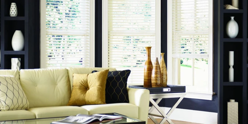
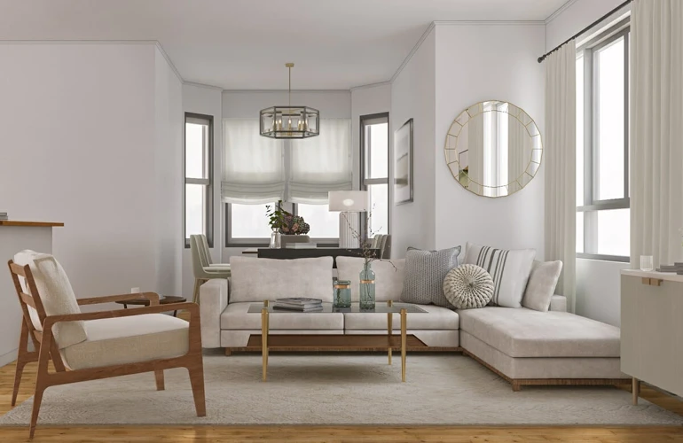
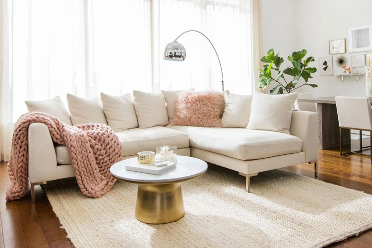
Examples of Neutral Color Home Decor
Neutral colors are a very popular choice of home decor nowadays. Designers globally often recommend using neutral tones as the main palette in any interior design project. Home decor items, like furniture, pillows, curtains, and wall art, can be easily found in neutral colors. These colors are so versatile and easy to work with that it is tough to go wrong with them.
So, what do neutral colors in home decor actually look like? A common neutral color found in home decor is beige. Beige is a warm, comfortable color that can bring a sense of calmness to any room. Gray is another go-to neutral color that has become increasingly popular in recent years due to its modern, elegant look. Another popular choice is white. White is a timeless color that can make a room feel more open and spacious.
Pairing different neutral colors together is also an excellent way to add depth and interest to a home. For example, combining different shades of beige or gray can add visual interest while keeping the overall color palette neutral. Cream is another neutral color that is often used in combination with other neutral colors. It has a light yellow or ivory undertone, making it an especially warm and inviting color for home decor.
When using neutral colors in home decor, it is essential to consider the texture of the items being used. Texture can add depth and complexity to a neutral room. Soft, fluffy pillows or a shaggy rug in a neutral color can create an inviting, cozy atmosphere, while smooth, modern furniture in a neutral color can add a touch of sophistication.
It is also important to consider the lighting in the room when choosing neutral colors for home decor. Neutral colors can sometimes appear different depending on the lighting. For example, natural light may make a beige wall appear warmer, while a dimly lit room may make the same wall appear cooler.
Neutral colors in home decor can bring a sense of tranquility, sophistication, and warmth to any home. From beige to gray to white, these colors can easily be incorporated into any design style or room, making them an ideal choice for homeowners who want a timeless, versatile look.
Conclusion
In conclusion, the use of neutral colors in interior design can have a significant impact on the overall mood and atmosphere of a space. Through the basics of what neutral colors are and their psychological effects, we have learned that neutral colors can create a calming and soothing effect on individuals, making them perfect for spaces designed for relaxation and rest.
However, it is also important to note that neutral colors may not be suitable for every space or individual preference, and they may require additional accents and textures to prevent the space from looking bland or boring.
When choosing the right neutral color for your home, it is important to consider factors such as natural lighting, the purpose of the room, and personal preferences. Utilizing best practices for incorporating neutral colors such as mixing different shades and textures, can also add depth and interest to the space.
Overall, incorporating neutral colors into your home decor can create a timeless and sophisticated look while providing a calming and peaceful atmosphere. With the knowledge of the psychology behind neutral colors and their benefits, you can confidently design a space that will stand the test of time.
Frequently Asked Questions
What Are Some Examples of Neutral Colors?
Examples of popular neutral colors include white, black, gray, beige, and taupe.
How Do Neutral Colors Affect Mood?
Neutral colors can create a calming and relaxing atmosphere in a room, which can lead to improved mood and reduced stress levels.
What Are the Benefits of Using Neutral Colors in Interior Design?
Neutral colors are versatile and timeless, allowing for easy incorporation into various design styles. They can also create a cohesive look in a space and make it appear larger and more open.
Are There Any Downsides to Using Neutral Colors in Interior Design?
Using too many neutral colors in a space can result in a bland or boring look. It may also make a room appear cold and uninviting.
How Can I Choose the Right Neutral Color for My Home?
Consider the natural light in your space and the existing colors in your decor. Test out a few neutral shades on your walls to see how they look in different lighting conditions.
What Are Some Best Practices for Incorporating Neutral Colors Into My Home?
Try incorporating pops of color through accessories and artwork to create interest in a space. Use different textures and patterns to add depth to a neutral palette.
Can I Use Neutral Colors in Small Spaces?
Yes! Neutral colors can actually make a small space appear larger and more open. Stick to light and cool-toned neutrals for the best effect.
How Can I Make My Neutral Space Feel Cozy?
Use warm accents like throw pillows and blankets in natural materials like wool and linen. Incorporate soft lighting and include natural textures like wooden accents and plants.
What Design Styles Can I Use Neutral Colors With?
Neutral colors can be used in almost any design style, including modern, traditional, minimalistic, and rustic.
How Can I Incorporate Neutral Colors into a Colorful Space?
Use neutral colors on large surfaces such as walls, floors, and furniture, and use pops of color in accessories and decor.