Introduction
As we sit down to enjoy a meal, the presentation of the food may be the first thing that catches our eye, but did you know that the colors in your kitchen and dining area can also influence your appetite? From the paint on the walls to the decorative elements, each color can have a different effect on our mood and hunger levels. In this article, we will explore how color influences appetite and provide tips on choosing the best color scheme for your kitchen and dining area, as well as ideas for painting and decorating to create the perfect ambiance. Let’s dive in!
Why Color Matters in the Kitchen and Dining Area
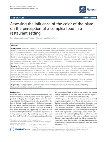
Color is an essential component of any interior design, including the kitchen and dining area. The colors you choose can have a significant impact on the overall feel of the space, affecting everything from mood to appetite. Research has shown that color can affect people’s emotions and behavior, making it an important consideration when designing your kitchen and dining area.
Different colors can evoke different emotions and reactions, so it’s essential to select the right hues for your space.
| Color | Effect on Appetite | Effect on Mood |
|---|---|---|
| Red and Orange | Increases appetite | Energetic and passionate |
| Yellow | Increases appetite | Happy and cheerful |
| Green | Can decrease appetite | Calm and refreshing |
| Blue | Can decrease appetite | Relaxing and peaceful |
| Purple | Can decrease appetite | Regal and luxurious |
| Brown | Neutral | Earthy and organic |
| Gray | Neutral | Cool and sophisticated |
Red and orange are popular choices for the kitchen and dining area because they can increase appetite and create a sense of energy and passion. Warm colors tend to be stimulating, making them perfect for social occasions and gatherings.
Yellow is another color that can increase appetite and create a happy and cheerful atmosphere. This color is ideal for breakfast nooks or informal dining areas.
Green can have a calming effect on the mind and body, which can decrease appetite. However, incorporating pops of green in your décor can create a refreshing and relaxing dining experience.
Blue tends to have a calming effect and can be useful in reducing appetite. This color often works well in formal dining rooms.
Purple can also have a calming effect on the mind and body and can decrease appetite. Regal and luxurious, deep purple hues can create a sophisticated ambiance in the dining area.
Brown and gray are neutral colors that can create a warm and inviting atmosphere in both the kitchen and dining area. Brown is often used to create an earthy and organic feel, while gray is considered to be cool and sophisticated. These colors are good choices when creating a cohesive color scheme throughout the home.
How Colors Affect Our Appetite
As humans, we have a complex relationship with color. The way we respond to different hues is ingrained in us on a subconscious level, and can impact our mood, emotions, and even our appetite. Color is a powerful tool that designers use to create a specific atmosphere in a room, and the kitchen and dining area are no exception. In this section, we will delve into the ways that color influences our appetite and the different effects that red, orange, yellow, green, blue, purple, brown, and gray can have on our cravings and appetite. Understanding the impact of color can help you create a more inviting and appetizing space in your home.
Red and Orange
When it comes to bold, attention-grabbing colors that stimulate your appetite, red and orange are at the top of the list. Studies have shown that these warm colors can increase hunger and stimulate the senses. Red, in particular, is known to increase heart rate and blood pressure, which can lead to a feeling of excitement and energy. These colors are great for dining spaces where you want to create a lively, energetic atmosphere.
However, it’s important to use caution when incorporating red and orange into your kitchen and dining area color scheme. These colors can also be overwhelming if used excessively or in the wrong way. Too much red or orange can be too stimulating, leading to feelings of restlessness and anxiety. It’s best to use these colors as accent pieces rather than covering an entire wall.
If you’re set on incorporating red or orange as a dominant color in your kitchen or dining area, consider using them in small doses or pairing them with more neutral colors. For example, you could opt for a neutral beige or white wall color with bold red or orange accents on curtains, tableware, and decorative elements. This creates a balanced and visually appealing space.
It’s also important to note that red and orange may not be the best choice for small kitchens or dining areas. These warm colors can make small spaces feel even smaller and more cramped. If you’re working with limited space, consider using cooler colors like blues and greens to create the illusion of a larger space. For more information on cooling colors and their effects, check out our article on calming cool colors in interior design.
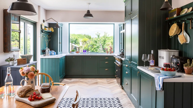
Yellow
Yellow is often associated with happiness and optimism, as well as with hunger and warmth. It is a great color to use in the kitchen and dining area, as it stimulates the appetite and creates a warm and inviting atmosphere.
Benefits of Yellow
– Yellow is a great color for small kitchens or dining areas, as it can make the space feel larger and brighter.
– It can also help to lift the mood and promote feelings of happiness and positivity.
– Yellow is often associated with energy and can enhance mental focus, making it a great choice for a home office or study area.
Pairing Yellow with Other Colors
Yellow can be paired with many other colors to create different moods and effects in your kitchen or dining area. Consider pairing it with:
– White or beige for a classic, timeless look.
– Blue or green for a cool and refreshing contrast.
– Red or orange for a bold and energetic look.
Using Yellow in Decor
There are many ways to incorporate yellow into your kitchen or dining area decor, including:
– Painting the walls or cabinets in a pale yellow hue for a subtle touch of warmth.
– Using yellow accents such as curtains, placemats, or dish towels for a pop of color.
– Incorporating yellow flowers or plants into your decor for a fresh and natural touch.
Remember to balance the use of yellow with other colors and neutrals to avoid overwhelming the space.
Maintenance and Cleaning Tips
Yellow can be a tricky color to maintain, as it tends to show dirt and stains easily. To keep your yellow kitchen or dining area looking its best, consider these tips:
– Wipe down surfaces regularly to avoid buildup of food, grease and grime.
– Use cleaning products that are specifically designed for use on colored surfaces, and test small areas before cleaning large sections.
– Avoid using abrasive sponges, brushes, or cleaning products that can scratch or damage surfaces.
Yellow is a great color to incorporate into your kitchen or dining area decor. It creates a warm and inviting atmosphere, stimulates the appetite, and promotes a positive mood. Consider using yellow in your home to bring a touch of sunshine into your life!
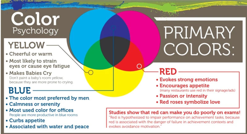
Green
Green is a color that has a calming effect on people. It is associated with nature, freshness, and health. It is said to reduce stress and anxiety, which makes it a perfect color for the kitchen and dining area where people come to relax and unwind.
Green also has an interesting effect on our appetite. It is believed that the color green can reduce our desire to eat, which can be helpful for people who are trying to control their food intake. This is because when we see green, our brains associate it with healthy foods like salads, fruits, and vegetables.
However, there is a downside to this effect. If the green is too pale, it may not have the desired effect of reducing appetite. On the other hand, if it is too dark, it can make the dining area feel cramped and small. It is important to choose the right shade of green for your kitchen and dining area, depending on the size of the space and the mood you want to create.
One way to incorporate green into your kitchen and dining area is by painting the walls or cabinets. A light shade of green on the walls, paired with white or cream cabinets, can create a bright and airy space. If you have a small kitchen, using a bold shade of green on one wall as an accent can make the space feel larger.
Another way to add green to your kitchen and dining area is through the use of decorative elements, such as curtains, rugs, and dishes. These accents can add pops of color and texture to the room, without overwhelming the space.
If you’re looking to create a more earthy and natural feel in your kitchen and dining area, consider pairing green with other natural colors such as browns, beiges, and yellows. This can create a warm and inviting atmosphere that encourages relaxation and socialization.
When it comes to cleaning and maintaining your green kitchen and dining area, it is important to use gentle cleaning products that won’t damage the paint or finishes. Always check the manufacturer’s instructions before using any cleaning products.
Green is a versatile color that can work well in the kitchen and dining area. Its calming effect and association with healthy foods make it an excellent choice for this space. By choosing the right shade of green and coordinating it with other colors and decorative elements, you can create a beautiful and inviting space that is perfect for cooking and dining.
Blue
Blue is known for its calming and soothing effects on the mind and body. It is believed to slow down your metabolism, making it a great color to use in dining areas to encourage more relaxed and slower eating. Studies have also shown that the color blue suppresses appetite, so it may not be the best color to use in kitchens if you’re trying to stimulate your appetite.
If you still want to incorporate blue into your kitchen or dining area, consider using it as an accent color rather than the main color. Lighter shades of blue, such as baby blue or sky blue, can create a serene and peaceful atmosphere, while darker shades like navy or royal blue add a sense of sophistication and elegance.
To balance out the calming effects of blue, try adding in some warm colors as well. For example, you can use warm wood tones or orange accents to create a cozy and inviting atmosphere that counteracts the coolness of blue.
When choosing blue as a color scheme, it’s important to think about the overall style and mood you want to create. Blue works well in coastal, farmhouse, and traditional styled kitchens and dining areas, but it can also be used in modern or minimalist design. Depending on the shade and the amount used, blue can create a calming and relaxing atmosphere, or a lively and energetic one.
If you have a small kitchen or dining area, using blue as the main color can make the space feel even smaller. Consider using blue as an accent color instead, and pair it with lighter shades to create the illusion of a bigger space. For more tips on using bold colors in small spaces, check out our article on bold colors in small spaces.
Purple
Purple is a unique and bold color that can have various effects on appetite. This color has both calming and energizing properties that have an impact on people’s mood while they are eating. The color purple is rarely used in kitchens and dining areas, but it can be an excellent choice for those who want to create a unique and modern culinary space.
Effects of Purple on Appetite:
The color purple is believed to have the power to soothe and calm people, making it an excellent choice for those who want to create a relaxing and tranquil atmosphere in their kitchen and dining area. At the same time, the color purple is also capable of increasing creativity and enhancing the imagination of its viewers, which can make meal preparation and eating more enjoyable.
Additionally, the color purple is often associated with luxury and royalty, which is why it can create an elegant and sophisticated atmosphere in the kitchen and dining area. This atmosphere can cause people to have an increased sense of pleasure while eating, which can also help to boost appetite.
Combining Purple with Other Colors:
Purple is an excellent complementary color, and it can create a perfect atmosphere when used with other colors like cream, white, and gray. Combining purple with these colors can create a balanced and chic culinary space that can make meal times more enjoyable.
On the other hand, adding complementary colors like green and blue can make the culinary space feel more vibrant and energetic. Combining purple with yellow can create a visually appealing and unique look.
Using Purple in Small Details:
For those who do not want to use purple as the primary color in their kitchen and dining area, adding small details like kitchenware, tablecloths, placemats, or using purple as an accent color can be an excellent way to incorporate the shade without going overboard.
The color purple has a lot of potential to create a calming yet energizing atmosphere in your kitchen and dining area. While it’s not a commonly used color, incorporating purple in small ways can create a unique and modern look in your culinary space.
Brown
Brown is a warm neutral color that is commonly associated with nature and earthiness. It is a popular choice for kitchen and dining areas because it can create a cozy and inviting atmosphere. When used in the kitchen, brown can give the space a rustic or country-style feel. It is also a great color for highlighting natural wood features like cabinets or flooring.
1. Brown and Wood Tones: Brown walls or accents can make the wood tones in your kitchen stand out. You can use dark brown walls against light-colored wood cabinets or light brown walls with dark wood cabinets. It’s important to choose shades that complement each other to avoid having the room look too dark or too light.
2. Brown and Other Neutral Colors: Brown pairs well with other neutral colors like beige, cream, and white. Consider painting the walls a light brown and then adding white trim for a classic look. You can also use brown as an accent color with beige or cream walls.
3. Brown and Accented Colors: Brown can work well with bright or bold accent colors. If you’re feeling adventurous, try pairing brown with a bright shade like red or orange. You can incorporate these colors through kitchen accessories or even upholstered dining chairs.
4. Brown and Metallics: Brown can also be paired with metallic accents. Copper or bronze are great choices for a rustic kitchen while silver or stainless steel can bring modern flair to the space.
When using brown in your kitchen or dining area, it’s important to consider the overall mood you want to create. Brown can make a room feel cozy and warm, but it can also make the space feel small and dark if not used correctly. Try incorporating brown through natural wood features, accent walls, or small decorative touches like brown table runners or placemats.
If you’re unsure how to use brown in your kitchen or dining area, consider consulting with a professional decorator or designer for expert advice. You can also check out some of the useful resources available online such as Color Highlight for Architectural Features. By choosing the right colors and design elements, you can create a beautiful and inviting kitchen or dining area that you and your guests will enjoy.
Gray
When it comes to using gray in the kitchen and dining area, it can be a versatile and sophisticated choice. Gray is a neutral color that can be calming and timeless, but it also has the potential to look dreary or dull if not used properly.
Positives: The use of gray in the kitchen and dining area can be warmed up by opting for warmer shades of gray or pairing it with wood textures or warm metallic accents. Gray can also act as a great backdrop for other accent colors, such as bold red or bright yellow. It can create a sleek, modern and sophisticated atmosphere, particularly when combined with stainless steel appliances and brushed nickel hardware.
Negatives: However, gray can also be overused in a space, making it feel cold and uninviting. Lighter shades of gray can also look dirty easily, particularly around cooking and eating areas.
It’s important to be mindful of how much gray is used in the space, and where it’s being used.
Here are some tips for incorporating gray into your kitchen and dining area:
| DO: | AVOID: |
| Pair gray cabinets with warm metallic accents, such as brass or copper | Using gray on all surfaces, creating a monochromatic and uninviting look |
| Use warm gray paint on the walls to create an inviting atmosphere | Using cool-toned grays that make the space feel cold and uninviting |
| Pair gray with natural wood textures to add warmth and texture to the space | Using too many gray finishes, creating a space that lacks contrast and interest |
Gray can be a great neutral color to use in your kitchen and dining area, as long as it’s balanced with warmer accents and textures. When using gray, it’s important to keep in mind the mood you want to create and use it strategically to achieve the desired effect.
If you want to learn more about the psychological effects of neutral colors in design, check out this article. If you need help choosing the right paint color for your home office, this article has some great tips. And if you’re interested in the power of accent walls in interior design, check out this article.
Choosing the Right Color Scheme for Your Kitchen and Dining Area
Now that we know how different colors can affect our appetite in the kitchen and dining area, the question arises: how do we choose the right color scheme for the space? This can be a perplexing task, as there are various factors to consider when it comes to picking the right colors. In this next section, we will explore some tips and tricks for selecting the perfect color scheme for your kitchen and dining area. From considering personal taste and mood to analyzing the size and layout of the space, we will guide you through the process of creating a visually pleasing and appetite-stimulating environment.
Consider Your Personal Taste
When it comes to choosing the right color scheme for your kitchen and dining area, considering your personal taste is crucial. This is the space where you’ll spend a lot of time cooking, entertaining, and enjoying meals with your loved ones, so it’s important that the colors reflect your unique style and personality.
To help you narrow down your options, create a table listing your favorite colors and how they make you feel. For example:
| Color | Feelings/Emotions |
|---|---|
| Blue | Calm, Relaxing, Refreshing |
| Green | Natural, Fresh, Tranquil |
| Yellow | Energetic, Happy, Cheerful |
| Red | Passionate, Exciting, Bold |
| Orange | Warm, Inviting, Playful |
| Purple | Luxurious, Mystical, Elegant |
| Brown | Earthy, Comforting, Warm |
| Gray | Neutral, Sophisticated, Elegant |
This table can serve as a starting point for your color selection process. You can use it to identify your preferred colors and the emotions and feelings they evoke. Once you’ve narrowed down your choices, you can start considering how each color may enhance or not your kitchen and dining area.
Remember that the point of considering your personal taste is ultimately to create a space where you will feel comfortable and happy. Don’t let current trends or the opinions of others sway you from choosing colors that speak to you. Trust your instincts and select colors that will make you feel excited and inspired every time you enter your kitchen and dining area.
Think About the Mood You Want to Create
When choosing a color scheme for your kitchen and dining area, it’s important to think about the mood you want to create. Whether you’re aiming for a cozy, intimate feel or a bright and energetic atmosphere, the colors you choose can have a big impact on the overall mood of the space.
Here are some considerations to make when deciding on the mood:
- Consider the purpose of the space. Will your kitchen and dining area be primarily used for cooking and eating, or will it also serve as a gathering spot for entertaining guests? If you’re mainly using the space for intimate meals with family, you may want to create a warm and inviting ambiance. If you’re planning to host parties or social gatherings, you may want to opt for brighter, more energetic hues.
- Think about the time of day that the space will be used most frequently. If you’re primarily using your kitchen and dining area in the morning and early afternoon, you may want to choose colors that feel bright and energizing. If the space will be used more frequently in the evening or at night, you may want to opt for darker hues or more muted tones that create a cozy and comfortable atmosphere.
- Consider the overall style of your home. If you have a modern and minimalist decorating style, you may want to choose a color scheme that complements that aesthetic. If your home has a more traditional or rustic vibe, you may want to choose colors that reflect that style.
- Think about the emotions that different colors evoke. Colors like red and orange are associated with energy and excitement, while blues and greens are often seen as calming and peaceful. You may want to choose a color scheme that reflects the emotional tone you want to set in the space.
By considering the mood you want to create in your kitchen and dining area, you can choose a color scheme that feels both visually appealing and emotionally satisfying. Whether you opt for bright and bold hues or more muted and calming tones, your color choices can have a big impact on how you feel in the space.
Consider the Size and Layout of the Space
When choosing a color scheme for your kitchen and dining area, it’s important to consider the size and layout of the space. Different colors can have a significant impact on how large or small the room appears, as well as influence the flow of traffic and the overall ambiance.
One factor to consider is the size of the room. Darker colors tend to make a space feel smaller, while lighter colors can create the illusion of more space. If you have a small kitchen or dining area, you may want to stick to lighter colors to help open up the space visually. Conversely, if you have a large space, you can choose darker colors without worrying about making the space feel too cramped.
The layout of the space is also an important consideration. You want to choose colors that will enhance the flow of traffic through the room, rather than hinder it. For example, if you have a narrow galley-style kitchen, you can use lighter colors on the walls and cabinets to widen the space visually. In contrast, if you have an open concept kitchen and dining area, you may want to use a cohesive color scheme that ties the areas together without overwhelming one or the other.
To help you visualize the impact of different colors on the size and layout of your kitchen and dining area, check out the following table:
| Color | Effect |
|---|---|
| Light Colors | Create the illusion of more space |
| Dark Colors | Make a space feel smaller |
| Bright Colors | Add energy and vibrancy |
| Neutrals | Provide a timeless and classic look |
| Analogous Colors | Create a cohesive and harmonious feel |
| Complementary Colors | Add contrast and depth |
Understanding the impact of color on the size and layout of your kitchen and dining area will help you make more informed choices when selecting a color scheme. Paying attention to these factors will ensure that the end result not only looks great but also enhances the functionality of the space.
Coordinate with Existing Elements
Coordinate with Existing Elements: When choosing the color scheme for your kitchen and dining area, it is important to consider the existing elements in the space. These elements include the flooring, countertops, cabinets, and appliances. You do not want your color choices to clash with these elements, but rather to complement them.
To coordinate with existing elements, you can follow these steps:
- Start with a neutral base: Select a neutral color scheme as your base. This can be white, beige, or any other color that matches your existing elements. The neutral color will help tie everything together.
- Add accent colors: Once you have your neutral base, you can add accent colors that complement the existing elements. For example, if you have a brown countertop, you can add green or blue accent colors.
- Use color swatches: Take samples of your existing elements (flooring, countertops, etc.) and bring them with you when selecting your color scheme. This will help you choose colors that match or complement these elements.
- Consider texture: If your existing elements have a lot of texture or patterns, you may want to choose solid colors that will not compete with them.
By coordinating with existing elements, you can create a cohesive and visually appealing color scheme for your kitchen and dining area.
Painting and Decorating Ideas for Your Kitchen and Dining Area
Now that we know how colors can affect our appetite and mood, it’s time to think about how we can incorporate these colors into our kitchen and dining area. Painting and decorating our space is a fun and creative way to add personality and style to our home. Here are some innovative ideas to add color and creativity to your kitchen and dining area. So grab a brush and let’s get started!
Accent Walls
One easy way to add a pop of color to your kitchen or dining area is by painting an accent wall. An accent wall is a single wall painted a contrasting color to the rest of the space, making it stand out as a focal point.
Benefits of an Accent Wall
There are several benefits to adding an accent wall in your kitchen or dining area. For one, it’s a low commitment way to add color to the space. If you’re not ready to commit to painting all the walls a bold color, an accent wall is a great compromise. It’s also a budget-friendly option, as you only need to paint one wall rather than the entire room.
Choosing the Right Wall
When choosing which wall to paint as your accent wall, consider the layout of the space. Typically, the accent wall should be the one that draws the eye the most or the one that serves as a backdrop for a focal point like a piece of art or a statement light fixture.
Color Selection
The color you choose for your accent wall will play a big role in the overall feel of the space. Bold colors like red, orange, and yellow can create a warm and inviting atmosphere, while cooler colors like blue and green can make the space feel more calm and relaxed.
Painting Techniques
Once you’ve chosen the wall and the color, it’s time to paint. There are various painting techniques you can use to make your accent wall even more interesting. Here are a few ideas:
| Technique | Description |
|---|---|
| Stripes | Use painter’s tape to create stripes in a contrasting color. |
| Ombre | Gradually blend the accent wall color into the other walls using a sponge or blending tool. |
| Stencils | Use stencils to create a pattern on the accent wall. |
Other Accent Wall Options
Painting isn’t the only way to create an accent wall. You could also use wallpaper, wood paneling, or tile to create a unique wall design. Just keep in mind that these options may be more permanent and difficult to remove or change in the future.
An accent wall is a simple and effective way to add a burst of color and personality to your kitchen or dining area. Just be sure to choose the right wall, color, and technique to make the most impact.
Bold Cabinetry
One way to incorporate color into your kitchen and dining area is through bold cabinetry. This involves using cabinets in vibrant, eye-catching colors that stand out from the rest of the space.
Here are some tips for using bold cabinetry to enhance your kitchen and dining area:
- Choose a Color Scheme: When selecting bold cabinets, it is essential to have a color scheme in mind. Consider the other colors in the room and choose a color that complements or contrasts them. For example, if the walls are a light blue color, a bold yellow cabinet would create a striking contrast.
- Mix and Match: If you don’t want to commit to one bold color, consider mixing and matching cabinets in different hues. You could have a few cabinets in a bright red color and others in a sunny yellow shade, creating a fun and playful look.
- Pair with Neutral Elements: To ensure that the bold cabinets don’t overpower the room, pair them with neutral elements such as white or beige walls, countertops, and backsplash tiles.
- Consider the Style: Bold cabinetry can work in both modern and traditional kitchens, but the style should reflect the rest of the space. Pair bright red cabinets with sleek, modern countertops and stainless steel appliances for a contemporary look, while muted green cabinets with ornate hardware would complement a more traditional style.
- Apply a Glossy Finish: Applying a glossy finish to the cabinets will help reflect light in the room and make the colors pop even more.
When done right, bold cabinetry can make a significant impact on the overall look and feel of the kitchen and dining area. It adds personality and character to the space and can be an excellent choice for those who enjoy making bold design choices.
Statement Ceiling
One way to add a pop of color to your kitchen or dining area is by making a statement with your ceiling. This is a unique way to add visual interest and create a stunning focal point that will make your guests look up in awe.
1. Bold Paint Colors: Choose a bold and vibrant paint color that complements the rest of your décor. Whether it’s a bright red, a lush green, or a deep blue, a statement ceiling will make your kitchen or dining area feel more dynamic and exciting.
2. Wallpaper: Another option for making a statement with your ceiling is by using wallpaper. This is a great way to add pattern and texture to your space while also introducing a bold color. Just be sure to choose a wallpaper that is suitable for high-moisture areas.
3. Exposed Beams: If your kitchen or dining area has exposed beams, consider painting them a bold color for a unique and eye-catching look. This will draw attention to the architectural details of your space and create a dramatic visual impact.
4. Textured Plaster: Textured plaster is another way to create a statement ceiling in your kitchen or dining area. This technique involves applying a textured plaster to the ceiling and then painting it in a bold and vibrant color. The result is a unique and visually stunning look.
5. Ceiling Tiles: If you want to add pattern and texture to your ceiling, consider using ceiling tiles. These come in a variety of styles and colors, so you can choose one that complements your existing décor. Additionally, ceiling tiles are easy to install and can be a DIY project.
When making a statement with your ceiling, be sure to coordinate the color and style with the rest of your décor. You don’t want it to clash or feel out of place. A statement ceiling can be a great way to add a pop of color and excitement to your kitchen or dining area, so don’t be afraid to get creative and try something new.
Colorful Decorative Elements
Incorporating colorful decorative elements is an excellent way to add flair and personality to your kitchen and dining area. By selecting the right items, you can create a cohesive look and tie together your color scheme.
Artwork: Hang colorful artwork on your walls to add a pop of color to your space. Abstract or nature-inspired pieces with bold hues can create a stunning focal point and complement your color palette. Choose artwork that reflects your personal style and adds interest to your kitchen and dining area.
Flowers and Plants: Fresh flowers or indoor plants can add life and color to your kitchen and dining area. A vase of bright sunflowers or a potted herb garden can bring warmth and vibrancy to your space. Additionally, plants can improve air quality and provide a soothing atmosphere during meals.
Decorative Bowls and Plates: Colorful bowls and plates can add visual interest to your dining table. Mix and match vibrantly colored dishes to create a multi-hued tablescape. Don’t be afraid to combine colors and patterns for a playful and eclectic touch.
Area Rugs: Placing a colorful area rug in your kitchen or dining area can anchor your space and add a cozy touch. Choose a rug with bold patterns or bright colors to create a statement. Additionally, an area rug is an excellent way to define your dining area and separate it from other areas in your home.
Window Treatments: Adding colorful curtains or window shades is an easy and cost-effective way to add color to your kitchen or dining area. Choose curtains with bold patterns or bright hues to bring personality and charm to your space. Additionally, curtains can provide privacy and help regulate light, making your dining experience more enjoyable.
By incorporating colorful decorative elements, you can create a lively and inviting space that reflects your personality and style. Choose items that speak to you and complement your overall color scheme for a cohesive and beautiful look.
Unique Backsplash
The backsplash is an often-overlooked area in the kitchen when it comes to color and design, but it can actually be a great opportunity to add some visual interest and personality to the space. Here are some unique backsplash ideas to consider:
- Mosaic tiles: Mosaic tiles in various colors can create a stunning backsplash that adds depth and texture to your kitchen. This is also a great way to tie in different colors in your color scheme.
- Patterned tiles: Patterned tiles are a bold and expressive option for a backsplash. Consider choosing a tile with a colorful pattern that ties in with the other colors in your kitchen.
- Chalkboard paint: For a more unique option, consider using chalkboard paint for your backsplash. This allows you to change up the design and color scheme as often as you’d like and can serve as a fun canvas for displaying menus, grocery lists, or even artwork.
- Stainless steel: For a modern and sophisticated look, a stainless steel backsplash can add a sleek metallic finish to your kitchen. This is also a practical option, as it is easy to clean and maintain.
- Textured wallpaper: Wallpaper may not be the first thing that comes to mind for a kitchen backsplash, but various textured options can add depth and interest to the space. Consider a bold color or pattern that complements your kitchen’s color scheme.
- Glass: A glass backsplash allows you to add a bold color or pattern to your kitchen while also creating a modern and streamlined look. This option is also easy to clean and maintain.
No matter which backsplash option you choose, it’s important to consider the colors and patterns in your overall color scheme to ensure that everything works together seamlessly.
Colorful Tableware and Linens
When it comes to adding color to your kitchen and dining area, don’t overlook the impact that colorful tableware and linens can have. Not only do they serve a functional purpose, but they can also add a visually pleasing element to your space.
One idea for adding color to your table is to use brightly colored plates and bowls. Consider mixing and matching different colors and patterns for a eclectic and playful look. You can also use colored glassware or stemware to add a pop of color to your table setting.
Another way to inject color into your dining area is through the use of table linens. Bold tablecloths, table runners, and placemats can help create a focal point for your table. Try using a tablecloth with a bright, eye-catching pattern or a table runner in a rich, jewel toned color.
Napkins are another opportunity to add color to your table. Opt for napkins in shades that complement your overall color scheme or choose a contrasting color for a bold statement. You can even fold them creatively and use them as a decorative element on your table.
When selecting your colorful tableware and linens, remember to consider the overall style and aesthetic of your kitchen and dining area. It’s important to find pieces that not only add color, but also work well with the existing decor.
Lastly, don’t be afraid to mix and match colors and patterns to create an eclectic and personalized look. You can also switch up your table setting with the changing seasons, using different colors and textures to reflect the time of year.
Incorporating colorful tableware and linens is an easy and affordable way to add personality and style to your kitchen and dining area.
Tips for Maintenance and Cleaning of Colorful Kitchen and Dining Areas
Maintaining a colorful kitchen and dining area can be challenging, but it’s also rewarding. Here are some tips to keep your space looking fresh and clean.
Clean Up Spills Immediately
Accidents happen, but it’s important to clean up spills as soon as possible to prevent staining. Use a damp cloth or sponge to blot up any liquid and then wipe the area with a dry towel to soak up excess moisture.
Use Mild Cleansers
When cleaning your colorful kitchen and dining area, it’s best to use mild cleansers. Harsh chemicals can damage the surfaces and fade the color. A mixture of vinegar and water is an effective and natural cleaner that won’t harm your surfaces.
Avoid Scrubbing Too Hard
Scrubbing too hard can scratch and damage the finish of your surfaces, so it’s important to use gentle pressure when cleaning. Use a soft sponge or cloth for best results.
Protect Your Surfaces
To avoid scratches and stains, use trays, placemats, and coasters on your surfaces. This will also help with maintenance in the long run.
Regularly Dust and Vacuum
Dust and dirt can accumulate in the kitchen and dining area, especially in corners and on shelves. Regularly dust and vacuum these areas to keep your space looking clean and inviting.
Rotate Decor
If your kitchen and dining area have decorative items that are exposed to sunlight, rotate them periodically to prevent fading on one side.
Replenish Your Supplies
When cleaning your kitchen and dining area, it’s important to have the right supplies. Make sure to replenish your cleaning products and tools to ensure you’re always prepared for spills and messes.
By following these tips, you’ll be able to maintain the beauty of your colorful kitchen and dining area for years to come.
Conclusion
In conclusion, it’s clear that color plays a significant role in how we perceive and experience food in our kitchen and dining areas. The right color scheme can positively influence our appetite and make meal times more enjoyable.
However, it’s important to understand that color preferences and influences are subjective. What works for one person may not work for another. Therefore, it is essential to choose colors that you personally enjoy and that create the desired mood and atmosphere within your kitchen and dining space.
When considering a color scheme, it’s essential to keep in mind the psychology behind colors and their potential effects on appetite and mood. Red and orange are known stimuli that can increase appetite and energy, while blue and purple are calmer and can have a more relaxing effect on people. Yellow is believed to create a warm and welcoming atmosphere and green is associated with freshness and nature.
The layout and size of the kitchen and dining area are also factors to consider when selecting a color scheme. Light hues can make a small space feel larger, while darker shades can make a large space feel more cozy and inviting. It’s also essential to coordinate the color scheme with existing elements and decor within the room, such as cabinets, countertops, and flooring.
When it comes to painting and decorating ideas, the sky’s the limit. From bold accent walls to colorful backsplashes, there are myriad ways to incorporate color into your kitchen and dining areas. Adding colorful tableware and linens, unique decorative elements and statement ceilings can also go a long way in elevating your space’s overall aesthetic.
Once a color scheme has been decided upon, it’s crucial to keep the space clean and well-maintained to ensure that the colors remain vibrant and inviting for years to come. Regular cleaning and upkeep will prevent dirt and grime from dulling the colors and make your space look fresh and inviting at all times.
At the end of the day, choosing the right color scheme for your kitchen and dining area is a personal decision that can greatly influence your experiences within the space. So, take your time, consider your options, and enjoy creating a space that speaks to your unique style and taste.
Frequently Asked Questions
What is the most appetizing color for a kitchen?
There isn’t one specific color that is universally considered the most appetizing, as everyone’s tastes and preferences are different. However, warm and earthy tones such as red, orange, and brown tend to increase appetite.
Can certain colors decrease appetite?
Yes, colors such as blue and purple are known to decrease appetite, so they may not be the best choices for a dining area or kitchen space.
How can color affect how much we eat?
Colors can influence our appetite and the amount of food we eat by creating certain moods and emotions. For example, warm tones like red and orange can increase hunger, while cool colors like blue and green can decrease appetite.
What colors should I avoid in my kitchen and dining area?
You may want to avoid using too much blue or purple in your kitchen and dining area, as they can have a calming effect that may not be conducive to eating. Dark or muted colors can also make a space feel dreary and unappetizing.
How can I use color to make my kitchen appear larger?
You can use light or neutral colors like white or cream to make a small kitchen appear brighter and more spacious. Reflective surfaces like mirrors or metallic accents can also help to open up the space and create the illusion of more room.
What are some popular color combinations for kitchens?
Some popular color combinations for kitchens include white and gray, black and white, blue and yellow, and green and white. However, the best color scheme for your kitchen will depend on your personal taste and the overall style of your home.
What color should I paint my cabinets?
The color you choose for your cabinets will depend on the style and overall look you’re going for. White or cream cabinets are a classic choice that work well with almost any color scheme, while bold colors like red or navy can add personality and drama to the space.
What are some easy ways to add color to my kitchen without painting?
You can add color to your kitchen by incorporating colorful table linens, dishware, or decorative accents. Adding green plants or fresh flowers can also bring life and color to the space.
How can I maintain the color in my kitchen over time?
To maintain the color in your kitchen over time, avoid exposing colored surfaces to direct sunlight or extreme temperatures. Clean up spills and stains as soon as possible to prevent discoloration, and use gentle cleaning products that won’t strip color or cause damage.
Can the color of my dining area affect how much my guests eat?
Yes, the color of your dining area can affect how much your guests eat by influencing their mood and appetite. Choosing warm, inviting colors like red, orange, or yellow can help to increase hunger and encourage your guests to eat more.