Neutral colors are a versatile and timeless choice for home decor, but have you ever wondered how they affect your mood? The psychology of color has been studied extensively, and neutral colors have their own unique properties that can evoke feelings of calm, balance, and sophistication. This article will explore the science behind the psychology of neutral colors, the benefits and drawbacks of using them in home interiors, and provide tips for choosing and decorating with these colors. So, let’s delve into the world of neutrals and discover how they can impact our minds and emotions.
What are Neutral Colors?
When it comes to designing a room or selecting clothes to wear, color plays a crucial role. This is because colors can evoke different emotions and affect our mood in various ways. One popular color family that is often used in interior design and fashion is neutral colors. These colors may seem bland at first, but they actually have a lot of depth and sophistication. It’s important to understand what neutral colors are, how they differ from each other, and how they can be used to create a specific atmosphere in a room or on your body. Let’s dive into the world of neutrals and explore their unique properties. For some inspiration on how to use neutral colors, check out these top 10 neutral colors for a minimalist look at home.
Types of Neutral Colors
Neutral colors are shades that don’t belong to any specific color category and are not easily identifiable as any specific hue. They include beige, ivory, gray, white, black, and brown.
Beige: As the most popular neutral color, beige has a warm undertone that creates a soothing and inviting atmosphere in any space. Its delicate nature allows it to pair well with bold colors and patterns.
Ivory: Ivory is a cooler shade of beige that offers a subtle hint of yellow. It is commonly used to add depth to bright or pastel colors.
Gray: Gray is a versatile neutral color that ranges from light to dark shades. It can create a cool or warm atmosphere depending on the undertone. Light gray is often associated with tranquility, while darker shades evoke elegance and formality.
White: White is a classic neutral that is widely used in modern and minimalist designs. It creates a clean and fresh appearance, but it can also feel cold or sterile if not paired correctly.
Black: Black is often used to create a dramatic effect in a space. While it is not a traditional neutral color, it can be used as a background to make other colors stand out.
Brown: Brown is a warm neutral that can range from light tan to deep chocolate. It is often used in rustic or earthy designs to provide a comfortable and cozy atmosphere.
Different shades of neutral colors can be combined to create a cohesive and comfortable space. By layering textures and patterns, you can create a space that is interesting and visually appealing. You can learn more about how to layer neutrals in your home in the article “Neutral Colored Room Layering Techniques.”
Properties of Neutral Colors
Neutral colors are versatile and can be used in a variety of design styles. They have particular properties that make them unique in comparison to other colors. Here are some of the properties of neutral colors:
| Property | Description |
|---|---|
| Simplicity | Neutral colors are simple and understated, making them a great choice for minimalist designs. |
| Flexibility | Neutral colors can be used as a base for any design scheme. |
| Timelessness | Neutral colors have a classic and timeless quality that never goes out of style. |
| Balance | Neutral colors create a sense of balance and harmony in a space. |
| Soothing | Neutral colors have a calming effect on the mind and body. |
| Light Reflective | Neutral colors reflect light and create a bright, airy feeling in a space. |
| Matchability | Neutral colors can be paired with bolder colors and patterns without overwhelming a space. |
These properties make neutral colors an excellent choice for home interiors. They can help create a warm and inviting atmosphere that is both functional and stylish. Whether you’re going for a timeless neutral look or pairing them with bold walls or metallic accents, there are many ways to incorporate neutral colors into your home design.
Source: Timeless Neutral Look
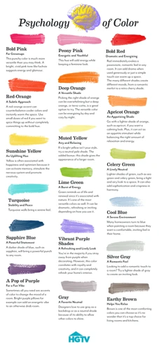
The Science of Color and Emotions
As you decorate your home, it’s important to consider the impact of different colors on your emotions and mood. The Science of Color and Emotions delves deeper into this subject, exploring the ways in which color can affect our thoughts and feelings. Various studies have shown that colors have a strong influence on our emotions and behaviors, which makes them an important factor to consider when choosing colors for your home. Understanding the relationship between color and emotion can help you create a space that feels comfortable, relaxing, and welcoming. To learn more about how to use this knowledge in your home, check out our tips on pairing neutral colors with bold walls, incorporating metallic accents, or choosing the right neutral colors for small spaces.
How Color Affects Mood
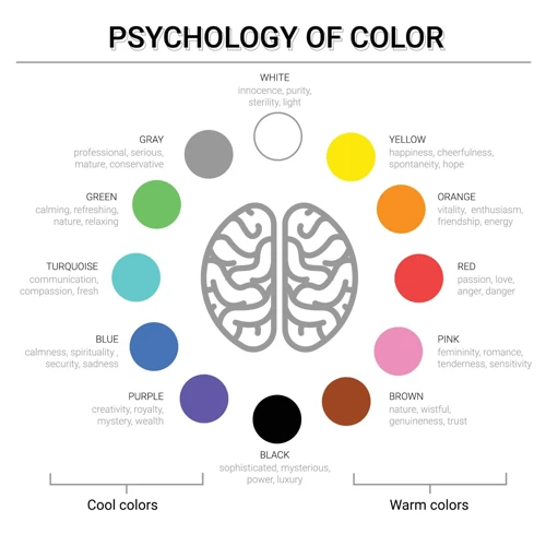
Colors can have a significant impact on our emotions and mood. Studies have shown that different colors can elicit different emotional responses, and the effects can vary depending on individual experiences and cultural backgrounds. Warm colors such as red, orange, and yellow can evoke feelings of energy and excitement, while cool colors like blue and green can promote relaxation and calmness.
Neutral colors, such as black, white, gray, and beige, are less colorful than warm and cool colors, which means their effects on mood are more subtle. However, neutral colors can still have a significant impact on our mental state. For example, white can provide a sense of purity and cleanliness, while gray can promote feelings of sophistication and elegance.
Additionally, the saturation and brightness of neutral colors can also affect our emotions. Soft neutrals, like beige and cream, can feel calming and serene, while darker, bolder neutrals, like charcoal and navy, can be more dramatic and moody.
When it comes to interior design, it’s essential to take into account how colors affect mood and select a color scheme that will promote the desired feelings and emotions in a space. Neutral colors can be especially useful in creating a calming and comfortable atmosphere in a home.
If you’re interested in learning more about how to incorporate neutral colors into your home’s interior design, check out our article on creating a coastal interior with neutral colors. You can also explore our guide to popular neutral paint colors and find out the difference between warm and cool neutral paints and how they affect home atmosphere.
The Psychology of Neutral Colors
Neutral colors, despite their lack of intense pigmentation, can have a significant impact on our emotions and the way we perceive our surroundings. Understanding the psychology behind these colors can help us make informed decisions when it comes to decorating our homes and workspaces.
1. Calming – Neutral colors such as gray, beige, and white can create a calm and serene atmosphere in a room. This is because they are not overwhelming or distracting, allowing the mind to relax and focus on other things.
2. Versatility – Neutral colors are incredibly versatile and can be paired with almost any other color scheme. This makes them an excellent choice for those who want to decorate their space without committing to a specific color theme.
3. Timeless – Neutral colors are timeless and don’t go out of style. This is ideal for those who don’t want to regularly update their decor and prefer a classic look.
4. Sophistication – Neutral colors can create an atmosphere of sophistication and elegance. They are often associated with luxury and refinement, making them a popular choice for upscale homes and businesses.
5. Depersonalization – While neutral colors can create a calming atmosphere, they can also make a space feel impersonal or bland. This is why it’s important to incorporate personal touches and unique decor to add character and personality to the room.
The psychology of neutral colors shows that they have a calming and versatile effect, making them a popular choice for decorators. However, it’s important to incorporate personal touches to avoid a generic or bland feeling in the room.
Using Neutral Colors in Home Interiors
Neutral colors are a versatile and timeless option for home interiors. They can create a calming and relaxing atmosphere while also allowing for pops of color to stand out. However, the challenge lies in knowing how and where to use them, as well as which specific shades of neutral work best for each space. In this section, we will explore the possibilities of incorporating neutral colors into various rooms in your home and offer tips for achieving a cohesive and stylish look.
Living Room
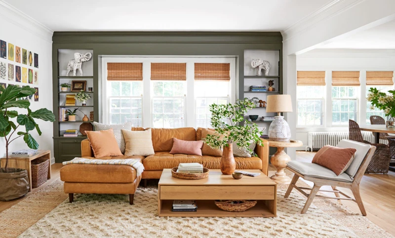
When it comes to decorating the living room with neutral colors, there are countless options to choose from. Neutral colors create a calming and peaceful environment in the living room, making it a welcoming space where family and friends can relax and unwind. The key is to select a color scheme that makes you feel comfortable and at ease.
One of the best and most popular color schemes for a neutral living room is black, white, and gray. This color combination creates a clean and sleek look while providing a sense of sophistication and refinement to the space. Another option is an all-white living room, which creates a bright and airy atmosphere, making the room appear bigger than it actually is.
For those who prefer a softer approach to neutral colors, beige, tan, and cream are great options. These colors are warm and inviting and create a cozy and relaxed atmosphere in the living room. Brown and taupe are also popular options, as they add a touch of warmth while still maintaining a neutral color palette.
To emphasize the neutral colors in the living room, it’s important to incorporate a variety of textures and patterns. Woven blankets, faux fur pillows, and knit throws can add depth and dimension to the space while also providing a cozy and comfortable atmosphere. The choice of furniture also plays a significant role in the overall look of the living room. Leather furniture, neutral-toned sofas, and wooden end tables and coffee tables all blend seamlessly together, creating a cohesive and stylish space.
When decorating the living room with neutral colors, it’s important to keep in mind that simplicity is key. Adding too many colors or patterns can overwhelm the space and detract from the calming environment that neutral colors provide. By selecting a color scheme that makes you feel comfortable and complementing it with the right textures and furniture, you can create a cozy and inviting living room that reflects your personal style.
| Color Scheme | Atmosphere Created |
|---|---|
| Black, White, and Gray | Clean, Sleek, Sophisticated |
| All-White | Bright, Airy, Spacious |
| Beige, Tan, and Cream | Warm, Inviting, Cozy |
| Brown and Taupe | Warm, Neutral, Stylish |
Bedroom
When it comes to decorating your bedroom with neutral colors, there are a few things to keep in mind to create a soothing and relaxing retreat. Here are some tips to help you get started:
- Choose the right shade: Consider using shades of beige, ivory, or gray to create a calming atmosphere in your bedroom. These colors are versatile and can be paired easily with other colors and patterns.
- Mix textures: Adding textures like a plush throw, fluffy rug, or woven basket can create depth and interest in a neutral bedroom. Mixing textures also helps prevent a monotonous look.
- Accessorize thoughtfully: Accessories such as throw pillows, artwork, or a statement lamp can amplify a neutral bedroom. Select items that complement your chosen color scheme and add interest without overpowering your space.
- Maximize natural light: Keeping your bedroom bright and airy can help make a low-key neutral bedroom feel more energetic. Opt for strategically-placed mirrors, sheer curtains, or light-colored bedding to maximize natural light in your room.
- Don’t skimp on comfort: Choosing the right bedding is essential to creating a comfortable and serene bedroom space. Invest in high-quality sheets, comforters, and pillows to add a luxurious touch to your room.
A neutral color scheme in your bedroom can create an overall calming vibe and promote a good night’s sleep. By following these tips and using the right shades, textures, and accessories, you can create a beautiful and peaceful bedroom retreat where you can relax and recharge.
Kitchen
The kitchen is often considered the heart of the home, a place where we cook, entertain and eat with family and friends. Choosing the right color scheme for this important space can have a significant impact on our mood and overall experience. Let’s take a look at some ideas for incorporating neutral colors in the kitchen.
Paint: One of the easiest ways to incorporate neutral colors in the kitchen is through the use of paint. Neutral shades of white, beige, and gray are classic choices that can provide a clean and timeless look. If you want to add some depth and warmth to the space, consider painting the walls a soft shade of taupe or khaki.
Cabinets and Countertops: Neutral shades of wood, such as oak or maple, can provide warmth and texture to the kitchen. Granite or marble countertops in neutral shades of beige or gray can also create a sleek and elegant look.
Backsplash and Flooring: A neutral-colored backsplash, such as white subway tile or a light-colored mosaic, can add visual interest without overwhelming the space. For flooring, consider using natural stone or light-colored wood.
Decor and Accessories: Adding pops of color through decor and accessories can help break up the neutral tones of the kitchen. Consider adding a colorful fruit bowl or vase of flowers on the countertop, or displaying colorful dishware on open shelving.
Lighting: Lighting can play a major role in how neutral colors are perceived in the kitchen. Natural lighting can bring out the warmth and texture of wood cabinets and countertops, while pendant lights or under-cabinet lighting can provide a warm glow that highlights the space’s details.
Incorporating neutral colors in the kitchen can create a calming and inviting atmosphere that is perfect for cooking, entertaining, and spending time with loved ones.
Bathroom
When it comes to using neutral colors in the bathroom, there are many creative ways to make this space feel both tranquil and visually appealing. Here are a few ideas for incorporating neutral tones in your bathroom decor:
- Tile: Choose neutral-toned tiles for your bathroom walls, floors, and shower areas. Whether you go for a classic white subway tile or opt for a warm beige or soft gray, neutral tiles create a clean, timeless look that can make even a small bathroom feel spacious and bright.
- Textiles: Add texture and warmth to your bathroom with soft, neutral-toned textiles like towels, bath mats, and shower curtains. Consider incorporating organic cotton or bamboo fabrics for a spa-like touch.
- Accessories: Use neutral accessories to tie your bathroom decor together. Think about natural wood accents, glass jars, white pottery, or stone soap dishes. These small touches can help create a cohesive and calming atmosphere.
While designing a neutral bathroom comes with many benefits, there are some drawbacks to be aware of as well:
- Lack of color: Without bright colors, it can be challenging to make a neutral bathroom feel visually interesting. To compensate, consider incorporating various textures and patterns to create visual interest.
- Too sterile: A bathroom with all neutral colors can sometimes feel too sterile or clinical. To combat this, consider using natural materials like wood or adding pops of color with decorative elements like plants or artwork.
When choosing and decorating with neutral colors in your bathroom, keep in mind these helpful tips:
- Play with contrast: Experiment with contrasting shades of neutral colors, such as pairing light gray walls with crisp white tiles or adding a black accent piece to a cream-colored room.
- Consider lighting: Neutral colors can look different in different lighting conditions. Take a sample of your chosen neutral color to your bathroom’s lighting to make sure you still like how it looks in every light.
- Use nature for inspiration: Neutral colors can mimic the natural tones and textures of nature. Look to outdoor scenes, such as a sandy beach or a forest of trees, to get ideas for colors and textures that will create a calming and inviting bathroom.
A neutral bathroom can create a calming, spa-like atmosphere that is perfect for a relaxing bath or a refreshing shower. By using these tips and tricks, anyone can create a neutral bathroom that is both soothing and stylish.
Benefits and Drawbacks of Neutral Colors

When it comes to choosing the color scheme for your home, neutral colors always seem to be a safe bet. They are versatile, timeless, and can create an elegant and sophisticated atmosphere. However, like any other color, there are both benefits and drawbacks to using a neutral color palette. Before you finalize your design plans, it’s important to understand how these colors could potentially affect your mood, and assess whether they will be suitable for your specific needs and preferences. Let’s dive deeper into the advantages and limitations of decorating with neutral hues.
Benefits
When it comes to the benefits of using neutral colors in your home, there are several distinct advantages to consider:
- Versatility: One of the biggest advantages of neutral colors is their versatility. Neutral shades such as beige, ivory, gray, and taupe can work well in a wide variety of aesthetics, from modern and minimal to more traditional or bohemian.
- Calming: Another major benefit of neutral colors is that they can have a calming effect on the mind and body. Unlike bright or bold hues that can be energizing or overwhelming, neutral tones can create a peaceful, relaxing environment that encourages rest and relaxation.
- Timelessness: Using neutral colors can have a timeless quality. Some trendy or fashionable colors may look dated after a few years, but classic neutral shades can remain both stylish and relevant for years to come.
- Flexibility: Neutral colors can be used in a variety of ways in your home, from wall paint to furniture, décor, and textiles. This flexibility can make it easier to decorate your space and change your style over time without needing to make major changes.
- Highlighting: Another benefit of neutral colors is that they can be used to highlight other design elements in your home, such as artwork, unique features, or architectural details. By keeping the backdrop neutral, these pieces can stand out and draw more attention.
Using neutral colors in your home can help create a calming and versatile space that will stand the test of time. Whether you prefer modern, bohemian, or traditional décor, neutral shades can serve as both a background and a highlight, making it easier to create a cohesive and stylish interior design.
Drawbacks
While there are many benefits to using neutral colors in home decor, there are also some drawbacks to consider before committing to an all-neutral color scheme. Below are some potential drawbacks of using neutral colors:
- Lack of Energy: Neutral colors may create a sense of calmness and tranquility, but they can also be perceived as boring or lacking energy. This can lead to a space feeling dull and unexciting.
- Difficulty Creating Contrast: Without the use of bold colors, it can be challenging to create visual contrast in a room with a strictly neutral color scheme. This means that furniture and decor pieces may blend in with the walls and floors, resulting in a lack of depth or dimension.
- Difficulty Achieving a Cozy Atmosphere: While neutral colors can create a sense of calmness, they can also make a space feel cold or impersonal if not properly balanced with warm accent pieces or textures.
- Stains and Dirt are More Visible: Neutral colors, especially lighter shades, can show stains and dirt more prominently. This can make upkeep more challenging, requiring more frequent cleaning or replacement of items.
- Can Look Sterile or Uninviting: An all-neutral color scheme can sometimes give off a clinical, sterile vibe which might make guests feel unwelcome. It’s essential to add personal touches, warm lighting, and interesting textures to help create a welcoming space.
These drawbacks don’t necessarily mean one should avoid using neutral colors in their interior design. However, it’s essential to consider these points when planning your color scheme and make sure the overall look and feel of the space align with your desired mood and atmosphere.
Tips for Choosing and Decorating with Neutral Colors
When it comes to decorating with neutral colors, there are some key tips that can help you create a cohesive and visually appealing space. Neutral colors may seem easy to work with, but the reality is that choosing the right shades and balancing them with other elements can be a challenge. In this section, we will explore some practical tips for selecting and decorating with neutral colors, and how to make the most of their subtle beauty. From choosing the right hues to using texture and accent pieces, these tips will help you create a space that feels calm, inviting, and effortlessly stylish. So, let’s dive in and discover how to master the art of decorating with neutrals!
Choosing the Right Neutral Colors
When it comes to choosing the right neutral colors, there are a few key things to keep in mind. Here are some tips to help you make the best decision for your space:
- Consider the size of the room: If you have a small space, you may want to choose lighter neutral colors, such as beige or pale gray. These lighter colors can make a small room feel more open and airy. On the other hand, larger rooms can handle darker neutral colors, such as charcoal or espresso.
- Think about the natural lighting: The amount of natural light in a room can also affect the way a neutral color appears. If your room gets a lot of natural light, you can choose a bolder or darker neutral color. But if your room is lacking in natural light, you may want to choose a more muted or lighter neutral color to avoid making the space feel too dark.
- Consider the undertones: Neutral colors can have undertones of other colors, such as blue, green, or pink. It’s important to consider these undertones when choosing a neutral color, as they can affect the overall mood of the room. For example, a gray with blue undertones can create a cooler, more calming atmosphere, while a beige with pink undertones can create a warmer, cozier feel.
- Think about the purpose of the room: The purpose of the room should also be considered when choosing a neutral color. For example, if you’re decorating a bedroom, you may want to choose a softer, more relaxing neutral color. But if you’re decorating a home office, you may want to choose a more energizing neutral color to help keep you focused and alert.
- Consider the existing decor: It’s important to consider the existing decor in the room when choosing a neutral color. You want to choose a neutral color that will complement the existing furniture and decor, rather than clash with it. If you’re starting from scratch and have yet to purchase any furniture or decor, you may want to choose a neutral color that will be versatile enough to work with a variety of styles and colors.
By keeping these tips in mind, you can choose the perfect neutral color to create the mood and atmosphere you desire in your home.
Decorating with Neutral Colors
When it comes to decorating with neutral colors, there are several things to keep in mind. Here are some tips to help you create a cohesive and stylish space using neutrals:
- Use different textures: Since neutral colors can sometimes lack visual interest, adding a variety of textures can help create depth and dimension in a room. Consider incorporating materials like wood, linen, velvet, or leather to add visual interest.
- Layer neutrals: To avoid a space feeling too bland, try layering different shades of neutrals. For example, pair a light gray sofa with a darker gray rug and cream-colored curtains. This can help create a sense of depth and visual interest without adding a lot of color.
- Add pops of color: While the basis of your decor may be neutral, adding pops of color can help create interest and draw attention to certain elements in a room. Consider adding a colorful piece of artwork, or incorporating colorful accessories like pillows or throw blankets to add visual interest.
- Experiment with patterns: Although neutrals are often associated with solids or subtle patterns, don’t be afraid to experiment with bolder patterns. A bold black and white striped rug, for example, can add a lot of visual interest in a neutral space.
- Accessorize carefully: When working with neutrals, it’s important to accessorize carefully. Too many accessories can overwhelm a neutral space, so choose a few carefully curated pieces that will add style and interest to the room.
By following these tips, you can create a stylish and cohesive space using neutral colors. Whether you prefer a minimalist aesthetic or a more layered look, neutrals offer a versatile and timeless approach to home decor.
Conclusion
As we wrap up our exploration of the psychology of neutral colors and their impact on our mood and home decor, it’s clear that these shades are much more than just a safe option. Their versatility and ability to create a calming, comforting atmosphere make them an excellent choice for almost any space. However, it’s essential to keep in mind that choosing the right hue and balance is crucial for the desired effect. With this in mind, let’s reflect on some key takeaways from our discussion.
Final Thoughts
After delving into the topic of neutral colors and their impact on our mood and emotions, it’s safe to say that these hues are more than just a simple choice in home decor. Neutral colors are calming, versatile, and timeless. They create a sense of balance and harmony in any space while allowing other decorative elements to shine.
However, when used excessively, neutral colors can create a dull and lifeless space. It’s important to strike a balance between neutrals and pops of color to prevent the room from feeling too monochromatic.
The key to using neutral colors effectively is understanding their psychological impact on our mood and emotions. Take the time to choose the right neutral hues that speak to your personal style and evoke your desired feelings. And, don’t forget to experiment with textures, patterns, and materials to add depth and interest to your neutral space.
Neutral colors are a powerful tool in interior design, capable of creating an inviting and harmonious environment that fosters a sense of tranquility and calm. With the right understanding and use, they can be an excellent choice for any room in the home.
| Benefits of Neutral Colors | Drawbacks of Neutral Colors |
|---|---|
| 1. Calming and Relaxing | 1. Can create a dull and lifeless space if used excessively |
| 2. Timeless and Versatile | 2. Lack of color can be seen as boring or uninspiring |
| 3. Create a sense of balance and harmony | 3. May not suit everyone’s personal style |
| 4. Allow other decorative elements to shine | 4. May not be suitable for high-traffic areas that require regular cleaning |
When it comes to choosing and decorating with neutral colors, remember to:
– Choose the right neutral colors that evoke the desired mood and style.
– Experiment with textures, patterns, and materials to add depth and interest.
– Strike a balance between neutral hues and pops of color to prevent the space from appearing monochromatic.
– Avoid overuse of neutral colors to prevent a lifeless and dull space.
Frequently Asked Questions
What makes a color neutral?
A color is considered neutral when it contains low saturation or intensity and tends to blend well with other colors.
What are the types of neutral colors?
There are four main types of neutral colors: white, black, gray, and brown.
What are the properties of neutral colors?
Neutral colors are often associated with sophistication, timelessness, and versatility. They tend to create a calming and relaxing atmosphere.
How does color affect mood?
Colors have a significant impact on our emotions and behavior. Bright colors tend to stimulate and energize us, while muted and neutral colors tend to calm and relax us.
What is the psychology behind neutral colors?
Neutral colors are often associated with balance, stability, and calmness. They can convey a sense of elegance and sophistication, and are often used in minimalist design.
How can neutral colors be used in home interiors?
Neutral colors can be used in a variety of ways in home interiors, from wall colors and furniture to decor and accessories. They can create a soothing and harmonious environment.
What are the benefits of using neutral colors in home interiors?
The benefits of using neutral colors in home interiors include creating a timeless and versatile design, as well as providing a calming and relaxing atmosphere. Neutral colors also tend to be easier to match with other colors and styles.
What are the drawbacks of using neutral colors in home interiors?
The drawbacks of using neutral colors in home interiors include the risk of creating a bland or uninteresting design if not executed correctly. Neutral colors can also appear dull if not paired with other interesting textures or patterns.
How can I choose the right neutral colors for my home?
When choosing neutral colors for your home, consider the existing decor, natural lighting, and the mood you want to create. Cool grays and blues can create a calming atmosphere, while warm beiges and browns can evoke a sense of warmth and comfort.
What are some tips for decorating with neutral colors?
Some tips for decorating with neutral colors include incorporating interesting textures and patterns, using accent colors to add interest, and creating contrast with darker and lighter shades of neutrals. Additionally, don’t be afraid to play with different textures like natural fibers, metals, and woods!