Imagine entering a space where the hues are so perfectly harmonized that you instantly feel at ease. This is the power of a well-thought-out home color scheme. It’s not just about picking your favorite shades; it’s about creating a cohesive palette that enhances the beauty and functionality of your living space.
Understanding the 70 20 10 Color Rule in Interior Design
The Basics of the 70 20 10 Rule
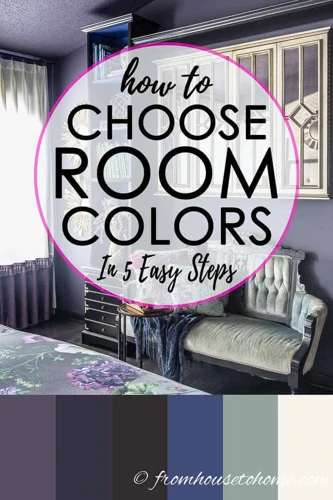
The 70 20 10 color rule is a classic principle in interior design that helps create a balanced and visually appealing space. It suggests that 70% of your room should be in a dominant color, 20% in a secondary shade, and the remaining 10% should feature an accent color. This formula ensures that colors are distributed in a way that creates harmony and depth.
Applying the 70 20 10 Rule in Different Rooms
Each room of your home serves a different purpose and thus, may evoke different moods. In a living room, you might choose a soothing neutral as your dominant hue, a complementary soft tone for furnishings, and a pop of color in accessories. A bedroom, on the other hand, could afford to play with more serene accent colors to promote relaxation.
Choosing a Color Scheme for Your Home
Starting With Inspiration
Embarking on choosing a color scheme for your home can feel daunting. Start by gathering inspiration — be it from nature, art, or fashion. Let these palettes guide you towards a scheme that reflects your personal style and the atmosphere you want to create in your home.
Considering Color Undertones
Undertones are the subtle, underlying hues in colors that can significantly affect how they pair together. Warm undertones can make a space feel cozy, while cool undertones offer a sense of calm. Paying attention to these nuances is crucial when curating your color scheme.
Implementing the 70 20 10 Rule in Your Home
Selecting Your Dominant, Secondary, and Accent Colors
When implementing the 70 20 10 rule interior design principle, start with the dominant color, which will serve as the backdrop for your room. Next, decide on the secondary color that will support the main hue. Finally, choose an accent color that will bring a touch of personality and vibrancy to the room.
Repeating Colors for Cohesion
Repeat your chosen colors throughout the space for a sense of cohesion. The repetition can come through various elements such as textiles, artwork, or furniture. This strategy helps to unify the room and make the color scheme feel intentional.
Practical Tips for Choosing Your Home’s Color Palette
Using Textiles and Decor as Color Inspiration
Textiles and decor pieces are excellent starting points for your palette. A beloved throw pillow or an heirloom rug can contain a range of colors to inspire your home’s color scheme. Build upon these existing items to create a cohesive look.
Understanding the Impact of Lighting on Colors
Lighting can dramatically alter the appearance of colors. Natural daylight shows the truest color, while incandescent lighting brings out warm tones, and fluorescent lighting casts a sharp blue tone. Test your colors in different lighting conditions to ensure they work harmoniously in your space.
Room-by-Room Guide to the 70 20 10 Rule
Creating Harmony in Shared Spaces
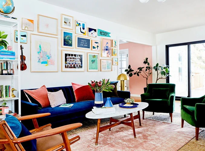
In shared spaces like the living room or kitchen, the 70 20 10 rule can help create a balanced and welcoming atmosphere. Use the dominant color for walls and large furniture pieces, the secondary color for smaller furniture and curtains, and the accent color for decorative items and artwork.
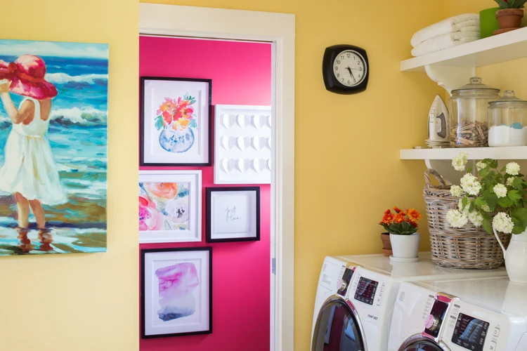
Personalizing Private Areas with Color
Private areas like bedrooms and bathrooms offer a canvas to reflect personal tastes. While still applying the 70 20 10 rule, you can opt for more daring or subdued colors based on your preferences, creating a sanctuary that feels uniquely yours.
Advanced Color Scheme Strategies
Incorporating Trends Without Compromising Timelessness
While it’s tempting to embrace the latest color trends, it’s important to consider longevity. Use trendy hues in your accent color for easy updates down the line, and stick with classic shades for your dominant and secondary colors to ensure your scheme stands the test of time.
Balancing Warm and Cool Tones
A mix of warm and cool tones can add dimension to a space. Warm tones, like reds and yellows, bring energy, while cool tones, like blues and greens, are calming. Striking the right balance depends on the mood you want to set in each room.
When designing the perfect home, color choice is paramount in creating a harmonious and aesthetically pleasing environment. If you’re looking to master the art of color coordination within your living space, we have several resources that could guide you through the process. Discover the secrets to a perfect color flow in your home, which is essential for a balanced and inviting atmosphere. For those focusing on the private sanctuary of sleep, our article on cool color schemes for the bedroom can provide inspiration for a tranquil retreat. And for general tips to ensure your color choices complement each other beautifully, don’t miss our advice on home color scheme tips. Together, these resources will help you create a cohesive and serene space that you’ll love coming home to.
Conclusion: Bringing Your Color Scheme to Life
Creating the perfect home color scheme is a journey of discovery and creativity. By understanding and applying the 70 20 10 rule, seeking inspiration, and considering the nuances of color and light, you can craft a space that is both aesthetically pleasing and deeply personal. Remember, the colors you choose will set the tone for your home, so choose wisely and enjoy the process of bringing your vision to life.