Have you ever walked into a room and instantly felt a certain emotion? Perhaps it was a sense of calm from the cool blue walls or a burst of energy from the vibrant red accents. It’s no secret that colors have a powerful effect on our mood and emotions. This is why understanding color psychology can be so important when it comes to choosing the right paint colors for your home. In this article, we will explore the basics of color psychology, delve into the meanings behind some of the most popular paint colors, and provide a step-by-step guide to help you choose the perfect colors to suit your mood and personality.
The Basics of Color Psychology
Understanding color psychology is essential to choosing the right paint colors for your home. Colors have a powerful effect on our mood, emotions, and even physical responses, and it’s important to consider these factors when deciding on a color scheme for a space. In this section, we will delve into the basics of color psychology, exploring what it is and how it affects our brain. By the end of this section, you will have a better understanding of why certain colors are more popular than others and how they can impact your home’s atmosphere. To learn more about incorporating trending paint colors into your home decor, check out our article on how to incorporate trending paint colors into existing decor.
What is Color Psychology?
Color Psychology is the study of how colors affect a person’s thoughts, emotions, and behavior. It is the reason why certain colors make us feel calm, while others evoke different emotions easily. When we see a specific color, it triggers a response from our brain subconsciously, and that reaction can be different from person to person.
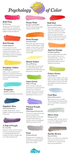
According to color psychology, each color has its unique meaning and purpose. The following table provides an overview of what each color represents:
| Color | Meaning |
|---|---|
| Red | It is associated with passion, energy, and urgency. It can also increase appetite and raise blood pressure. |
| Blue | It is often associated with calmness, intelligence, and trustworthiness. It can also suppress appetite, making it a good choice for kitchens or dining rooms. |
| Yellow | It is often associated with optimism, happiness, and warmth. It can also increase mental activity and stimulate appetite, making it an excellent option for use in kitchens. |
| Green | It is often associated with nature, tranquility, and safety. It can also reduce eye strain, making it a great option for home offices or reading rooms. |
| Pink | It is often associated with romance, femininity, and tenderness. It can also soothe and calm the mind, making it a great color choice for bedrooms or living rooms. |
| White | It is often associated with cleanliness, simplicity, and purity. It also provides a blank slate and can allow other colors in the room to stand out. |
| Gray | It is often associated with sophistication, neutrality, and balance. It can also create a calming and relaxing mood, making it a great choice for any room. |
| Black | It is often associated with power, elegance, and drama. However, overuse of black in a room can create a heavy and dark look, so it’s essential to use it in moderation. |
Understanding the psychology of colors is crucial in selecting the right paint color for your home. The color you choose can affect your mood, feelings, and behavior. So, it’s essential to choose the right paint colors to achieve the desired effect.
You can read more about decorating with trending paint colors and tips at /decorating-trending-paint-colors-tips/.
How Does Color Affect Our Brain?
Color affects our brain in many ways, and it can have a significant impact on our mood, behavior, and emotions. Here are some of the ways in which color affects our brain:
- Emotional Response:
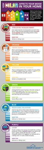
The colors we see can evoke strong emotions and have a direct impact on our mood. For example, warm colors like red, yellow, and orange can create feelings of warmth, excitement, and happiness, while cool colors like blue and green can create a sense of calm and relaxation. - Memory and Attention:
Color can also affect our memory and attention. Bright, bold colors can grab our attention and help us remember things more easily, while softer, muted colors can help us focus and concentrate better. - Physical Reaction:
Certain colors can even have a physical effect on our bodies. For example, seeing the color red can increase our heart rate and blood pressure, while blue can have a calming effect and lower our heart rate. - Cultural and Personal Associations:
Finally, the way we perceive color can be influenced by cultural and personal associations. For example, in Western cultures, white is often associated with purity and innocence, while in Asian cultures, it is associated with death and mourning. Likewise, a person’s past experiences and memories can also influence how they perceive different colors.
Understanding how color affects our brain can be key in choosing the right paint color for a room. This knowledge can also help explain why certain colors are trending in home design. You can explore the most popular paint colors of 2021 in this article. Whether you’re looking to create a modern look with trending paint colors for small spaces, or hoping to achieve a cozy feel with home trending paint colors, keeping color psychology in mind can help you make the right choice.
The Most Popular Paint Colors: What They Say About You
As we all know, colors play a pivotal role in how we feel about a space. They can inspire and uplift us, or make us feel calm and relaxed. That’s why choosing the right paint color for your home is so important. In this section, we will discuss the most popular paint colors and what they say about your personality and mood. We’ll explore the meanings behind colors such as red, blue, yellow, green, pink, white, gray, and black. Understanding the psychology behind these colors can help you create a space that reflects your personality and meets your specific needs. So, let’s dive into the world of color psychology and explore what your favorite paint colors say about you. If you’re interested in finding more about trending paint colors for a modern look, check out our recent article. Or, if you’re looking for paint colors for small spaces, our latest guide has got you covered.
Red
Red is a bold and attention-grabbing color that can evoke strong emotions. It is associated with passion, energy, and excitement. Using red in your home can be a statement of confidence and boldness.
Pros:
- Red can increase energy levels and stimulate conversation, making it a great color for social spaces like living rooms and dining rooms.
- It can also boost self-confidence and create a sense of power, making it a good choice for home offices and workout spaces.
- Red can even increase appetite, which is why it is often used in restaurants and kitchens.
Cons:
- In some cultures, red is associated with danger and warning, so overuse of the color can create a sense of alarm or anxiety.
- Red can also be over-stimulating and cause aggression, making it unsuitable for bedrooms or spaces meant for relaxation.
- It can make rooms appear smaller and darker, which could be an issue in smaller spaces or rooms with limited natural light.
If you want to incorporate red into your home decor, consider using it as an accent color rather than painting entire walls red. This will allow you to enjoy the color’s benefits without overwhelming the space. Pairing red with neutral colors like white or gray can also help balance out the intensity of the color.
Blue
Blue is a popular color for both residential and commercial spaces, with many interior designers using it as their go-to color. Its calming and relaxing properties make it perfect for bedrooms and bathrooms, but it can also be used to create a serene workspace.
Positive Associations with Blue:
Blue is often associated with feelings of serenity and calmness, as well as stability and trust. It is also frequently associated with the sea and sky, creating a tranquil atmosphere in a space.
Negative Associations with Blue:
While blue is typically seen as a positive and soothing color, it can also be associated with sadness and depression, particularly in darker shades.
| Shade of Blue | Positive Associations | Negative Associations |
|---|---|---|
| Pale Blue | Calmness, Tranquility, Serenity | N/A |
| Sky Blue | Freshness, Openness, Freedom | N/A |
| Turquoise | Refreshment, Clarity, Creativity | N/A |
| Teal | Stability, Professionalism, Sophistication | N/A |
| Navy Blue | Trustworthiness, Confidence, Intelligence | Sadness, Depression |
Best Uses for Blue:
With its calming and tranquil properties, blue is a popular choice for bedrooms and bathrooms, as well as offices and workspaces. It can also be used in living rooms and other communal spaces to promote a relaxing atmosphere.
When choosing between shades of blue, it’s important to consider the purpose of the room and the atmosphere you want to create. For a calming effect, lighter shades of blue like pale or sky blue are great choices. On the other hand, darker shades like navy blue should be used sparingly, and may be better suited for accent walls or furniture rather than as the main color of a room.
Yellow
The color yellow is often associated with happiness, optimism, and energy. In color psychology, it is believed to stimulate the nervous system and encourage communication. Here are some things to consider when choosing yellow as your paint color:
- Yellow paint can make a room feel brighter and more welcoming.
- But be careful not to overdo it: too much yellow can overstimulate the brain and create feelings of anxiety and irritability.
- If you want to use yellow as a dominant color in a room, consider using a lighter shade and pair it with neutral colors or soft pastels to balance out the intensity.
- Yellow is a great color for spaces where you want to inspire creativity and positive energy: think art studios, playrooms, or home offices.
- For bedrooms, use softer shades of yellow to create a cozy and nurturing environment.
- If you’re unsure about using yellow as a main color in a room, consider using it as an accent: yellow throw pillows, curtains or decorative pieces add pops of color without overwhelming the space.
Yellow can be a great choice for painting a room and creating a lively, optimistic atmosphere. But it’s important to be mindful of how much yellow you use, as too much can create feelings of anxiety and overstimulation. Consider balancing your yellow with neutral colors or pastels, or using it as an accent color in your decor.
Green
Green is a versatile color that has many shades, and each shade can evoke a different mood or feeling. From lush, deep greens to soft, pastel tones, green is a color that can have both calming and energizing effects. Let’s take a closer look at the psychology of the different shades of green.
| Shade | Feeling | Personality Traits |
|---|---|---|
| Deep green | Calm, balance, harmony | Growth, stability, reliability |
| Olive green | Warmth, natural, earthy | Wisdom, peace, nature lover |
| Emerald green | Fresh, vibrant, luxurious | Prosperity, elegance, confidence |
| Mint green | Refreshed, soothing, peaceful | Cheerful, optimistic, youthful |
| Chartreuse green | Energetic, playful, bold | Creativity, individuality, spontaneity |
As you can see, different shades of green can create different atmospheres in a room. If you are looking for a calming and balanced space, deep green may be the best option for you. For a more natural and earthy feel, olive green may be your choice. If you want to add a touch of luxury and elegance to a space, emerald green may be a great option. And for a cheerful and optimistic feel, mint green or chartreuse green may be what you’re looking for.
It’s important to consider the other colors in the room when choosing a shade of green. Green can complement many other colors, such as gray or beige, but it can clash with others, such as red or purple. The lighting in a room can also affect how a shade of green looks, so it’s important to test paint samples in the room before making a final decision.
Green is a great color to consider when choosing a paint color. With so many different shades and moods to choose from, it’s easy to find a shade that fits your personality and style.
Pink
Pink is a color that is often associated with femininity and sweetness. However, its psychological effects can be much more complex than that. Here are some of the ways that pink can affect your mood and personality:
- Calming: Light shades of pink can create a calming and soothing atmosphere. This is because pink is a more subdued version of red, which is known to stimulate the senses.
- Warmth: Pink can also create a feeling of warmth and comfort. This is especially true of darker shades of pink, which can be reminiscent of a warm fire or a cozy sweater.
- Nurturing: Pink is often associated with nurturing, compassion, and love. This is likely because of its connection to motherhood and the nurturing instinct that comes with it.
- Romance: Finally, pink is often associated with romance and love. This is because of its association with femininity and the traditional color palette of Valentine’s Day.
Pink can be a very versatile color that can create a range of different moods and emotions depending on how it is used. So, whether you’re looking to create a calming bedroom or add a touch of romance to your living room, pink might be the perfect choice for you.
White
White is a popular color choice for many homeowners, and for good reason. This color conveys a sense of purity and cleanliness, and it can help to make a space feel more open and spacious. However, the psychology of white is not always so simple.
Positive Associations:
The color white is often associated with purity, innocence, cleanliness, and simplicity. It can create a sense of peace and calm in a room, and it can also help to reflect light, making a space appear brighter and more open.
Negative Associations:
White can also be associated with emptiness, insipidity or sterility, and it can lack depth or character if not paired properly. On the other hand, bright white can feel cold or clinical if it is not tempered with other colors or textures.
Who Does it Suit:
White is a versatile color that can work well in any space, no matter the room or style. It is often used as a base color or a neutral backdrop, making it the ideal choice for those who like to change up their decor frequently. White is also a great color for minimalists who want to create calm, uncluttered spaces.
Where to Use it:
White is a great choice for any room in the house. It can work particularly well in kitchens and bathrooms, where it can add to the feeling of cleanliness and openness. White in bedrooms is great for those who want to create a cozy and peaceful space, and it’s particularly suitable for a child’s room, where it can create an illusion of more space.
How to Use it:
White can be used in a variety of ways throughout your décor. Depending on your style and preferences, you can use it as the primary color or as an accent to other shades. You can use different textures and materials to add depth and character to the space, such as wood or metal.
White is a great color choice for those who want to create clean, airy spaces. However, it’s important to keep in mind that it can be a bit tricky to work with. By focusing on texture and balance, and by layering in other colors and materials, you can create a space that is not only beautiful but also functional and comfortable.
Gray
Gray is a color that is often associated with neutrality, practicality, and sophistication. It is a popular choice for both traditional and modern interiors. When it comes to paint colors, gray can be a versatile option that can evoke a range of emotions and moods depending on the shade and undertones.
Light gray: Light gray can create a calming and serene atmosphere, and it is a popular choice for bedrooms and bathrooms. It can also make a small room appear larger.
Warm gray: Warm gray has undertones of yellow, brown or pink, which can create a welcoming and inviting ambiance. It is a great choice for social spaces such as living rooms or dining rooms.
Cool gray: Cool gray has undertones of blue or green, which can create a more modern and sophisticated look. It is a popular choice for offices and home libraries.
Charcoal gray: Charcoal gray is a dark and dramatic shade that can add depth and complexity to a space. It is a popular choice for accent walls or for creating a moody atmosphere.
When choosing gray for a space, it is important to consider the room’s lighting and decor. Gray can often appear different under various lighting conditions, so it is important to test paint samples in the space before committing to a color.
Gray is a versatile and timeless color choice that can suit a range of moods and styles. It is a great option for creating a neutral backdrop that can be easily accented with pops of color, textures, and patterns.
Black
Black is a timeless color that is often associated with sophistication and elegance. However, its use as a wall color can be tricky since it can easily overwhelm a space if not used correctly. Here are some things to keep in mind if you want to incorporate black into your paint color selection:
- Mood: Black has a reputation for being a moody and intense color. It is often associated with feelings of power, mystery, and drama. Depending on the shade of black you choose, it can create a cozy and intimate atmosphere or a sleek and modern one.
- Personality: Black is often preferred by those who value elegance and simplicity. It takes confidence to embrace such a bold and daring color on the walls, and those who do often have a strong sense of self and a love of sophistication.
- Room: Black can work well in various rooms in the house, but it’s essential to consider the amount of natural light in the room. Since black absorbs light, it can make a space feel smaller and darker if used in a room with little natural light. However, if used strategically in a room with ample natural light, it can create a dramatic and chic statement.
- Accents: Since black can carry such a strong presence, incorporating it as an accent rather than a wall color may be a better choice for many. Consider adding black through decor elements like furniture, textiles, or artwork. This approach allows you to experiment with the color without fully committing to it as a wall color.
Black can be a daring and exciting color choice for your walls. If you’re unsure about using it as a wall color, try incorporating black accents to see how it feels in your space first. With the right lighting and decor, black can create an elegant and sophisticated atmosphere that makes a statement.
How to Choose Paint Colors That Suit Your Mood and Personality
Choosing the paint colors for your space can be overwhelming. You want to make sure the colors match your mood and personality, but where do you start? In this section, we’ll explore some steps you can take to choose paint colors that suit your unique self. By following these guidelines, you’ll be able to create a space that feels just right. So, let’s dive in!
Step 1: Identify Your Goals for the Space
One of the key factors in choosing a paint color for a room is identifying your goals for the space. This involves considering the room’s function, who will be using the room, and what emotions you want to evoke in the space. Before you start looking at paint swatches or picking out trendy colors, take some time to think about these key factors.
Function: Consider how you will be using the space. Is it a bedroom meant for relaxation? A kitchen meant for cooking and socializing? A home office meant for productivity? The function of the room should guide your color choices.
Users: Who will be using the space? Is it a shared space, like a family room or living room, where multiple people have differing opinions on color? If so, you may need to find a color that everyone can agree on. If it’s a personal space, like a bedroom, you can choose a color based purely on your own preferences.
Emotions: What emotions do you want to evoke in the space? Do you want it to feel calm and serene or energizing and invigorating? Different colors can have different psychological effects on mood, so it’s important to choose a color that aligns with the emotions you want to evoke in the space.
Consider these factors and write down your goals for the space in an html table for easy reference:
| Function: | Consider how you will be using the space. |
|---|---|
| Users: | Who will be using the space? |
| Emotions: | What emotions do you want to evoke in the space? |
By identifying your goals for the space, you can approach the process of choosing a paint color in a more thoughtful and intentional way, ultimately creating a space that feels cohesive and aligned with the intended function, users, and emotions you want to evoke.
Step 2: Consider the Room’s Lighting
When choosing a paint color, it’s important to take the room’s lighting into consideration. The amount and type of light in a room can greatly impact how a color looks on the walls.
To get an idea of how the color will look in different lighting situations, it’s recommended to view paint swatches in the room during different times of day. This will allow you to see how the natural light changes throughout the day and how it affects the color.
It’s also important to consider the type of lighting fixtures and bulbs in the room. Warm-toned bulbs can make colors appear more yellow or brown, while cool-toned bulbs can make colors appear more blue or green.
The direction of the lighting in the room can also make a difference in how a color looks. North-facing rooms tend to receive cooler light and can make colors appear more blue or gray, while south-facing rooms receive warmer light and can make colors appear more yellow or red.
To make sure the color looks the way you want, it’s a good idea to paint a test patch on the wall and observe it in different lighting situations. This will give you a better idea of how the color looks in the specific space’s lighting.
Consider the following factors when thinking about the room’s lighting:
| Factor | Importance |
|---|---|
| Amount of natural light | High |
| Type of lighting fixtures and bulbs | High |
| Direction of the lighting | Medium |
Step 3: Look at Inspiration Photos
When deciding on paint colors for a room, it can be helpful to look at inspiration photos to get a sense of what colors and palettes you are drawn to. This can be especially useful if you feel stuck or unsure about which direction to go with your color choices.
Here are some tips to keep in mind when looking at inspiration photos:
| Tips for Finding Inspiration Photos |
|---|
| 1. Use Pinterest or other online resources to search for photos that align with your vision for the space. Save the images you like to a specific board or folder so you can easily reference them later. |
| 2. Look for inspiration within the room you are painting. For example, if you are painting a bedroom, look for photos of bedrooms to get a sense of color palettes and styles that work well in that space. |
| 3. Consider the mood you want to create in the room. If you want a calming atmosphere, look for photos with soft blues, greens, and grays. If you want a more energetic space, look for photos with bold, bright colors. |
| 4. Don’t limit yourself to photos of rooms. Look for inspiration in nature, art, fashion, and other areas to find unique and interesting color combinations. |
| 5. Take note of the colors that consistently catch your eye. This can help you narrow down your choices and make a final decision. |
Remember, don’t feel pressure to copy inspiration photos exactly. Use them as a starting point for your own creativity and personal taste.
Step 4: Test Paint Samples in the Space
When it comes to choosing paint colors for a space, it’s important to test paint samples in the actual space to see how the colors look in different lighting conditions throughout the day. Here are some tips for testing paint samples in the space:
1. Get Sample Paint Pots: Most paint brands offer sample pots of their paint colors. Buy sample pots of the colors you’re considering and paint small sections of the wall to see how the colors look in the space.
2. Paint the Samples Directly on the Wall: Instead of painting poster boards or other surfaces, paint the samples directly on the wall. This will give you a better idea of how the color will look in the space and in different lighting conditions.
3. Test the Colors in Different Lighting Conditions: It’s important to test the paint samples in different lighting conditions throughout the day. See how the colors look in natural daylight, in the morning, afternoon, and evening, and with artificial light sources like lamps and overhead lights.
4. Consider the Colors in Combination with Other Elements: Take a look at how the paint samples look in combination with other elements in the space like furniture, flooring, curtains, and decor. The paint color should complement the other elements in the room and create a cohesive look.
5. Live with the Samples for a Few Days: After testing the paint samples in the space, live with them for a few days before making a final decision. This will allow you to see how the colors look in different lighting conditions throughout the day, and how they make you feel in the space.
Testing paint samples in the actual space may take some time and effort, but it’s worth it to ensure that you choose a color that you’ll be happy with for years to come.
Step 5: Choose a Color That Makes You Feel Good
When it comes to choosing a paint color for your room, it’s essential to pick a color that makes you feel good. This final step is all about trusting your instincts and choosing a color that evokes the right emotions and feelings for you.
Here are some tips to keep in mind when choosing a color that makes you feel good:
| Consider your personality and style: | Are you drawn to bright and bold colors, or do you prefer soft and subtle hues? Consider your personal style and how it might influence your color choices. |
| Pick a color that matches your goals for the space: | Think about the intended use of the room and the emotions you want to evoke. If you want to create a tranquil, relaxing space, consider a soothing shade of blue or green. |
| Think about the impact of the color on your mood: | Colors can have a powerful effect on our emotions and mood. If you want to feel energized and upbeat, consider a bold shade of red or orange. |
| Consider the room’s existing decor: | Think about the colors that are already in the room, including furniture, bedding, and accessories. Choose a color that complements these existing pieces. |
| Test the color before you commit: | Paint swatches can look very different in different lighting conditions. Before you commit to a color, be sure to test it on the wall and observe how it looks throughout the day. |
Keep in mind that color is a personal choice, and what makes you feel good may not be the same for someone else. Trust your instincts, and choose a color that speaks to you and evokes the emotions and feelings you want to experience in your space.
Conclusion
In conclusion, it’s important to understand the impact that color has on our mood and the psychology behind it. The color of a room can affect our emotions, behavior, and overall well-being. Color psychology is a complex field that studies the influence of colors on human behavior and mental processes.
The most popular paint colors can say a lot about our personality and mood. Each color has a unique meaning and can evoke different emotions. For example, red is often associated with passion and excitement, while blue is known for its calming and soothing properties.
When choosing paint colors, it’s important to consider your personal goals for the space and the lighting of the room. Looking at inspiration photos and testing paint samples can also help you find the perfect color to suit your mood and personality.
Remember, the color of a room is not the only factor that affects our mood. Other elements such as lighting, furniture, and decor can also impact our emotions. By understanding the psychology of colors and paying attention to how they make us feel, we can create spaces that promote positive energy and well-being.
Frequently Asked Questions
What is the significance of color psychology?
Color psychology is an area of study that focuses on how colors affect human behavior and emotions. It is a fascinating tool that can help individuals enhance their well-being, mood, and productivity in different settings.
What are the primary colors that affect our mood?
The primary colors that affect our mood are red, blue, green, yellow, pink, white, gray, and black.
How do different colors impact our brain?
Different colors have distinctive psychological effects on our brain, activating various parts of the brain and stimulating different emotions, thoughts, and behaviors. For example, blue is known to have a calming effect, while red tends to bring excitement and energy.
What does the color red signify?
The color red signifies passion, stimulation, and energy. It is often associated with love, power, and intensity.
What feelings does the color blue evoke?
The color blue evokes feelings of calmness, serenity, and relaxation. It is often associated with trust, loyalty, and stability.
What mood does the color yellow create?
The color yellow creates a mood of optimism, joy, and happiness. It is often associated with positivity, creativity, and warmth.
What is the effect of the color green on our mood?
The color green has a calming and balancing effect on our mood. It is often associated with nature, growth, and harmony.
What does pink represent in color psychology?
Pink represents compassion, love, and nurturing. It is often associated with a caring and supportive personality.
What does the color black symbolize?
The color black symbolizes elegance, sophistication, and mystery. It is often associated with power, authority, and formality.
What steps can we take to choose paint colors that match our mood and personality?
To choose paint colors that match our mood and personality, we need to identify our goals for the space, consider the room’s lighting, look at inspiration photos, test paint samples in the space and choose a color that makes us feel good.