When we discuss interior design, architecture, or even photography, the term ‘color temperature’ often surfaces, playing a crucial role in the aesthetics and functionality of spaces. In essence, it refers to the hue and tone of light emitted from a source, profoundly impacting the atmosphere and perception of an environment.
Defining Color Temperature and the Kelvin Scale
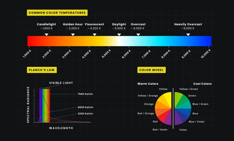
To comprehend this concept, it’s imperative to understand the Kelvin scale lighting, a numerical value that quantifies the appearance of light. Measured in degrees Kelvin (K), this scale ranges from warm, reddish tones to cool, blueish whites. For instance, candlelight, with its warm, inviting glow, sits at the lower end of the spectrum, around 2000K, while the midday sun, with its stark, brilliant luminance, would be near 5500K or higher.
Warm vs Cool Light: Characteristics and Comparisons
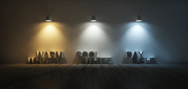
Delving into the nuances of warm vs cool light reveals that each brings its unique characteristics. Warm light, typically below 3000K, creates a cozy, relaxed feeling, often used in living rooms and bedrooms. In contrast, cool light, which exceeds 4000K, is associated with clarity and alertness, making it ideal for offices and commercial spaces.
The Impact of Color Temperature on Lighting Mood and Atmosphere
Not only does color temperature influence visual perception, but it also shapes the emotional responses of individuals in various settings. The lighting mood can be tailored to evoke specific feelings, from tranquility to vitality.
Creating Ambiance with Warm Lighting
Warm lighting is synonymous with comfort and serenity, often utilized to craft an inviting ambiance. Its golden hues are perfect for intimate settings where relaxation is paramount, lending spaces a soft, welcoming aura that encourages unwinding and socializing.
Setting a Productive Tone with Cool Lighting
Conversely, cool lighting is the go-to for areas requiring focus and energy. Its resemblance to daylight boosts concentration and productivity, making it the preferred choice in work environments and educational institutions where performance is key.
Color Temperature in Photography: Capturing the Perfect Light
For photographers, mastering color temperature in photography is essential. It’s a powerful tool that can transform the narrative and emotion conveyed through an image.
Adjusting White Balance for Accurate Color Depiction
Adjusting the white balance is pivotal in rendering colors accurately. This process compensates for the color temperature of the light source, ensuring that whites are rendered true to life, which in turn makes all other colors in the photograph look natural.
Choosing the Right Color Temperature for the Desired Photographic Effect
Selecting the appropriate color temperature can enhance the storytelling aspect of photography. A cooler temperature might be used to convey a bleak, desolate landscape, while a warmer one might paint a scene with nostalgia or romance.
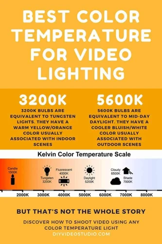
Practical Applications of LED Color Temperatures
LED technology has revolutionized how we utilize color temperature. With LED color temperatures spanning a broad range, these lights are incredibly versatile for various applications.
LED Color Temperature Options and Their Uses
- 2700K – 3000K: Ideal for residential interiors, creating a warm, inviting space.
- 3500K – 4100K: Suited for kitchens and bathrooms where tasks require more precise lighting.
- 5000K – 6500K: Best for commercial and industrial settings where high visibility is essential.
Color Temperature Adjustment for LED Lighting
With advancements in technology, color temperature adjustment is now a feature in many LED solutions, allowing users to change the ambiance of a room with the touch of a button. This flexibility is invaluable in adapting to different activities and times of the day.
Light Quality and Its Relationship with Color Temperature
Light quality is a multifaceted concept that goes hand in hand with color temperature. It influences how we perceive our surroundings, both aesthetically and functionally.
How Color Temperature Influences Perceived Light Quality
The color temperature of a light source can significantly affect how we perceive light quality. For example, a warm light can make a space feel more intimate and comfortable, while a cool light might render it more sterile or uninviting.
Measuring Light Quality: Beyond the Kelvin Scale
However, assessing light quality extends beyond just the Kelvin scale. Factors like Color Rendering Index (CRI) and luminous efficacy also contribute to our evaluation of light, affecting everything from mood to visual comfort and task performance.
Ambient Lighting and Its Color Temperature Considerations
Ambient lighting serves as the foundational layer of illumination in a space. It is essential to strike the right balance in its color temperature to complement the area’s purpose and design.
Designing with Ambient Light in Mind
Designing with ambient lighting in mind requires a thoughtful approach. It sets the stage for additional layers of lighting and should align with the room’s function and aesthetic. A harmonious blend of light sources can enhance the overall atmosphere.
Harmonizing Ambient Lighting with Space and Function
Harmonizing ambient lighting with a room’s space and function involves considering the color temperature’s influence on mood and activity. For instance, a library might benefit from warmer tones to create a relaxed reading environment, whereas a home office might thrive under cooler, daylight-mimicking illumination.
When it comes to achieving the perfect ambiance in any space, understanding the impact of color temperature and lighting is crucial. Our article on the accuracy of color samples under different lighting conditions delves into how lighting can alter the perception of colors in your environment. Additionally, for those interested in the technical aspects of paint colors, our write-up on light reflectance values (LRVs) of paint colors is a must-read. It’s not just about aesthetics, though; the choice of paint can also have an environmental angle. Our discussion on the environmental impact of oil-based paints explores the ecological considerations you should be aware of when selecting your materials. Together, these articles provide a comprehensive look at how light and color interact and the broader implications of your color choices.
Conclusion: Balancing Color Temperature for Optimal Lighting Effects
In conclusion, the strategic balance of color temperature is paramount for achieving optimal lighting effects. Whether it’s enhancing the ambiance of a room, improving productivity, or capturing the perfect photograph, understanding and manipulating color temperature can profoundly influence our visual and emotional experiences. By considering the principles outlined here, one can master the art of lighting and create spaces that are not only visually appealing but also functionally tailored to their intended purpose.