As we step into any room, one of the first things we notice is the color scheme. The colors used in a space can set the mood, create a sense of harmony, and reflect the personality of those who inhabit it. It seems like choosing the right colors is a daunting task, but don’t worry, we’re here to help. In this article, we’ll discuss classic color combinations that have stood the test of time and provide tips on how to use them effectively. Whether you’re looking to revamp your living room or just want to add a pop of color to your kitchen, this guide will help you create timeless interiors that you’ll love for years to come. So let’s get started!
The Importance of Color in Interior Design
Color plays a crucial role in interior design, affecting the overall look and feel of a space. When considering a decorating project, color should be one of the main components to carefully select. Not only does it have the power to completely transform a room and create a certain atmosphere, but also has the ability to influence emotions and behaviors. Understanding the fundamentals of color theory and the psychological effects of color can help homeowners make informed decisions that will result in a harmonious and timeless interior design. In this section, we will explore the significance of color in interior design and its impact on the different rooms of your home, as well as some tips for choosing the right color combinations.
The Basics of Color Theory
Color theory is the foundation for creating beautiful and harmonious color combinations in interior design. Understanding the basics of color theory will help you create the perfect color palette that will reflect your style and personality. The primary colors in color theory are red, blue, and yellow. These colors are called primary colors because they cannot be created by mixing other colors.
Secondary colors, such as green, purple, and orange, are created by combining two primary colors. For example, by mixing blue and yellow, you get green. Tertiary colors are created by mixing primary and secondary colors.
In addition to understanding the primary, secondary, and tertiary colors, it’s essential to understand color temperature. Warm colors, such as red, orange, and yellow, create a cozy and inviting atmosphere, while cool colors, such as blue, green, and purple, create a calming and serene environment.
Another critical concept of color theory is color harmony. Different color schemes can create a different mood and atmosphere. Complimentary color combinations, such as blue and orange, are opposite each other on the color wheel, creating a vibrant and energetic look. Harmonious color palette, on the other hand, entails analogous combinations that create a calm and peaceful atmosphere.
Tints, shades, and tones are other properties that interior designers use to create contrasting color combinations. Tints are created by adding white to a color, while shades are created by adding black to a color. Tones are created by adding gray to a color, resulting in a soft and muted hue.
By understanding these basics of color theory, you can create a stunning interior by combining shades, hues, and temperatures that complement each other. To check trending colors, visit /trending-colors-modern-home-decor/, to learn more about color combinations in small rooms, read /color-combinations-small-rooms/, and to understand the psychological impact of color in interior design, visit /psycho-color-mood-impact/.
The Psychological Effects of Color
Color is not just a visual element, but also a psychological one that can evoke different emotions and feelings in people. When it comes to interior design, the psychological effects of color should be taken into consideration in order to create a space that feels harmonious and balanced.
Red: This color is associated with energy, passion, and excitement. It can stimulate the senses and increase heart rate, which is why it is often used in areas like dining rooms and kitchens to create a lively atmosphere.
Blue: Blue is calming and soothing. It is associated with tranquility, peace, and relaxation. This makes it a great color for bedrooms and bathrooms, where people go to unwind and rejuvenate.
Green: Green is often associated with nature and the outdoors. It is a refreshing and restful color that creates a sense of balance and harmony. Green can promote concentration and focus, making it a good option for home offices or libraries.
Yellow: Yellow is bright and cheerful, evoking feelings of happiness, optimism, and warmth. It can be an invigorating color, but too much yellow can be overwhelming. This color is often used in kitchens and dining areas to create a welcoming atmosphere.
Orange: Orange is a bold and energetic color that promotes enthusiasm and excitement. It can be a great option for workout rooms or playrooms where energy and movement are key.
Purple: In many cultures, purple is associated with royalty and luxury. It can be a rich, sophisticated color that evokes a sense of elegance and opulence. It can also be calming and soothing, making it a good choice for bedrooms.
It is important to note that individual experiences and cultural associations can also shape how a person perceives color. It is essential to consider the culture and preferences of the homeowner when selecting color palettes for their living space.
One way to create a harmonious color palette is to use analogous color combinations. Analogous colors sit next to each other on the color wheel and share a similar wavelength, creating a cohesive and visually pleasing aesthetic. Another helpful tip is to consider the color palette of the exterior of the home, as it can influence the colors used inside. For example, if the home has a muted exterior color palette, it may make sense to continue this theme with muted interior colors.
Understanding the psychological effects of color is important when creating timeless interior color combinations. By carefully selecting colors and considering the preferences of the homeowner, designers and homeowners can create a space that is both visually appealing and emotionally harmonious.
Timeless Color Combinations
As you begin to plan the color scheme for your interior design, it’s important to consider classic combinations that have stood the test of time. These combinations not only look great, but are also a safe choice that will keep your space looking stylish for years to come. Whether you prefer bold contrasts or subtle harmonies, there are several timeless color combinations that might be worth considering. To inspire your choices, we’re going to explore some of the most popular and effective color combinations used by designers and homeowners alike. And if you’re looking for inspiration for the exterior of your home as well, check out our guide to exterior house color combos.
Black and White
One of the most classic color combinations for timeless interiors is black and white. This combo is timeless and can be used for virtually any space, from traditional to modern, and is perfect for those wanting to make a bold statement. It’s a high-contrast combination that has been popular for decades, and it is always in style.
When using black and white, it is important to balance out the space by using lighter shades of white and dark shades of black. This creates a harmonious effect, and the space does not look too dark or too bright.
If you are using black and white in your living room, consider adding a white area rug, black accent chairs, and complementing them with white walls or white throw pillows. This will create a modern and refined space.
If you want to use black and white in your bedroom, an easy way to do this is by investing in black and white bedding, and adding a black and white striped throw pillow to the bed. This creates a focal point in the bedroom and can be complemented by black and white curtains or a black and white rug.
In the kitchen, black and white can be used by pairing white cabinets with a black countertop or adding black bar stools to a white kitchen island. This creates a sleek and modern look.
In the bathroom, black and white can be used by incorporating black and white tiling or adding a black and white shower curtain or towels. This creates a classic look that will never go out of style.
Black and white is the perfect color combination for those wanting to achieve a timeless look. It is versatile and can be used in any room of the house. By balancing out the shades of black and white, you can create a harmonious and elegant space.
| Pros | Cons |
|---|---|
| Classic and timeless combination | Can be too stark or harsh if not balanced properly |
| High-contrast, bold statement | May need additional pops of color for visual interest |
| Versatile and can be used in any room | May not work well with certain styles, such as warm and earthy or bohemian |
Gray and Beige
When it comes to creating a timeless interior, one classic color combination that can never go wrong is gray and beige. This neutral duo is a perfect match for adding sophistication and understated elegance to any space.
Both gray and beige are versatile shades that can be used as a base color or as accents to other bolder hues. A great thing about using these colors together is that they can create a calming and serene atmosphere.
To make the most out of this classic combination, it’s important to pay attention to the undertones of each color. Gray can have cool or warm undertones, while beige can have pink, yellow or green undertones. To create a harmonious look, choose shades with similar undertones.
Here is an example of how to use gray and beige in an interior in a balanced way:
| Color | Description |
|---|---|
| Light beige | Used as a base color for the walls and larger furniture pieces. |
| Warm gray | Used as an accent color on smaller furniture pieces and accessories, such as throw pillows and curtains. |
| White | Used to create a contrast and add freshness to the space, through details like picture frames or vases. |
Using a palette of gray and beige lends a natural, earthy feel to a room, without overpowering it. It’s easy to add in other colors, such as muted greens or blues, to balance out the neutrals and create a cohesive look. This classic combination is perfect for any room in the house, adding a timeless sophistication that will never go out of style.
Navy and White
One of the most classic color combinations for timeless interiors is navy and white. This pairing brings a nautical and preppy feel to any space. Navy is a dark and rich color that represents sophistication and elegance, while white is a clean and crisp color that represents purity and simplicity. Together, they create a perfect balance of darkness and lightness that is both calming and soothing for the eyes.
When using navy and white in interior design, it’s important to consider the balance of the two colors. Too much navy can make a room feel dark and small, while too much white can make it feel bland and boring. Striking a balance between the two colors is key to creating a cohesive and harmonious look.
Ways to use navy and white in interior design:
- Wall color: Paint the walls navy and use white as an accent color in furniture and decor.
- Furniture: Use navy as the main color for furniture, such as a navy sofa or armchair, and use white as an accent color in pillows and throws.
- Textiles: Use navy and white patterned textiles, such as stripes or polka dots, for curtains, rugs, and bedding.
- Accessories: Use navy and white decor accessories, such as vases, picture frames, and candles, to add pops of color to a neutral space.
Why navy and white is a timeless color combination:
Navy and white have been used in interior design for decades, yet they continue to be a popular choice for designers and homeowners today. One reason for their timelessness is the versatility of the colors. Navy and white can be used in any style of decor, from traditional to modern, and can be paired with a variety of other colors.
Another reason navy and white are classic is their ability to create a sense of balance and harmony in a space. Navy is a grounding color that provides a sense of stability, while white is a bright and airy color that brings a sense of lightness. Together, they create a well-rounded and sophisticated look that never goes out of style.
Whether used as a bold statement or a subtle accent, navy and white make for a timeless color combination that will never go out of style.
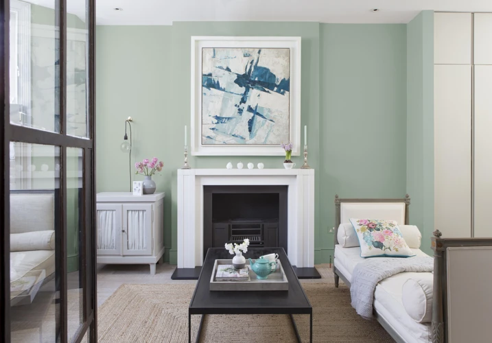
Blue and White
When it comes to timeless color combinations in interior design, one combination that stands out is blue and white. This pairing exudes a sense of calm and tranquility, making it a popular choice for bedrooms, bathrooms, and living spaces.
Here are a few ways to incorporate blue and white into your decor:
- Stripes: Blue and white stripes can add a nautical touch to any room. You can incorporate them through bedding, curtains, or even a striped area rug.
- Accent pieces: Choose blue and white accent pieces, such as throw pillows, vases, or picture frames, to add a pop of color to your space.
- Textured fabrics: Different textures can add depth and interest to blue and white decor. For example, a blue and white woven throw blanket or a patterned blue and white pillow can create a cozy and inviting atmosphere.
- Mix with natural materials: Combining blue and white decor with natural materials like wood or rattan can create an effortless coastal vibe.
Blue and white is a classic and timeless color combination that can work in a variety of design styles. Whether you prefer a traditional or modern look, this pairing can add a touch of sophistication and serenity to any room in your home.
Green and White
One timeless color combination that never goes out of style is a green and white pairing. This is a classic look that can work in a variety of spaces, from a traditional living room to a modern kitchen. The key is to use the right shades of green and to balance them out with white accents.
When it comes to choosing the perfect shades of green, there are many options to consider. For a fresh and airy feel, consider using a pale green, such as mint or seafoam. These shades of green are often associated with nature and can help create a calming atmosphere that is perfect for a bedroom or bathroom.
On the other hand, if you want to add a pop of color to a space, consider using a brighter shade of green, such as chartreuse or lime. These shades are perfect for a modern space and can add a playful element to a room.
To balance out the green, use plenty of white accents throughout the room. This could include white walls, white furniture, or white accessories. Additionally, you could consider using neutral-colored accents, such as beige or gray, to help soften the overall look of the space.
When it comes to incorporating green and white into different rooms, the possibilities are endless. In a living room, consider using a green sofa paired with white accent chairs or a green area rug paired with white walls. In a kitchen, consider using green cabinets paired with white countertops or a green backsplash paired with white appliances. And in a bathroom, consider using green towels and bath mats paired with white tile or a green shower curtain paired with white walls.
A green and white color scheme is a classic and timeless choice that can work in a variety of spaces. Whether you prefer a subtle touch of green or a bold pop of color, this pairing is sure to create a fresh and inviting atmosphere in any room.
| Shades: Pale green (mint or seafoam for a calming atmosphere), Brighter shades (chartreuse or lime for a playful element) |
| Balance: Use plenty of white accents throughout the room, such as white walls, furniture, or accessories. Neutral-colored accents, such as beige or gray, can also help soften the overall look of the space. |
| Rooms: Living room (green sofa with white accent chairs, green area rug with white walls), Kitchen (green cabinets with white countertops, green backsplash with white appliances), Bathroom (green towels and bath mats with white tile, green shower curtain with white walls). |
Yellow and Gray
One classic color combination that has gained popularity in recent years is the pairing of yellow and gray. This dynamic duo is balanced and cheerful, making it perfect for any space in your home.
Yellow is a color that is associated with happiness, optimism, and energy, while gray is a neutral color that gives off a calming and sophisticated vibe. This combination can be used in a variety of different ways, from bold accents to subtle pops of color.
One way to incorporate yellow and gray into your interior design is by using these colors in a patterned rug, throw pillows, or curtains. This will add a playful touch to your space while still maintaining a classic feel. Another option is to use the two colors in your wallpaper or paint choices, with gray serving as the base color and yellow as the accent.
In terms of furniture, a gray sofa with yellow accent pillows or a yellow chair with gray cushions can make a statement without being too overwhelming. Additionally, small decor items such as lamps, vases, or picture frames can be yellow or gray, adding harmony and cohesiveness to the overall look.
When using a color combination, it is important to consider the amount of each color you will use. In the case of yellow and gray, too much yellow can overpower the space and too much gray can make it feel dull. Balancing the amount of each color is key to achieving a cohesive and visually appealing look.
Take a look at the following table to understand the color psychology and effects of yellow and gray:
| Color | Psychology | Effects |
|---|---|---|
| Yellow | Associated with happiness, optimism, and energy | Stimulates creativity, increases energy and clarity, enhances happiness and joy |
| Gray | Associated with calmness, sophistication, and stability | Provides balance and neutrality, promotes calmness and relaxation, evokes feelings of refinement and elegance |
Yellow and gray is a timeless and versatile color combination that can be used in a variety of ways in your home. From small decor items to full wallpaper choices, this pair can provide a classic yet cheerful touch to any space. Remember to balance the amount of each color used to achieve a harmonious look.
Gold and Cream
A luxurious color combination that adds a touch of elegance and sophistication to any space is gold and cream. The warmth of gold and the softness of cream create a perfect balance, making it a timeless classic. Here are some ways to incorporate this color combination into your home:
- Accent Wall: Choose one wall in the living room or bedroom and paint it in a creamy color, then add gold accents with frames or wall decor for a subtle touch of glam.
- Furniture: Upholster your sofa or armchairs in a creamy color and add gold throw pillows or a metallic gold coffee table to complete the look.
- Accessories: Use gold accessories such as lamps, mirrors, and vases, on cream shelves or tables to instantly add glamour to any room.
- Textiles: Add gold and cream throw blankets, pillows, and curtains to create a soft and inviting atmosphere in your space.
It is important to note that gold and cream can easily overwhelm a space if not balanced correctly. To avoid this, consider using different shades of cream, such as ivory or beige, to create depth and dimension. Additionally, incorporate other neutral colors such as gray or brown, to create a cohesive and balanced palette.
Gold and cream is a classic color combination that adds a touch of luxury to any space. By following these tips, you can create an inviting and sophisticated atmosphere in your home.
Using Color in Different Rooms
When it comes to interior design, color plays a powerful role in shaping the look and feel of a space. Different colors can evoke different moods and emotions, making it important to choose the right color combinations for each room in your home. But with so many options, it can be overwhelming to know where to start. Which colors work best in the living room? What shades are ideal for the bedroom? Are there any colors to avoid in the bathroom? In this section, we’ll explore how to use color in different rooms, highlighting key considerations and providing tips to help you make the perfect color choices for your home.
Living Room
When it comes to the living room, there are many color combinations that can make the space feel warm and inviting. Here are some classic choices:
- Gray and Beige: A combination of gray and beige can create a calming and sophisticated atmosphere. This works well with wooden furniture and natural textures.
- Blue and White: A popular choice for coastal and nautical themes, blue and white can make the living room feel fresh and airy.
- Black and White: A timeless combination that can add a touch of elegance and drama to the living room. This can be achieved with black and white furniture, accessories, or even a striped rug.
- Green and White: A nature-inspired combination that can bring a sense of calmness and relaxation to the living room. This pair works well with plants and wooden accents.
When choosing a color combination for the living room, it’s important to consider the amount of natural light the space receives. If the room is dark, lighter colors can help to brighten it up. If the room is already well-lit, darker colors can add depth and richness.
Another important factor to consider is the size of the room. If the living room is small, sticking to lighter colors can help to make it feel more spacious. If the room is large, bolder colors can be used to make a statement.
No matter the color combination chosen, it’s important to incorporate different textures and patterns to make the space feel interesting and well-designed. A combination of solid colors with stripes, checks, and florals can create a visually appealing living room.
Bedroom
When designing the bedroom, color plays a crucial role in creating a soothing and relaxing environment. Here are some classic color combinations to consider for your bedroom:
- Blue and White: This combination creates a cool and calming atmosphere, perfect for promoting restful sleep. Consider using light blue walls and white bedding, or vice versa.
- Gray and Beige: This combination creates a sophisticated and neutral environment. Use shades of gray for the walls and bedding, and incorporate beige accents for warmth.
- Green and White: The freshness of green combined with the simplicity of white creates a clean and peaceful bedroom. Use green for the walls, bedding, or accents.
When choosing color combinations for the bedroom, it’s important to consider the psychological effects of color. Blue is known for its calming properties, making it an excellent choice for a tranquil bedroom. Gray is often associated with sophistication and elegance, while beige creates warmth and relaxation. Green is also calming, and can promote a sense of balance and harmony.
In addition to color, it’s important to consider the lighting in the bedroom. Soft lighting can create a peaceful and relaxing atmosphere, while bright lighting can be energizing and stimulating. Consider using dimmer switches or adding lamps with soft, warm light to create a cozy and relaxing environment.
Kitchen
When it comes to designing a kitchen, the color combinations used can greatly impact the overall atmosphere and functionality of the space. Below are some classic color combinations that can work well in a kitchen:
| Color Combination | Description | Visual Example |
| White and Gray | A timeless combination that creates a clean, minimalistic look. Gray can be used on cabinets or countertops, while white can be utilized on walls and backsplashes. |  |
| Blue and White | A fresh and calming combination. Blue can be used on cabinets or as an accent color, while white can again be used on walls and backsplashes to complement the blue. |  |
| Black and White | A striking combination that creates a modern and sophisticated look. Black can be used on cabinets or countertops, while white can again be used on walls and backsplashes to balance out the intensity of the black. |  |
When choosing a color combination for your kitchen, it’s important to consider the amount of natural light that the space receives. Lighter colors, such as white or beige, can help to brighten up a kitchen with low levels of natural light. Additionally, it’s important to select colors that are easy to maintain and clean, as kitchens are often exposed to moisture, heat, and spills.
Keep in mind that while color can greatly impact the overall look of a kitchen, functionality should always be the top priority. A kitchen that is designed with both style and practicality in mind will be sure to stand the test of time.
Bathroom
When it comes to choosing color combinations for the bathroom, it is important to consider both style and function. The bathroom is a space where we get ready for the day, so we want it to be energizing, but it can also be a space for relaxation and self-care, so it should promote calmness and relaxation. Here are some timeless color combinations that are perfect for any bathroom:
| Color Combination | Description |
|---|---|
| Blue and White | This classic color combination is perfect for creating a calming and spa-like atmosphere. Think soft blue walls with white towels and accessories. |
| Gray and Beige | These neutral tones work together to create a warm and inviting atmosphere. Choose beige tiles and gray walls for a timeless look. |
| Green and White | A bright and fresh combination, green and white can bring a touch of nature into your bathroom. Use white for the walls and green for accessories and towels. |
| Black and White | This classic combination is particularly suited to a modern bathroom with clean-lined fixtures. Use black and white tiles for the floors and walls for a timeless look. |
When choosing a color combination for your bathroom, it is also important to consider the size of the room. If your bathroom is small, it is generally best to use lighter colors that will make the room feel more spacious. If you have a larger bathroom, you can experiment with bold colors and patterns to create a more dramatic effect.
When it comes to accessories, you can use color to add personality and style to your bathroom. Choose towels, shower curtains, and soap dispensers in complementary colors to bring the whole design together. Remember, the key to a timeless bathroom design is to keep it simple and classic, while also adding your own personal touches.
Tips for Choosing Color Combinations
When it comes to choosing color combinations for your interior design, there are a few tips and tricks you can keep in mind. Firstly, consider the purpose of the room. Are you looking for a calm and relaxing space or do you want to create a lively and energizing atmosphere? The answer to this question can help guide your color choices.
Secondly, choose a color scheme that works well with the existing furniture and decor in the room. You don’t want to create an overwhelming or clashing look, so consider the colors of your upholstery, curtains, and other elements before making your final decision.
Thirdly, think about the mood you want to create with your color choices. For example, warm colors like red, orange, and yellow can create a sense of energy and excitement, while cool colors like blue, green, and purple can create a more calming and relaxing atmosphere.
Fourthly, consider the natural light in the room. Colors can appear differently depending on the lighting, so it’s important to test out your color choices in different lighting conditions before making a final decision.
Fifthly, don’t be afraid to incorporate different shades and tones of the same color to add depth and interest to your design. For example, using different shades of blue in a room can create a cohesive and harmonious look.
Sixthly, keep in mind the size of the room when selecting your color combinations. Dark colors can make a small room feel even smaller, while light colors can help a room feel more spacious.
Seventhly, consider incorporating neutral colors like black, white, gray, and beige as a base for your color scheme. These timeless shades can create a sophisticated and classic look that will never go out of style.
By considering the purpose of the room, existing decor, desired mood, lighting, shades and tones, size of the room, and incorporating neutral colors as a base, you can choose the perfect color combinations to create a timeless and beautiful interior design.
Examples of Timeless Interiors
When it comes to achieving a timeless interior, there are certain color combinations that have stood the test of time. Let’s take a look at some examples of interiors that have utilized these classic color schemes to create elegant and sophisticated spaces.
Black and White: Black and white interiors never go out of style. This classic color combination can be seen in both traditional and modern interiors. The contrasting colors create a striking and bold look, and the simplicity of the color scheme makes it easy to add pops of color through accessories.
Gray and Beige: This warm and neutral color combination is perfect for creating a cozy and inviting atmosphere. Gray and beige can be used on walls, furniture, and accessories to create a cohesive and harmonious space. This versatile color combination can be styled with a range of different textures and finishes to create a customized look.
Navy and White: Navy and white have a timeless nautical vibe that can be used to create a beachy or coastal atmosphere, or a more classic and sophisticated look. This color combination is also great for creating a gender-neutral space.
Blue and White: Blue and white interiors are both calming and elegant. The contrast between the cool blue and bright white creates a refreshing and airy feel. This color combination is perfect for creating a relaxing atmosphere in bedrooms and bathrooms.
Green and White: The natural world inspired this classic color combination. Green and white can create a tranquil and calming atmosphere, perfect for creating a relaxing oasis in any room of the house.
Yellow and Gray: Yellow and gray can bring a pop of sunshine into any space. The warm yellow pairs well with the cool gray to create an inviting and cheerful atmosphere. This color combination is perfect for infusing energy into a room.
Gold and Cream: Gold and cream create a luxurious and elegant look, perfect for creating a high-end atmosphere in living rooms and bedrooms. This classic color combination can be used on furniture and accessories to create a touch of glamour.
By using these classic color combinations, it’s easy to create a timeless interior that will stand the test of time. Remember, when using color in interior design, less is often more. Choose a few key colors and use accessories and accents to add interest and depth to the space.
Conclusion
In conclusion, color plays a crucial role in interior design and can greatly impact the overall look and feel of a space. By understanding the basics of color theory and the psychological effects of color, you can choose classic color combinations that will never go out of style. The timeless color combinations we discussed, such as black and white or navy and white, provide a sophisticated and elegant feel that can work in a range of different rooms and styles.
When choosing colors for specific rooms, it’s important to consider the function of the space and the mood you want to create. For example, a living room may benefit from warmer colors to promote relaxation and comfort, while a kitchen may benefit from brighter colors to create a sense of energy and vitality. By using color strategically, you can create a cohesive and inviting space that reflects your personal style.
When it comes to choosing color combinations, there are a few tips to keep in mind. Consider the different shades and tones of the colors you are using, as well as the balance of warm and cool colors in the space. Additionally, don’t be afraid to mix patterns and textures to add depth and interest to the room.
Overall, the key to creating a timeless interior with color is to choose classic combinations that will never go out of style and use them in a way that complements the space and creates the mood you want to achieve. By taking the time to carefully select colors and consider their impact on the space, you can create a beautiful and inviting home that will stand the test of time.
Frequently Asked Questions
What is the significance of color in interior design?
Color is an essential element in interior design, as it can set the mood, create ambience, and influence the overall aesthetic of a space.
What are the basics of color theory?
Color theory is the study of how colors interact with each other. It covers the three primary colors (red, blue, and yellow), secondary colors (orange, green, and purple), and tertiary colors (a blend of a primary and secondary color).
How does color affect our mood?
Color has a psychological effect on our emotions. For example, blue is calming and soothing, while red is exciting and energizing.
What are some timeless color combinations for interior design?
Some classic color combinations that have stood the test of time include black and white, gray and beige, navy and white, blue and white, green and white, yellow and gray, and gold and cream.
How can color be used differently in various rooms in the house?
Color can be used differently in various rooms based on their functions and purposes. For example, warm colors like red and orange are perfect for a cozy and inviting living room, while cool colors like blue and green are ideal for a tranquil and relaxing bedroom.
What are some tips for choosing the right color combinations for your home?
You can choose the right color combination for your home by considering the function of the room, the mood you want to convey, and existing decor elements like furniture and accessories.
What are some popular interior design styles that use specific color combinations?
Some popular interior design styles that use specific color combinations include Scandinavian (white and light wood), Art Deco (black and gold), and Mediterranean (blue and white).
How can neutral colors be used in interior design?
Neutral colors like beige, gray, and white can be used in interior design to create a calm and sophisticated ambiance. They can also serve as a versatile backdrop for bolder accent colors.
What are some ways to incorporate color without overwhelming a space?
You can incorporate color in a subtle way by using it sparingly as an accent color with neutral backdrops or choosing muted shades instead of bold hues.
What are some cost-effective ways to update the color scheme of a room?
You can update the color scheme of a room without breaking the bank by adding colorful accessories like throw pillows, curtains, or rugs, or by repainting furniture with a fresh coat of paint.