The world of interior design is constantly evolving, and one trend that has gained popularity in recent years is color blocking. But what exactly is color blocking? Essentially, it involves using contrasting colors to create visually striking walls or ceilings. The technique requires some knowledge of color theory, as well as a creative eye, but the end result can be truly stunning. If you’re looking to update a room in your home and add some boldness and personality, read on to learn all about the art of color blocking for walls and ceilings.
What is Color Blocking?
Color blocking is a contemporary interior design trend that involves using different blocks of colors to create a dynamic and eye-catching effect. This technique can be used on walls, ceilings, furniture, and accessories, and can dramatically transform the look and feel of a space. Whether you want to create a bold and vibrant statement or a subtle and sophisticated palette, color blocking allows for endless possibilities. Understanding the basics and benefits of color blocking is essential before you start your next home improvement project. So, let’s dive into the world of color blocking together!
Understanding Color Blocking
Understanding Color Blocking:
Color blocking is a popular interior design technique that involves painting sections of a wall or ceiling in different colors to create bold and striking contrasts. This technique is typically used to add visual interest to a room and create a unique focal point.
Color blocking can be done in a variety of ways, with different colors, patterns, and shapes. The key is to create a cohesive design that blends well with the overall decor of the room.
One of the advantages of color blocking is that it offers a cost-effective and quick way to transform a room without having to purchase expensive furnishings or accessories.
However, it is important to note that color blocking requires careful planning and execution. It is recommended to test the colors and techniques on a small area of the wall or ceiling first, to ensure that the final result meets your expectations.
To achieve the desired effect, it is also important to choose the right colors, techniques, and patterns. The colors chosen must blend well with other elements in the room, such as furniture, lighting, and flooring. The size and shape of the color blocks can also affect the overall look and feel of the room.
In the next sections, we will explore different color blocking techniques for walls and ceilings. We will also discuss color wheel basics, color combinations, and other tips for choosing the right colors for your project.
Benefits of Color Blocking
| 1. Adds Personality and Interest: | The technique of color blocking is a great way to add personality and interest to your space. By using bold and contrasting colors, you can create a focal point for the room that is visually exciting and unique. |
| 2. Makes a Room Look Bigger: | Using two or more colors on a wall or ceiling can make a room look bigger. This is because color blocking creates depth and dimension, which can trick the eye into perceiving a space as more expansive than it actually is. |
| 3. Hides Wall Imperfections: | If you have a wall with visible imperfections, such as cracks or dents, color blocking can help hide them. By using dark colors in areas with blemishes and lighter colors in other areas, you can mask imperfections while adding a stylish element to your space. |
| 4. Enhances Architectural Features: | Color blocking can enhance the architectural features of a room, such as moldings and trims. By painting them in contrasting colors, you can make them stand out and draw attention to their intricate details. |
| 5. Creates a Cohesive Look: | Using color blocking can help tie together different elements of a room, such as furniture and decor. By choosing colors that complement each other, you can create a cohesive look that brings the whole space together. |
Using the technique of color blocking can bring a number of benefits to your space. It adds personality and interest, makes a room look bigger, hides wall imperfections, enhances architectural features, and creates a cohesive look that ties different elements of a room together. Whether you are a beginner or an experienced DIYer, color blocking can be a fun and exciting way to experiment with paint. If you’re interested in exploring other paint techniques, check out our guide to sponge painting interior walls, or learn more about how to achieve a professional paint finish with a professional paint finish roller. You can also experiment with different brushing techniques for trims and molding or learn more about faux painting tips at faux paint tips.
Choosing Colors for Color Blocking
When it comes to color blocking, choosing the right colors can make all the difference. With so many hues and shades available, it can be overwhelming to decide where to start. However, with a little knowledge of the color wheel basics and some helpful tips, you can confidently select the perfect color combination for your walls and ceilings. In the next section, we will discuss the fundamentals of color blocking and share some valuable insights to help you choose colors like a pro. So, let’s dive in! For those who want to know more about different brushing techniques for trims and molding, check out our guide here.
Color Wheel Basics
Understanding the basics of color theory is crucial when it comes to color blocking. The color wheel is a valuable tool for selecting color palettes that are visually appealing and harmonious. Here are the key concepts you need to understand:
- The color wheel: It’s a circular diagram that shows the arrangement of colors based on their relationship to each other. The traditional color wheel consists of 12 hues, divided into primary, secondary, and tertiary colors. The primary colors (red, blue, and yellow) are the building blocks of all other colors. Secondary colors (purple, green, and orange) are created by mixing two primary colors. Tertiary colors (red-orange, yellow-orange, yellow-green, blue-green, blue-purple, and red-purple) are made by mixing a primary color with a secondary color.
- Color schemes: There are several color schemes based on the relationship between colors on the color wheel. Monochromatic color schemes use different shades and tints of the same hue. Analogous color schemes use colors that are next to each other on the color wheel, such as blue and green. Complementary color schemes use colors that are opposite each other on the color wheel, such as red and green. Triadic color schemes use three colors that are evenly spaced on the color wheel, such as yellow, blue, and red.
- Warm and cool colors: Colors can be categorized as either warm or cool. Warm colors such as red, orange, and yellow are associated with energy, excitement, and warmth. Cool colors such as blue, green, and purple are calming and soothing. When color blocking, consider the mood you want to create in the space and choose your colors accordingly.
- Color intensity: Color intensity refers to how bright or dull a color is. You can tone down a bright color by adding gray, black, or white to create a shade or tint, respectively. A muted color palette can create a sophisticated and serene atmosphere, while bold, saturated hues can add drama and a sense of fun.
By understanding these color wheel basics, you can confidently choose colors for your color blocking project that are harmonious and visually appealing.
Color Combinations
When it comes to color combinations, it’s important to understand the basics of the color wheel. The color wheel is a visual representation of how colors relate to each other. Colors that sit directly opposite each other on the wheel are called complementary colors. These colors create a strong contrast when paired together.
Some popular examples of complementary color combinations include:
- Red and Green
- Blue and Orange
- Yellow and Purple
Analogous colors, on the other hand, are located next to each other on the color wheel. They create a harmonious effect when paired together.
Some analogous color combinations include:
- Red and Orange
- Blue and Green
- Yellow and Green
A triadic color combination involves three colors that are equally spaced apart on the wheel. This creates a vibrant and balanced effect.
Some popular examples of triadic color combinations include:
- Red, Yellow, and Blue
- Orange, Purple, and Green
- Yellow, Cyan, and Magenta
Monochromatic color schemes involve using different shades and tints of the same color. This creates a subtle and sophisticated effect.
Some popular monochromatic color combinations include:
- Light blue, medium blue, and dark blue
- Light green, medium green, and dark green
- Pale pink, blush pink, and dusty rose
It’s important not to overlook neutral colors when choosing color combinations for color blocking. Neutrals like gray, beige, and white can be used to balance out and ground bolder colors.
Some popular neutral color combinations include:
- Gray and white
- Beige and white
- Black and white
The key to successful color combinations for color blocking is finding the right balance between boldness and harmony. Experiment with different combinations and see what works best for your space.
Tips for Choosing Colors
When it comes to choosing colors for color blocking, it can be overwhelming with so many options available. Here are several tips that can help make the process easier and more successful:
- Consider the room’s purpose: The colors you select should reflect the room’s function. For example, calming colors such as pale blues or greens are perfect for bedrooms, while vibrant colors such as reds or oranges work well in living rooms or dining rooms.
- Think about the mood you want to create: Color can affect mood, so consider the feelings you want to evoke in the room. Neutral colors such as beige or gray can create a peaceful atmosphere, while brighter colors can add energy and excitement.
- Look at the color wheel: The color wheel can be a useful tool when selecting color combinations. Complementary colors (opposites on the color wheel) can create a striking contrast, while analogous colors (next to each other on the color wheel) can create a more harmonious look.
- Consider the size of the room: Dark colors can make a room look smaller, while light colors can make a room look larger. If you have a small room, consider using lighter colors to create the illusion of space.
- Look to nature: Nature provides an abundance of color inspiration. Consider incorporating colors found in your favorite landscape or art piece into your color blocking design.
- Test colors in the room: Colors can look different in different lighting, so be sure to test your color choices in the room before committing to a design.
By following these tips, you can choose colors that not only look great together but also complement the purpose and feel of the room.
Color Blocking Techniques for Walls
When it comes to transforming the look and feel of a room, color plays a vital role. One technique that has gained popularity in recent years is color blocking. By strategically positioning solid blocks of color on walls, you can create an eye-catching and unique design that reflects your style and personality. There are several techniques when it comes to color blocking walls, and in this section, we will explore them step-by-step, highlighting the tools and materials you’ll need, as well as tips for achieving a professional finish.
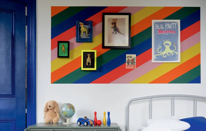
Horizontal Color Blocking
One of the most popular techniques for color blocking walls is horizontal color blocking. This technique involves using, as the name suggests, horizontal lines and blocks of color to create a visually captivating wall. It is a great way to add depth and interest to an otherwise plain or boring wall.
To achieve horizontal color blocking, you will need to choose two or more colors that complement each other. You can use the color wheel to choose colors that are opposite each other or located next to each other on the wheel. Alternatively, you can choose colors that match your décor or personal taste.
Once you have chosen your colors, you will need to mark out the areas where the colors will meet. This can be achieved using painter’s tape or a chalk line. You will then need to paint each section of the wall in the desired color, making sure to allow for drying time between coats.
When it comes to choosing the width of the blocks, there are no hard and fast rules. You can choose to have large, bold sections or thinner, more subtle strips of color. However, it is important to ensure that the blocks are all the same width and evenly spaced for a professional finish.
Horizontal color blocking is a versatile technique that can be used in any room of the house. It works particularly well in living rooms, dining rooms, and bedrooms, where it can create a focal point behind a sofa, bed, or dining table.
| Pros | Cons |
|---|---|
| Can make a room look bigger | Requires precise measuring and taping |
| Can create a striking focal point | May be difficult to match colors with existing decor |
| Can work with a range of color combinations | May not work in rooms with low ceilings |
| Can add depth and visual interest to a plain wall | May require multiple coats of paint for full coverage |
| Allows for customization and creativity | May be time-consuming to execute |
Horizontal color blocking is a fun and creative way to add personality and style to your walls. With a little patience and precision, you can create a unique and visually stunning feature in any room of your home.
Vertical Color Blocking
When it comes to vertical color blocking, it involves using colors in vertical stripes to create a visually interesting and unique look on walls. This technique is particularly effective for elongating the height of a room or creating a sense of drama. Here are some tips for executing this technique:
| Tip | Description |
|---|---|
| Choose colors wisely | When selecting colors for vertical stripes, opt for colors that have a subtle contrast or are within the same shade family. This will help create an ombre effect that is visually appealing. |
| Start with a base color | The base color should be the lightest or most neutral color of your chosen palette. This will serve as the background for the stripes. |
| Use painter’s tape | Painter’s tape will help create clean and crisp lines for your vertical stripes. Be sure to measure the distance between stripes evenly to ensure symmetry. |
| Alternate stripe widths | To create interest, alternate the width of your stripes. This will help create a dynamic look that draws the eye up and down the wall. |
| Consider the room’s proportions | When deciding on the number of stripes, consider the room’s height and width. Fewer stripes work best in smaller rooms, while larger rooms can handle more stripes without overwhelming the space. |
Vertical color blocking can work well in a variety of spaces, from bedrooms to living rooms to entryways. The key is to choose the right colors and execute the technique with precision to create a statement look that will wow visitors.
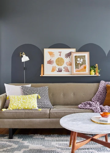
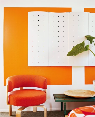
Asymmetrical Color Blocking
Asymmetrical color blocking is a bold and creative approach to color blocking for walls. The concept of asymmetry involves using a mixture of colors in a manner that is not evenly distributed. Instead, the colors are arranged in a way that creates a dynamic and eye-catching visual effect.
Choose your color scheme carefully:
To create an asymmetrical color block, start by choosing a color scheme that works well together. The key to success is to use colors that complement each other without overwhelming the room. Consider using colors that are found in other elements of the room, such as furniture, artwork or accessories.
Decide on the placement of the colors:
Remember, asymmetry does not mean random. Instead, focus on the placement of the colors, and how they interact with each other. For example, you could paint one side of the room a bold color, and leave the other side neutral or use soft, subtle colors. Alternatively, you could paint a specific area of the room a bright and bold color, such as above the fireplace or behind the bed.
Experiment with patterns:
Asymmetrical color blocking also enables you to experiment with bold patterns or shapes. Consider using painter’s tape to create triangles, diamonds, or other geometric shapes in different colours. This is an excellent approach to add visual appeal and create a room that looks more dynamic and exciting. Create a sketch of your design before you start to ensure that you achieve the desired effect.
Keep it balanced:
It’s essential to balance your asymmetrical color blocking. Make sure that you have an equal distribution of color and patterns throughout the room. You also want to avoid using too many colors as it can cause the room to look cluttered and chaotic. Instead, stick to three or four colors at most.
Make a statement:
Finally, asymmetrical color blocking is a way to make a strong statement in any room. Use it to create a sense of drama or to highlight a particular area. Remember, this approach works best in rooms that are relatively free of clutter and have simple furnishings.
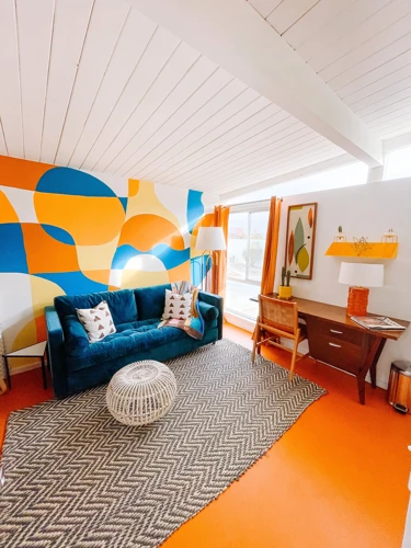
Geometric Color Blocking
Geometric color blocking involves using various geometric shapes to create a pattern on a wall. This technique is perfect for those who want to add a modern and artistic touch to their space. When it comes to geometric color blocking, the key is to keep the shapes simple and repetitive in pattern. Here are some popular shapes used in geometric color blocking and how they can be used:
| Shape | Description | Example |
|---|---|---|
| Square | Squares are a versatile shape that can be used in a variety of patterns. They can be used alone or combined with other shapes to create a unique design. |  |
| Triangle | Triangles are another versatile shape that can be combined to create interesting patterns. They can be used alone or with other shapes like squares and rectangles. |  |
| Circle | Circles can add a softer touch to a geometric pattern. They can also be used in combination with other shapes. |  |
| Hexagon | Hexagons are a more unique shape that can add a fun and modern touch to a space. They can be combined with other shapes to create interesting patterns. |  |
When using geometric color blocking, it’s important to choose colors that complement each other and the overall style of the room. Consider using a neutral color for the main background and brighter colors for the shapes. This will create a bold and eye-catching effect. It’s also important to carefully measure and plan the pattern before beginning to ensure a professional and cohesive finish.
Ombre Color Blocking
One unique color blocking technique to consider is ombre color blocking. This technique involves blending different shades of the same color to create a gradient effect. With ombre color blocking, you can create a subtle and sophisticated look that adds depth and dimension to any room.
To create an ombre effect, you’ll need to choose at least three shades of the same color. You can choose colors that are close in hue or opt for a more dramatic effect by choosing contrasting shades. A helpful tool for choosing colors is a color gradient generator which can help you visualize the progression of shades.
Here’s how to achieve an ombre color blocking effect:
1. Paint the top third of the wall with the lightest shade using a roller brush.
2. Mix the second lightest shade with the lightest color to create a transitional hue.
3. Using a roller brush, paint the middle section of the wall with the transitional hue.
4. Mix the second darkest shade with the transitional hue to create another transitional hue.
5. Paint the bottom third of the wall with the second darkest shade.
6. Use a dry brush or sponge to blend and soften the edges between each color.
7. You can repeat this process on multiple walls or even create an ombre effect on a ceiling.
While ombre color blocking may seem daunting, it is a DIY-friendly technique that can be practiced with patience and some basic painting materials. Tip: Use a roller and brush with blended bristles to smooth out the color transitions and create a seamless ombre effect on your walls.
With a little practice, you can master this technique and create a custom, one-of-a-kind look for your home.
Color Blocking Techniques for Ceilings
When it comes to decorating a room, the ceiling is often overlooked or left plain with a simple white coat of paint. However, adding color to your ceiling can completely transform the look and feel of a space. In this section, we’ll explore the art of color blocking for ceilings and show you how to elevate your room’s design by applying various color blocking techniques. From creating a statement ceiling to complementing the walls, there are endless options to choose from. So roll up your sleeves and get ready to take your room to the next level with these creative ceiling color blocking techniques.
Creating a Statement Ceiling
Color blocking doesn’t just have to be limited to walls. In fact, ceilings can be the perfect canvas for creating a bold and eye-catching statement in any room. Whether you want to add some drama to a small space or simply bring some color to an otherwise neutral room, a statement ceiling can do just that. Here are some techniques to help you create a statement ceiling through color blocking:
| 1. Bold Color | One of the easiest ways to create a statement ceiling is to simply paint it in a bold color. This technique works especially well in rooms with high ceilings, where the color can make a big impact. Choose a hue that complements the walls or opt for a contrasting color to create a more dramatic effect. Don’t be afraid to go bold! |
| 2. Pattern Play | If you’re feeling adventurous, try incorporating some patterns onto your ceiling. This can be achieved through stenciling, wallpaper, or even painting. Stripes, geometric shapes, and even florals can all make for a stunning statement ceiling. Just be sure to choose a pattern that complements the rest of the room’s decor. |
| 3. Metallics | Metallics are a fantastic way to add some glamour and shine to your ceiling. Consider painting your ceiling in a metallic hue or adding some metallic accents through foil or even glitter. This technique works especially well in rooms with natural light, as the metallics will reflect the light and make the room even brighter. |
| 4. Two-Tone Techniques | Another way to create a statement ceiling is through the use of two-tone techniques. Whether that be through horizontal or diagonal color blocking, or through the use of different paint finishes (matte and gloss), two-tone techniques can add depth and dimension to your ceiling. |
No matter which technique you choose, creating a statement ceiling through color blocking is a great way to add some personality and interest to any room. Just be sure to consider the overall design aesthetic of the space before committing to a specific color or pattern.
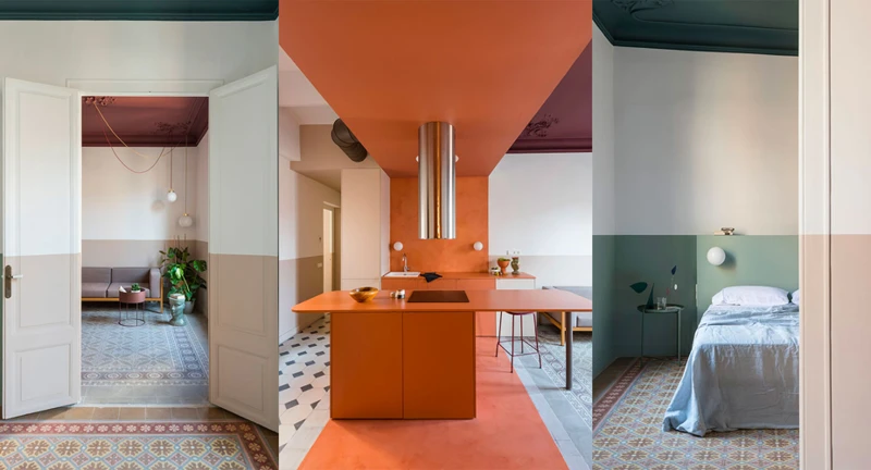
Complementing the Walls
To complement the walls with color blocking on the ceiling, there are a few things to keep in mind. Here are some tips to help you achieve a cohesive look:
- Choose Colors from the Same Color Family: To ensure that the colors on the walls and ceiling don’t clash, it’s best to stick to colors from the same color family. This will give your space a harmonious visual appeal.
- Create a Focal Point: Consider creating a focal point on the ceiling by color blocking one section. This will draw the eye upward and add interest to the space.
- Balance Bold Colors: If you’re using bold and vibrant colors on the walls, opt for a more muted tone on the ceiling for balance.
- Use Contrasting Colors: Another option is to use contrasting colors on the walls and ceiling. This can create a bold and dramatic effect, but be careful not to overwhelm the space.
- Avoid Busy Patterns: When complementing the walls, it’s best to avoid busy or complex patterns on the ceiling. This can create a cluttered look that detracts from the rest of the space.
By keeping these tips in mind, you can successfully complement your walls with color blocking on the ceiling. Remember to balance bold colors, create a focal point, and use colors from the same color family for a cohesive look.
Playing with Patterns
Patterns are a fun way to add visual interest and depth to a room’s design. When it comes to color blocking for ceilings, playing with patterns can be a great way to create a unique and eye-catching look.
Pattern | Description
— | —
Stripes | Stripes can be used to create a bold or subtle look. Vertical stripes can make a room appear taller, while horizontal stripes can make a room feel wider.
Checks or Plaids | Checks or plaids can create a cozy and traditional atmosphere. These patterns can be achieved through painting or through wallpaper.
Chevron | A chevron pattern can add a modern and playful touch. This pattern can be created with a stencil or with wallpaper.
Polka Dots | Polka dots can add a fun and whimsical vibe to a room. They can be achieved through painting or through wallpaper.
Floral | A floral pattern can add a feminine and romantic touch. This pattern can be achieved through painting or through wallpaper.
When working with patterns for a color-blocked ceiling, it’s important to keep the rest of the room’s design in mind. To avoid overwhelming the space, it’s best to stick to one or two types of patterns. Additionally, it’s important to use colors that complement each other and fit with the overall mood of the room.
To create a color-blocked ceiling using patterns, follow the same preparation and painting steps as with other color-blocking techniques. Then, using stencils or wallpaper, apply the pattern to the ceiling in a way that fits with the desired design. Make sure to take the time to align the pattern properly and to ensure that the colors look cohesive.
Playing with patterns can be a great way to add personality and visual interest to a room’s design. Whether using stripes or polka dots, it’s important to keep the rest of the room’s design in mind and to stick to one or two types of patterns to avoid overwhelming the space.
Using Metallics
Metallics are a great way to add a touch of glamour and luxury to any room, especially on the ceiling. Here are some tips on how to use them for color blocking:
- Choose the right color: Metallics come in a variety of shades, so it’s important to choose the right one that will complement the other colors in the room. For example, a warm gold will go well with earthy or neutral tones, while a cool silver or platinum will look great with blues and greys.
- Decide how much metallic to use: Depending on the size of the room, too much metallic can be overwhelming. Consider using metallics on just one accent wall or on the ceiling only, paired with neutral or matte colors on the other walls.
- Pair with complementary colors: Metallics can be paired with other colors that complement their shine, such as deep jewel tones or bold brights. Consider using metallic gold with navy blue or metallic silver with royal purple.
- Use metallics in a pattern: Metallics can be used to create patterns on walls or ceilings. For example, a stripe or chevron pattern made up of alternating metallic and matte colors can add interest and texture to a space.
- Balance with natural materials: To avoid a space feeling too cold or sterile, it’s important to balance the use of metallics with natural materials, such as wood or stone. Consider incorporating a wooden accent wall or natural stone tile around a metallic ceiling.
Using metallics for color blocking can be a bold choice, but done correctly, it can elevate a space and create a luxurious atmosphere.
DIY Color Blocking Tips
Now that you have a better understanding of the art of color blocking for walls and ceilings, it’s time to delve into the DIY aspect of this technique. While it may seem daunting at first, with the right tools, materials, and preparation, anyone can achieve a professional-looking color block design in their space. In this section, we’ll cover some essential tips and step-by-step instructions to help you create a stunning color block feature in your home. So, roll up your sleeves and let’s get started!
Tools and Materials
To get started with color blocking for walls and ceilings, it’s essential to have the right tools and materials on hand. Here are the must-have items:
| Tools | Materials |
|---|---|
| Paintbrushes | Painter’s Tape |
| Paint rollers | Drop cloths |
| Paint trays | Primer (if necessary) |
| Putty knife (for ceiling work) | Sandpaper (for smoothing walls or ceilings) |
| Level | Paint in desired colors |
Painter’s tape is crucial for creating clean lines and avoiding smudging. Drop cloths protect furniture and floors from paint spills. If the surface to be painted is not already painted with a similar color, a primer may be necessary for proper paint adhesion. Before painting, ensure that the walls or ceiling are smooth and even by sanding down rough patches. With these tools and materials on hand, you’re ready to begin your color blocking project.
Preparation
Before beginning your color blocking project, it’s important to properly prepare the surface to ensure a smooth and long-lasting finish. Here are some steps to help you prepare:
- Clean the walls or ceiling: Start by cleaning the surface with a damp cloth or sponge to remove any dirt, dust or debris. If there are any stubborn stains, use a mild soap and water solution to scrub them away.
- Repair any damage: Use spackle or putty to fill in any holes or cracks in the surface. Once it’s dry, sand it down until it’s flush with the wall or ceiling.
- Protect surrounding areas: Cover any nearby furniture or flooring with drop cloths or plastic sheeting to protect it from paint splatters or drips.
- Prime the surface: Applying a primer before painting can help the paint adhere better to the surface and ensure a more even finish. Make sure to use a primer that is compatible with the type of paint you’ll be using.
- Tape off the area: Use painter’s tape to create clean lines and to prevent paint from bleeding onto adjacent surfaces. Make sure the tape is firmly in place and pressed down along the edges.
- Test the colors: Before applying the paint, test your chosen colors on a small section of the wall or ceiling to ensure you’re happy with the combination and the way they look in the lighting of the room.
By properly preparing your surface before beginning your color blocking project, you can ensure a more professional-looking finish that will last for years to come.
Step-by-Step Instructions
To achieve a professional finish when color blocking your walls or ceilings, it’s important to follow a step-by-step process. Here’s a breakdown of how to do it.
| Step 1: | Prepare your space by clearing out any furniture or decor, and cover the floors and any remaining items with drop cloths or plastic sheeting. |
| Step 2: | Clean the surface thoroughly to remove any dust or dirt that could impact the paint’s adhesion. Use a mild soap and water solution, and let the surface dry completely. |
| Step 3: | Fill any holes or cracks with spackle, and sand the surface down once it’s dry to create a smooth, even canvas for painting. |
| Step 4: | Apply painter’s tape to the edges of the areas you plan to paint to create clean, straight lines. This is particularly important if you’re using multiple colors for your color blocking technique. |
| Step 5: | Apply a primer to the surface to create an even base for your paint. This step is especially necessary if you’re painting over a darker color, or if the surface has not been painted in a long time. Let the primer dry completely. |
| Step 6: | Apply your first coat of paint using a roller or brush. Let the first coat dry completely, and then apply a second coat for better coverage. Let the second coat dry completely as well. |
| Step 7: | Remove the painter’s tape carefully once the paint is dry to the touch, but not fully cured. This will help create a clean, smooth line. |
| Step 8: | Touch up any areas that may need it, and let the paint cure fully before replacing any furniture or decor. |
By following these steps and taking your time, you can achieve a professional-looking color blocked wall or ceiling in your space. Remember to choose colors that complement each other and follow the color blocking techniques that suit your needs and aesthetic preferences.
Tips for a Professional Finish
To achieve a professional finish when color blocking walls and ceilings, there are some tips that can be followed. Here are some essential tips:
- Use painter’s tape: Applying painter’s tape along the edges of the colors will prevent bleeding and ensure clean, crisp lines.
- Paint in stages: Allow each color to dry completely before moving on to the next. This will prevent smudging and ensure a neat finish.
- Pay attention to lighting: The way the colors appear may differ based on the lighting of the room, so make sure to consider this when choosing colors and also when applying the colors.
- Choose the right finish: The finish can greatly affect the appearance of the color blocking. Matte finishes may hide imperfections on the wall, but are less durable and harder to clean, while gloss finishes have a reflective quality that can enhance the appearance of the color blocking, but also highlight any imperfections.
- Don’t be afraid to blend: If the edges of the color blocking look too harsh, lightly blend them using a dry brush to create a seamless transition.
- Clean as you go: Accidentally getting paint on an area that you did not intend can easily happen. It is important to clean up any spills or mistakes as soon as they happen while the paint is still wet, using a damp cloth.
- Protect the surrounding areas: Cover any areas with drop cloths to avoid accidental paint spills on floors, furniture, and other things in the room that are not meant to be painted.
By following these tips, one can achieve a professional and polished finish when color blocking walls and ceilings.
Conclusion
In conclusion, color blocking is a creative and effective way to add personality and interest to any interior space. By understanding the color wheel and experimenting with different combinations, it’s possible to achieve a stunning visual impact that reflects your individual style.
Whether you choose to use color blocking on your walls, ceilings or both, there are a variety of techniques to explore. From classic horizontal and vertical stripes to more modern geometric and ombre patterns, the possibilities are endless.
When embarking on a color blocking project, it’s important to invest in the right tools and materials, take the time to prepare properly, and follow step-by-step instructions for a professional finish. With a little patience and attention to detail, you can create a statement interior that will impress friends and family.
Remember, color blocking isn’t just about following the latest trends and styles. It’s about using bold and beautiful combinations of colors to express your unique personality and make your home truly your own.
So why not experiment with color blocking and unleash your inner designer? With a little creativity and inspiration from this article, you can transform any room into a vibrant and stylish space that reflects your individual style and taste.
References
When writing an article, it’s important to include references to give credit to the sources of information and inspiration. References can also provide readers with additional resources to continue learning about the topic. Here are some tips for citing references:
Use trusted sources: When citing references, it’s best to use sources that are reputable and trustworthy. This includes academic journals, books, and reputable websites.
Be specific: When citing a source, be specific about the author, title, publication date, and any other relevant information. This information helps readers locate the source if they want to learn more about the topic.
Format properly: When citing a reference, it’s important to use the proper citation style. There are several different citation styles, including APA, MLA, and Chicago. Choose the style that is appropriate for your article and stick to that style throughout.
Include a variety of sources: To provide readers with a comprehensive understanding of the topic, it’s important to include a variety of sources. This can include academic articles, books, blogs, and other types of media.
Here are some examples of properly formatted references:
For a book:
Smith, J. (2010). The Art of Color Blocking. New York: Random House.
For an academic journal article:
Jones, S. (2018). Understanding the Benefits of Color Blocking. Journal of Design Psychology, 25(2), 45-56.
For a website:
ColorBlocking.com. (retrieved July 15, 2021). “Choosing Colors for Color Blocking.” https://www.colorblocking.com/choosing-colors/.
Including references in your article can make your work more credible and informative. By following these tips, you can ensure that your references are accurate and properly formatted.
Frequently Asked Questions
Can color blocking be done in any room?
Color blocking can be done in any room, although some techniques may work better in certain spaces. Consider the room’s size and lighting when choosing colors and techniques.
Do I have to use bold colors for color blocking?
No, you can use any colors you like for color blocking. However, using bold colors can make a more dramatic statement.
What is the best color wheel to use for color blocking?
The traditional color wheel, which includes primary, secondary, and tertiary colors, is best for color blocking.
Can I mix warm and cool colors for color blocking?
Yes, you can mix warm and cool colors for color blocking. In fact, using complementary colors (colors opposite each other on the color wheel) can create a dynamic look.
How many colors should I use for color blocking?
There is no set number of colors to use for color blocking, but using more than three can make the space look cluttered. Stick to a few key colors to create a cohesive look.
Can I use color blocking on textured or patterned walls?
Yes, you can use color blocking on textured or patterned walls. In fact, using color blocking on these walls can create an interesting visual effect.
What type of paint should I use for color blocking?
Use a high-quality, satiny or matte finish paint in your chosen colors for best results. Don’t forget to prime the walls before painting.
Do I need special tools to create a color block pattern?
No, you don’t need special tools to create a color block pattern. A painter’s tape, a foam roller, and a paintbrush will suffice.
Can I use color blocking on a small room?
Yes, you can use color blocking on a small room. Consider using lighter shades or pastels to make the space appear larger.
Is there a rule against using multiple color blocking techniques in one room?
No, there are no rules against using multiple color blocking techniques in one room. Mix and match techniques to create a unique look.